
MK Retouching investigated popular fashion magazines on retouching labels in research in Paris. These were then sorted and evaluated according to their appearance. To visit Paris is unavoidable, as the access to resources in Germany is very limited.
For this purpose, various editions of the following different magazines (french edition) were examined several times.
- Vogue Paris (No. 981, October 2017)
- Vogue Paris (No. 982, November 2017)
- Vogue Paris (No. 983, December 2017)
- Vogue Paris (No. 984, February 2018)
- Vogue Paris (No. 985, March 2018)
- Vanity Fair (No. 52, November 2017)
- Vanity Fair
 (No. 54, February 2018)
 - Elle (No. 3764, 9. February 2018)
- L’Officiel Paris (No. 1021, February 2018)
- Cosmopolitan (No. 532, March 2018)
- Marie Claire (No. 787, March 2018)
- Grazia (02.-08. February 2018)
- Pretties (No. 31, February-March 2018)
Amount of Retouching labels
A total of 87 retouching labels were found on advertisements from 31 brands in the 13 magazines mentioned above, with the words “Photographie retouchée”, “Photographie Retouchée”, or “Photo retouchée”.
To get an idea of the amount of retouching labels from the start of the new legislation over a specific time frame, Vogue Paris was examined from October 2017 to March 2018. Other journals were used for comparison for general statements and as a cross-section of the current retouching label rate. Vogue No. 983 and No. 985 are available online, so a comparison to the online presence of the hint could also be made.
Brand-Variety
As already described, 31 different brands were identified that used a retouching label. The ones with the highest amount of retouching labels were Prada (9), Louis Vuitton (9), Armani (7), Saint Laurent (7), Michael Kors (6), and Lancôme (5). It can be seen that well-known brands, which are priced in the upper price segment, use body deformations in image processing.
Right from the beginning of the decree, the industry reacted and implemented the labels.
Further findings
The monthly editions have a relatively constant amount of retouching labels. However, in the March issue was a significantly increased number of labels to find. This could be attributed to seasonal fluctuations. However, a valid statement would require further long-term studies.
In Figure 1 it can be seen that in online issues and printed versions, both have retouching labels. It can be assumed that printed and online versions are identical.
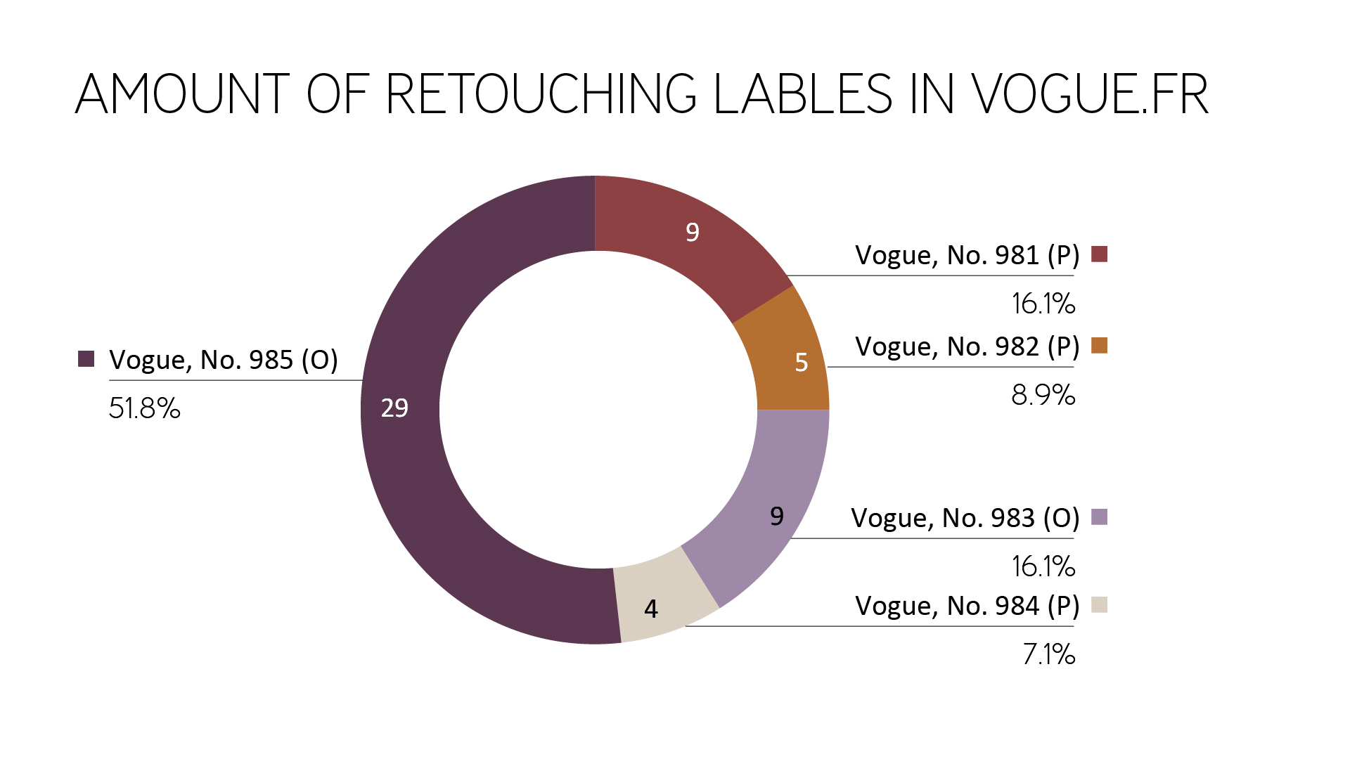
Figure 1: Amount of retouching labels in different editions of Vogue Paris
For comparison, the following pie chart shows the number of retouching labels of the remaining magazines (this means excluding Vogue.fr) with a total of 31 retouching labels. The reviewed magazines are close to the last investigated Vogue Paris edition in terms of time and show a constant, but a significantly lower percentage of advertisements with retouching information. This may have its origin in the unique role of Vogue Paris since Vogue Paris is very attractive for advertisers.
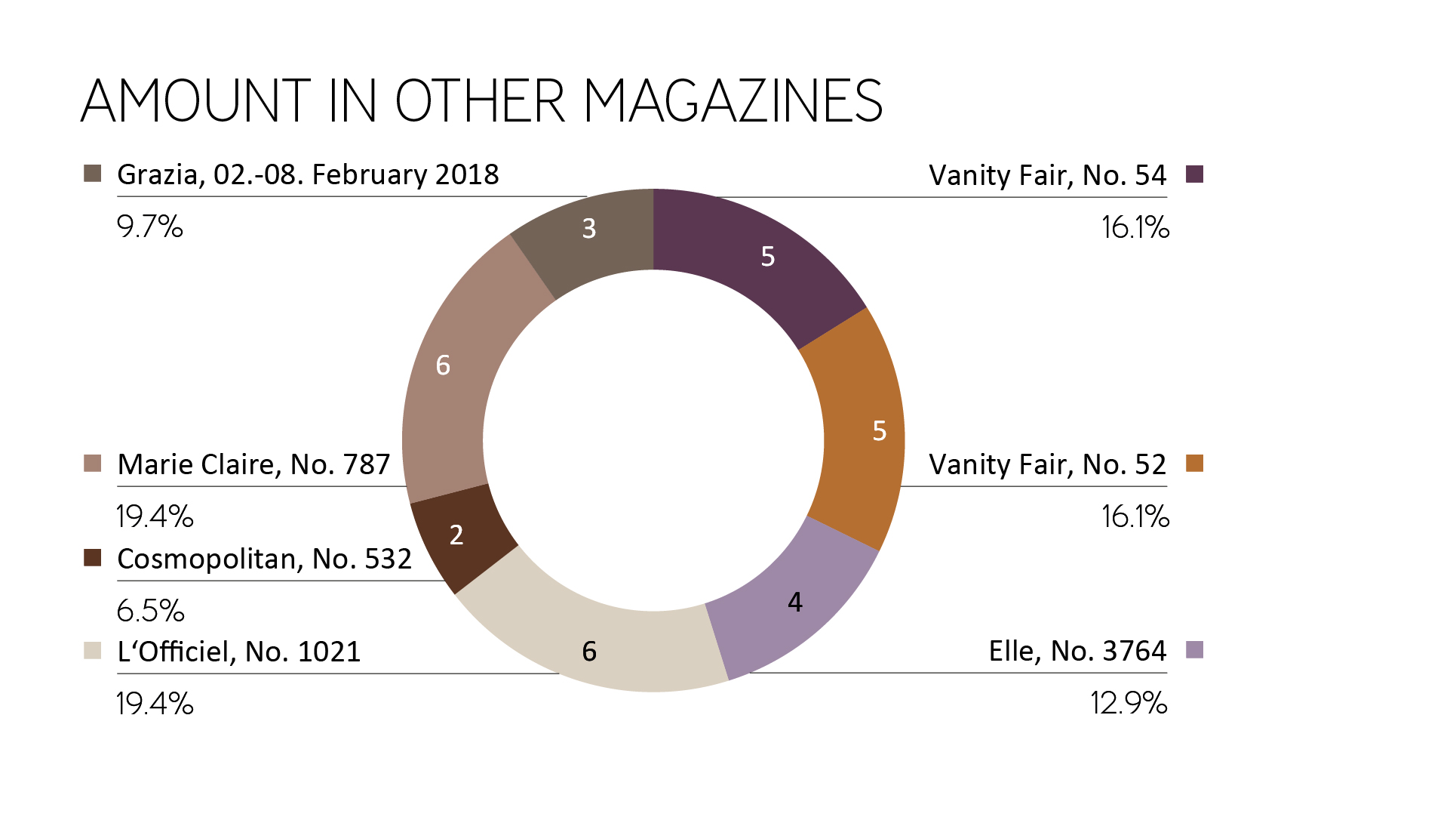
Figure 2: Amount of retouching labels in different magazines on February/March 2018
Position in Magazines
Only in the first section of the magazine and on the last page advertisements are positioned. Articles and editorial sections (definition: artistic photo series in fashion magazines) can be found in magazines usually in the middle or at the end of the magazine. That means, by using the magazines chronologically, the consumer is confronted with the advertisements with and without the retouching labels first.
Layout integration of the Retouching label
By analyzing the advertisements, it was found that the retouching labels could only be found on full-page or even double-sided advertisements. The pictures took a lot of space accordingly. As seen in Figure 3, two thirds can be found in single-page advertisements. A single page was scored as such if the image was placed without protrusion to the accompanying magazine page. If an image was placed (partly) on two magazine pages, it was scored as a double page. Two photographs of one brand ad on the left and right page were scored as two single pages.
The origin of a higher amount of single image adverts is based on the fact that predominantly portrait format is used in photography (instead of landscape format). Reasons for the resolution of the images can be neglected since the quality of the advertisement images is usually very high.
A total of three advertising images were found, which were placed as a portrait format each on two magazine pages. These were rotated – the consumer had to turn the magazine to see the advert in the right perspective.
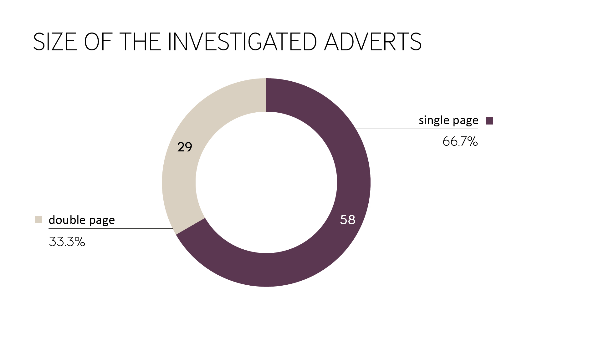
Figure 3: Size of advertising images that used a retouching label.
Placement on the magazine pages
Likewise, the placement of the retouching labels on the magazine pages was checked. As a reference point, the magazine page with the retouching label was used.
As shown in Figure 4, there is a strong preference for placement in the bottom left or top left. If the consumer focus on the left part of the ad or the left part of the magazine page, the chance of finding the retouching label is higher.
It is not clear if the placement follows a certain placement strategy. It could be the case that the reading direction or the distance to the retouched model are key factors for choosing a certain placement for the retouching label.
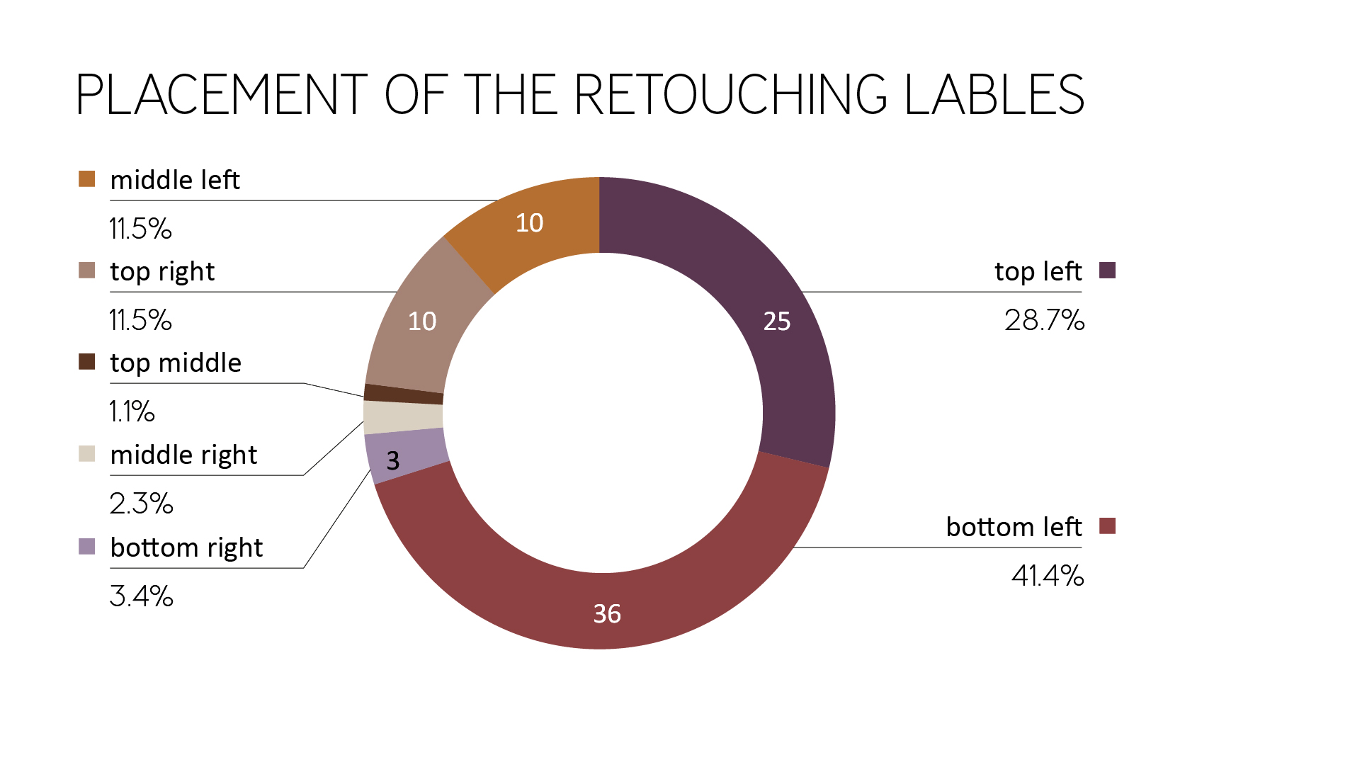
Figure 4: Placement of the retouching labels (magazine page as the reference point)
Furthermore, the hint has often been found near the fold and is hardly visible there. Also, with the placement vertically centered on the edge of a magazine page, the attention of the hint may suffer because the hand is often placed there to turn over the pages (see Figure 5 and Figure 6).
Figure 5: Example of a retouching label placed near the fold of the magazine (Vogue Paris, No. 985)
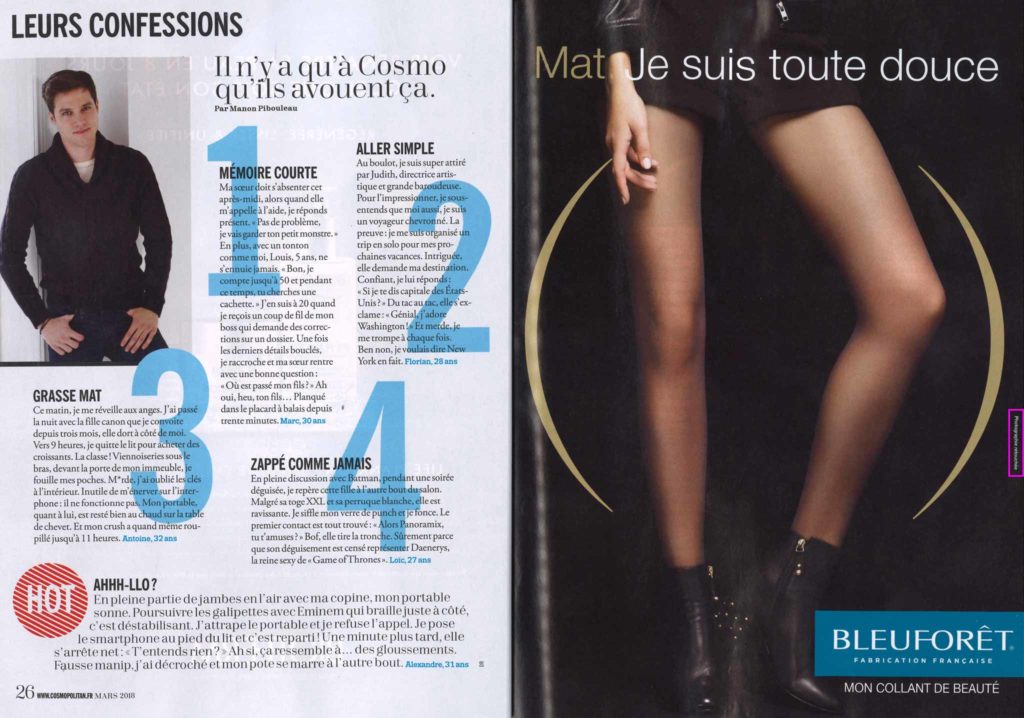
Figure 6: Possible placement for the hand on the magazine page by turning over the page (Cosmopolitan, No. 532)
It could be observed that the reference position was often placed as distanced as possible from the center or the model. In Figure 7 and 13 you can see that the model is located on the right page of the magazine, but the retouching label on the left one.
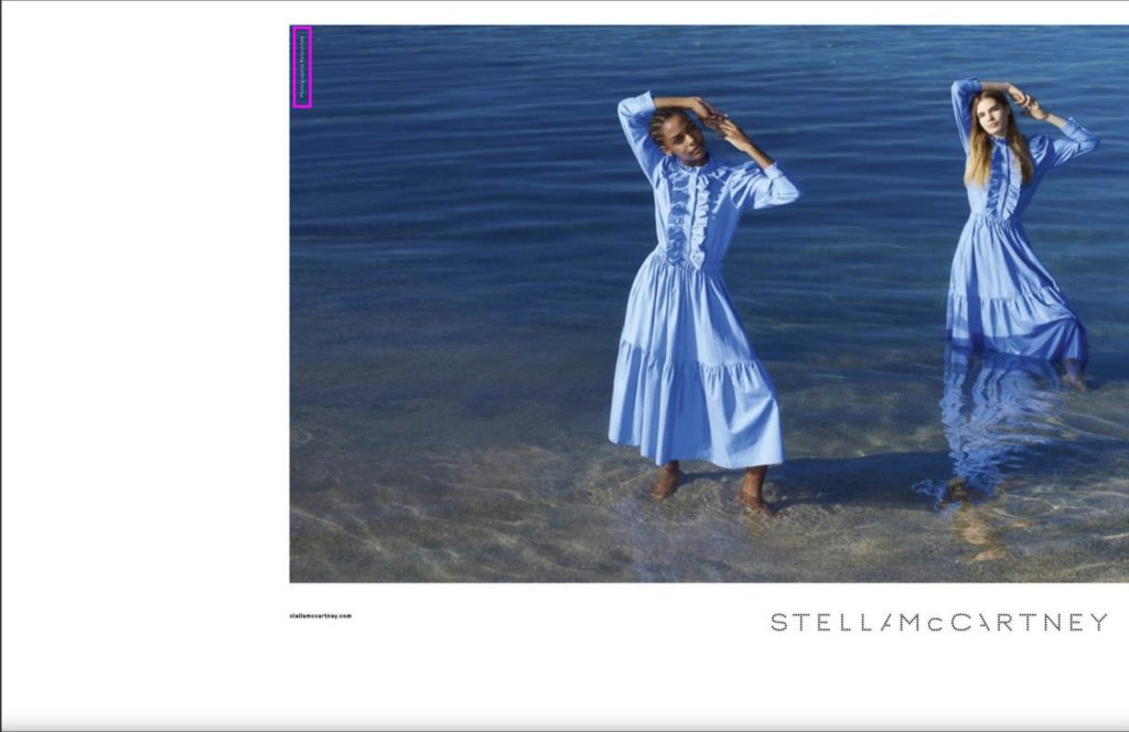
Figure 7: Distance between model and retouching label (Vogue Paris, No. 985)
Alignment on the magazine page
In this section, the orientation of the text is been discussed. It is much harder to read labels that are not aligned horizontally because they are contradicting the usual reading habits. Whether a retouching label should be placed vertically or horizontally is not clear from the corresponding legal text. Therefore, it is not surprising that, as Figure 8 shows, there is no clear preference for orientation in the advertising.
It was also noticeable that with vertical alignment of the retouch label, the rotation of the text can be found both 90°clockwise and counterclockwise.
Also noteworthy was the fact that retouching labels were surrounding by other information. Some were surrounded by website links, addresses, shop notes, or credits. In this case, the label is harder to find and therefore less noticeable during the search process (see Figure 9).
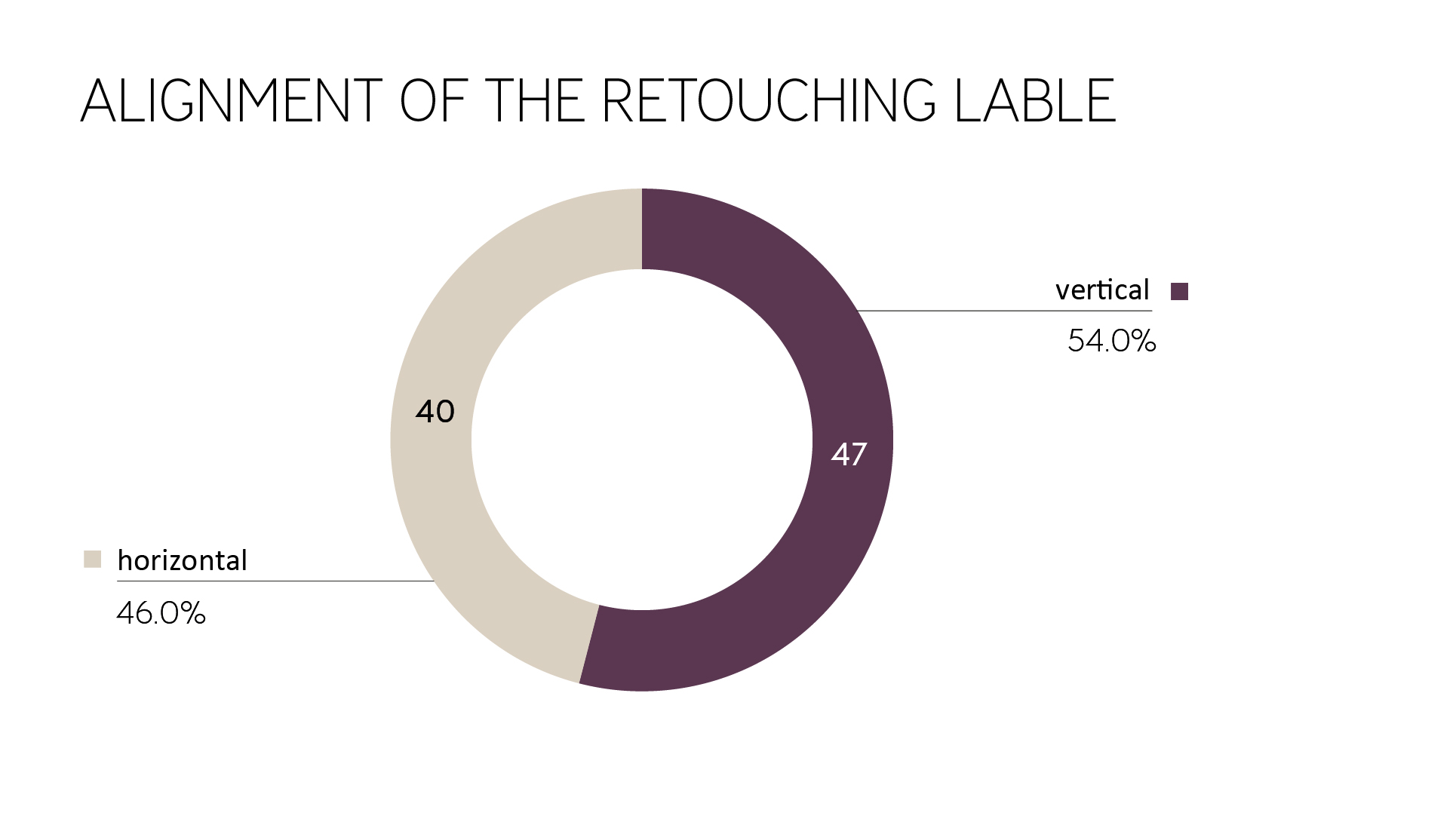
Figure 8: Alignment of the retouching label
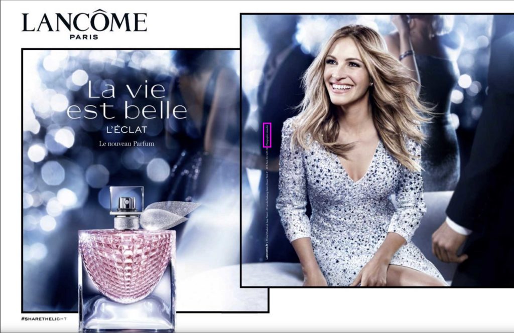
Figure 9: Retouching label surrounded by the address of the brand (Vogue Paris, No. 983)
Average size
How big and legible is the average size of a retouching label in print? The printed retouching labels were measured. For vertical retouching labels, the longer side was defined as the width and the shorter side as the height to achieve a clear average. The average retouching label in the investigated print magazines was:
- width: 26.1 mm
- height: 1.7 mm
The typography of the Retouching label
Typographically, three parameters were examined. As can be seen in Figure 10, the majority of the retouching information in magazines consists of sans-serif fonts. Serif typefaces were only used by a few brands such as Lancôme and Jean Paul Gaultier.
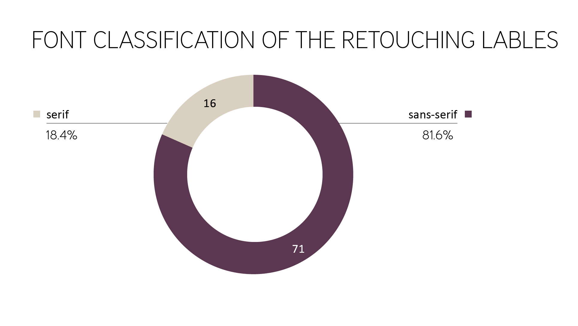
Figure 10: Font classification of the retouching labels
Another effect on the readability and presence of the hint has the font set. While capital letters appear optically more giant and lowercase letters look smaller, the combination of the standard capital letter and lowercase letters are easier to read. By a short page-turning time or quick passing by billboards as in Métro stations, therefore, the standard capital letter plus lowercase letters would be recommended. Because the label is printed very small in its size and the label itself is very short, capital letters should also be an option when it comes to the intended perception of the hint. As shown in Figure 11, all three options were used almost equal. Small capitals were not found.
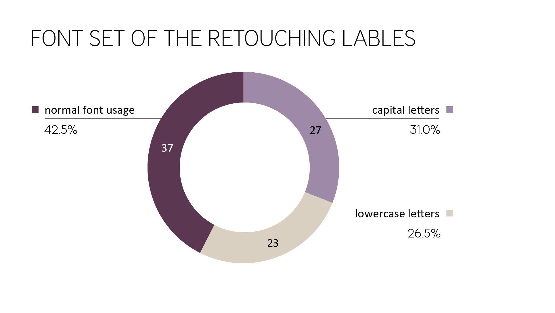
Figure 11: Font set of the retouching labels
If you take a look at the font style of the retouching label, the result of the investigation is clear: the retouching hint is predominantly to almost exclusively represented as a regular font. The exception is Lancôme (see Figure 12).
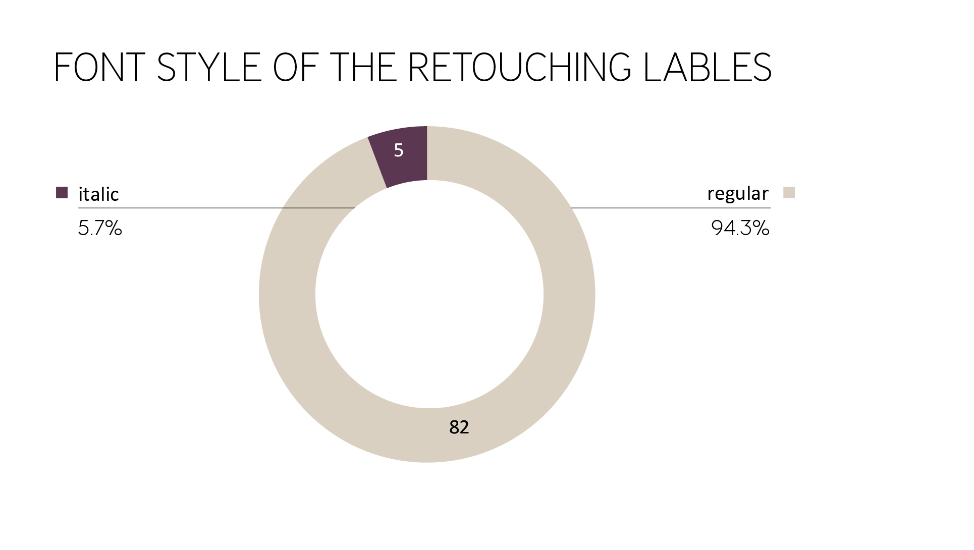
Figure 12: Font style of the retouching labels
Contrast values
Another aspect of the investigation was the contrast values from font to background. Almost half of the ads showed too little contrast. Examples of insufficient contrast between background and font were, for example: medium gray (font) – light gray (background), black (font) – medium gray (background), white (font) – light blue (background), white (font) – beige (background). Besides, in some cases, a busy background made it difficult to recognize the label. As shown in Figure 13, black lettering was placed on a grayscale brick building and is hardly recognizable due to its low contrast and size.
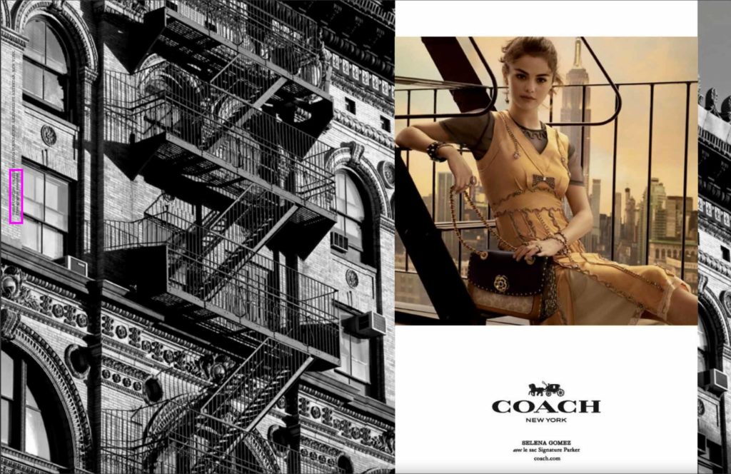
Figure 13: Example of bad contrast values (Vogue Paris, No. 985)
Mainly used product categories
As the last parameter, it was examined which products were advertised with retouching labels. Significantly ahead of all other product types were clothing or handbags. The category “Other” in Figure 14 summarizes the following three product discoveries: “hat”, “watch”, “lipgloss”.
The shown body parts of the models in the advertised articles tended to be significantly higher for clothing – or clothing, including bags (in contrast to jewelry, perfume, or eyewear advertisements). Overall, no other than the listed items (captured with models) were advertised in the magazines. That means, e.g., watch ads without models are included in the magazines, but those are not affected by the legislation.
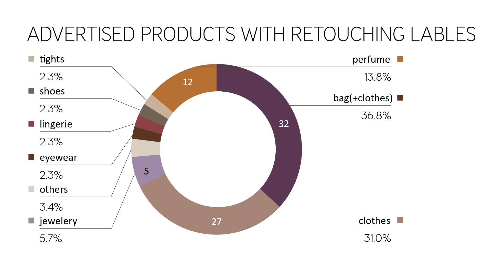
Figure 14: Advertised products with a retouching label
Recognition value
Overall, there is only a low recognition value, since the reference in the positioning and design differs depending on the brand. In some cases, there were even different versions within the brands (different campaign styles). Labels within a magazine are therefore different in its appearance and must first be searched for. The same ads in various magazines are identical.
Effectiveness of the labelling obligation
The full assessment of the effectiveness of the retouching advice can only be made after a certain amount of time and further studies. However, it is already clear that the scope of the retouching label is limited to specific cases: Only advertising images are marked, excluding editorial model images that are very popular. Images in the back of the magazines are, therefore, without retouching labels, even if the models were actually altered in body shape. The question of the credibility and recognition of such retouching changes seems increasingly difficult and complex.
It is questionable whether these labels characterized by a certain passivity and casualness in the reception situation and the likewise decreasing observation time and intensity of an average of 1.5 to 3 seconds are even perceived.
Nevertheless, the new regulations in the motherland of fashion are one step towards new international beauty standards to protect young models from discrimination and anorexia.![]()
Do you have any suggestions, additions, is this post out of date, or have you found any mistakes? Then we look forward to your comment.
You are welcome to share this post. We are very grateful for every recommendation.