No right-click allowed. © Mareike Keicher

Tag : Color harmonies

The Art of Creating a Successful Magazine Cover

Within the magazine industry, the challenge of selling print issues has become increasingly difficult in recent years due to the rising dominance of the internet. Print issues have become a less popular commodity and source of information now that everything we need to know can be easily searched for on mobile devices and desktops. However, even in this digital age, several publications have been able to thrive and achieve healthy print sales. How do they manage this?

In this article we will focus on how magazines can optimise their cover and different strategies used to attract and retain both regular and new readers. The science behind creating an impactful magazine cover can be broken down into a few simple but effective elements.

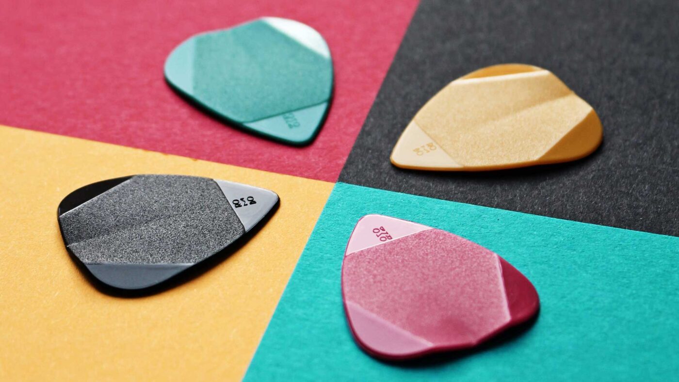
The best colour scheme

Choosing the colour scheme is often the most creatively fulfilling aspect of a shoot. The colour scheme is the backbone of an editorial shoot, along with the fashion, props and setting. As any artist will tell you, different colours can create different moods, emotions and impact. Red is one of the most popular colours used for magazine covers as it has attention-grabbing qualities, along with bright yellows. However, due to the popularity of these colours, it can be hard to distinguish between the array of magazine covers on newsstands. Black covers are also a popular choice, as they have the ability to provide a blank, yet powerful canvas against which the featured colour is contrasted.

 The colour green has had a history within the magazine industry for being a ‘cursed colour.’ Prolific editors and art directors have claimed that using green for cover art produces low sales. Others have since dubbed this as an urban myth, although colour experts have suggested that green may not be effective in stores, as fluorescent bulbs can cast a yellow light on the green cover, which has the effect of washing out the green and giving the cover a bluish cast. Lynn Staley, assistant managing editor of Newsweek, put forth a more plausible theory: “Like brown, [green] can be tricky to control on press […] if the printer isn’t careful. It’s a technical consideration, but it may explain an industry-wide allergy to the color.”

The right cover star

When editors and art directors choose their cover star, they are primarily concerned about one thing: who will sell? Up until 20 years ago, models were chosen mainly based on their looks and unique features. Today, cover stars are most often recognisable movie stars, supermodels, social media influencers, and even political figures. 

The business of selling magazines is driven mainly towards recognisability. Cover models within the entertainment industry have been known to increase sales. However, many publications may not  have the budget to hire an A-lister for their cover and need to look beyond that type of model.

Choosing a model which target readers will find ‘inspiring’

Most magazine publications rely heavily on the loyalty of their subscriber base to maintain their sales. Subscribers aren’t usually impacted by the identity of the magazine cover star, but rather the content of the editorials. For the casual reader those who like to browse the shelves of newsstands there are certain cover design elements which could entice them to pick up a copy of a glossy.

In a 2016 study by Fashion Academic, Ben Barry, of consumer products sales strategies, Barry found that men were more likely to purchase products that featured a model who was portrayed as ‘wealthy’ (e.g. wearing designer clothes, expensive watches etc.) while women were more likely to buy products from a model who appeared to be ‘honest’ (a warm smile and ‘ordinary’ clothing). When considering physical attributes, women were more inspired by models who shared similar physical and ethnic features as they themselves. 

When planning a photo shoot, it’s important to bear this idea in mind. While these ideas shouldn’t necessarily take precedence over the creative process, they should at least be considered and drive the intent. Depending on the magazine’s target audience, it’s important to understand what and who will inspire them to pick up a copy.

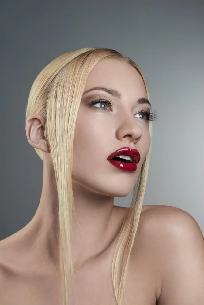
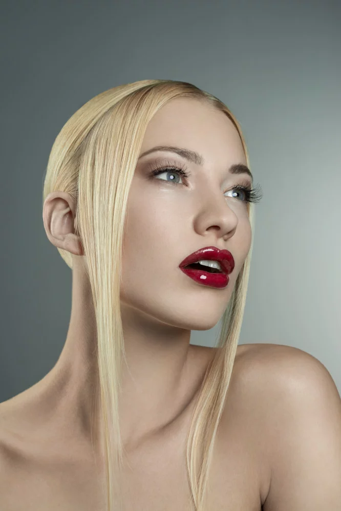
A Cover Star with the right pose

Modelling is an art form in its own right, and a model striking the right pose on the cover can emphasize the overall message of the magazine. Unlike the editorial within the magazine, where models and the feature star can experiment with different poses, the cover should normally show a simple pose that exudes confidence and a sense of openness which creates an impact and invites a reader to explore further.

Mainstream consumer magazines usually opt to use a single person for their cover, usually a portrait photo, with the subject looking straight forward into the camera. As an image, this technique is used to catch eyes on the newsstand, as if the cover star were making eye contact with the potential buyer. With this in mind, it’s important to enhance the model’s eyes. They don’t have to be the main focal point of the image but they do need to be striking enough to catch a reader’s attention.

Sticking to a formula that works for the long-term – and breaking away for a short-term impact

As stated above, many consumer publications stick to a tried and tested formula for their covers in order to solidify and reinforce their brand. Usually this refers to the layout and typography used on the cover. Sticking to a set layout and design can create a sense of familiarity and recognition for consumers looking to pick up copies of their favourite magazines.

On the other hand, creating a signature cover layout from time to time can also pique interest and coverage, especially when a publication decides to break its rules for a special edition issue. Changing a formula cover design can create a dramatic effect and can be especially useful if a magazine is looking to bring awareness to a particular cause or celebrate a historic cultural moment. Magazines regarded as ‘special editions’ are likely to sell well.

Without a doubt, magazine covers are the “shop window” to the issue. Covers are the gateway for consumers, and a great magazine cover will attract potential customers and entice them to partake in the magazine’s contents. When done right, a great magazine cover will not only help to boost sales, but may inspire readers to take a break from their phones and enjoy flipping through the glossy pages. 

Do you have any suggestions, additions, is this post out of date, or have you found any mistakes? Then we look forward to reading your comments. You are welcome to share this post. We are very grateful for every recommendation.

@radu_marcusu from Unsplash

Are you a Photographer or a Retoucher? Read these books.

Every retoucher’s first steps. 

When I was starting out, and I was retouching my own photographs, I remember I didn’t have a clue about what I should be doing. For several months, I tried to learn as much as possible from YouTube, paid tutorials, and “how-to” videos on the internet. As soon as I learned a new trick, I tried to apply it to one of my images. I felt I was getting more and more comfortable with the tools provided by Photoshop and Capture One, but I knew I was still missing the real point. 

Every time, regardless of the actual content of an image, I just went through my “trick list”:

  • Frequency Separation on skin ✅ 
  • Colorize the skin-tone to make it uniform ✅ 
  • Dodge and Burn contouring ✅ 
  • Heavily colorize shadows and highlights. ✅ 
  • Add Sharpening ✅ 
  • Add Vignette ✅ 

Yikes right?! 

I was working on autopilot, and there was absolutely no thought process behind it. After a while, I started to realize that my beloved “trick list” was just working against me. 

Where to find better sources of knowledge? 

Step by step tutorials and “how-to” videos can be great, but unless you have a solid understanding of what an image needs, they can be useless or even detrimental to your work.

Over the past couple of years, I started to do some research to improve my understanding of visual arts and increase my knowledge regarding colors and composition. 

These books that I’m about to recommend to you are not recreational reads. Most of the concepts are difficult to understand. They do not often offer a practical way to implement what you read. Nonetheless, they point you in the right direction. They force you to become more thoughtful and change your perspective. They will give you interesting insights that will inevitably question workflow, whether you are a photographer or a retoucher. It can sound daunting, but in reality, this is actually a good thing since experimenting and re-evaluating our own beliefs is the only way to improve. 

Aspects that you can improve

You will realize why a certain combination of colors works and why another does not. Also:

  • how composition rules affect the perception of your images,
  • the relativity of the human vision,
  • the importance of correct color reproduction workflows,
  • the complexity of printing processes, and much more. 

It won’t be easy, but it will be worth it! 

Here is the list of color theory books (if you are not a retoucher but a photographer or artist these will also help you a lot):

Theory of Colours. Goethe (1840) 

It talks about the nature, function, and psychology of colors. It is Goethe’s attempt to derive the laws of color harmony while he rejects Newton’s ideas about the color spectrum. His theories have been largely disproved over the years, so it cannot be considered a work of science; however, it is a fascinating read that illustrates the phenomena of colored shadows, after-images, and complementary colors that happen in our brain.


Point and Line to Plane. Vasilij Kandinskij (1926) 

In this book, Kandinskij analyzes the geometrical elements that form a painting and describes their characteristics. For instance, a line always indicates movement; it inevitably leads somewhere, forcing the eyes to move along its path. Depending on its correlation and position with other lines or points, the painter is able to evoke visual tension or comfort. Since we are still talking about bi-dimensional visuals, the same concepts can be used to improve your understanding of camera framing and composition.


Color Science and the Visual Arts. Roy S. Berns (2016) 

This is a highly technical book, and it covers topics like color measurement, color inconstancy, metamerism, physical characteristics of light, color management,  and color reproduction. Even though this read is mainly intended for curators, conservators or painters, the key points can be appreciated by photographers and retouchers as well.


Color Choices. Stephen Quiller (2002) 

This is both a theoretical and practical book, which shows how to use the color wheel to understand color relationships and mix colors more effectively. Then it explains how to develop five color schemes and use color in an impactful way. This book was intended to educate painters, but since it’s full of visual examples, it is highly recommended for retouchers and photographers as well to help them develop their color sensibility during their pre and post-production processes.


Interaction of Color. Joseph Albers (1963) 

This book allows us to understand the relativeness of colors thanks to its comprehensive visual examples. To the human eye, there are no “real” colors; in fact, Albers defines them as passive, unstable, but predictable. With the aid of practical exercises, he shows us how to change the perception of one color, make two colors look identical, make three colors look like two, etc. Albers does not dictate which colors you should use and how, but instead, he encourages exploration and experimentation, affirming that experience is always the best teacher.


The Art of Color. Johannes Itten (1961) 

Subjective feelings and objective color relations are the two main topics of this book. Itten defines the color’s role and function in a practical way while he analyzes the color wheel, the effects of color composition, and color expression.
In this book, he provides his famous list of seven color contrasts that can be used as inspiration to create striking effects and pleasing harmonies: the contrast of hue, of light and dark, of cold and warm, of complements, of saturation, of extension, and simultaneous contrast.

Want to read more about Johannes Itten? Check out this article: Type of artist & their behaviour with the color

Photo by ROMBO from Pexels

Sharpening & Contrast: The Ultimate Guide to Achieve Perfectly Sharp Photos

You keep seeing them again and again: images that are over-sharpened to the point of looking ridiculous. Halos around people’s heads make them look like funny versions of Jesus, hair appears super dry, and somehow everything just looks cheap.

So, what exactly is sharpness?

Sharpness refers to the contrast between different elements in an image. This can include differences in brightness at edges and details, as well as color contrast or saturation contrast. In fact, even the content of an image can affect its sharpness.

When sharpening images, Adobe Photoshop looks for edges and enhances them by making one side lighter and the other darker. However, Photoshop doesn’t take color contrast into account – it can only manipulate luminance contrasts:

Let’s take a closer look and do the same thing again:


Take a look at the eye – it looks really sharp in this image. Unfortunately, this comes at the cost of the skin texture, which looks a bit rough, and the hair, which appears dry and straw-like. The hands also seem to be overly bright and have an unnatural glow to them.

Fortunately, there is a great “manual tool” available for adjusting luminance in images: Dodge & Burn. With this tool, you can adjust the brightness of specific areas of the image to bring out more detail and make the image look more polished.

In this particular example, I used Dodge & Burn to manually sharpen the image. As you can see, the eye looks sharp without any negative side effects. Interestingly, this only took me about 2 minutes to do.

Sharpness through color contrasts

Let’s take a look at this image here:

These two colors are very similar – the red and the orange are almost identical, with only a small difference in their hues. The saturation and luminance of both colors are the same. However, if we change the hue of one of the color fields (while keeping the saturation and luminance the same), we get a completely different result:

The contrast between the two fields is so strong that even JPG compression struggles to accurately display the image. As a result, we can see visible artifacts in the middle. It’s amazing to see how much of a difference a simple change in color tone can make.

If you were to apply this concept to an image, you could do so in the following way:

By making only a minimal adjustment to the color tone, a sharper image was produced. It’s a very subtle effect, but it works wonders without any negative side effects.

Conclusion

In conclusion, if you want to achieve sharp images, it’s important to keep contrasts and contrast edges in mind when retouching your photos. This approach can often make subsequent sharpening unnecessary. When using Dodge & Burn, I always try to darken the edges a little more and lightly lighten the other side of the edge. With colors, it’s important to pay attention to color harmonies, so that you can achieve harmonious and sharp contrasts at the same time.

A little hint at the end

A final tip: if you try to sharpen your image while using the raw converter or increase the saturation, you may get a sharper image initially, but it will require twice the amount of work to eliminate any resulting problems. It’s better to use raw conversion to create a flatter, but balanced image and then deliberately increase the sharpness during retouching.

Stay tuned for our next blog article on sharpness, which will be published next week!

Do you have any suggestions, additions, is this post out of date, or have you found any mistakes? Then we look forward to your comment.
You are welcome to share this post. We are very grateful for every recommendation.