No right-click allowed. © Mareike Keicher

Tag : color

3 types of artists are represented by 3 different paintings

Type of artists and their color behavior


When we were young, people often judged us by our zodiac sign, ascendant, or first impression. We may have taken personality tests to discover our strengths and weaknesses for job interviews. However, as time went on, we thought we knew ourselves well or better than anyone else.

With that in mind, this article offers a new perspective that could be interesting for future creative careers. Specifically, we discuss the three different types of artists and their color behavior, as identified by Johannes Itten.

Types of artists and their color behavior

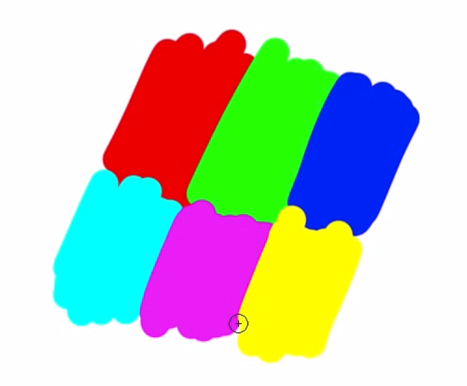
Itten identifies three types of attitudes towards color from various groups of painters. (cited by The Elements of Color – Johannes Itten (p.26f))


1. Epigoni

2. Originals

3. Universalists

The first type of artist is the epigones, who copy after the manner of their teachers or exemplars.


The term epigon preserves the meaning of “continuation” / “copycat” in Italian.

The second type is the originals, who paint as they themselves are and compose according to their inner personality. When the theme changes, the chromatic expression remains the same.

We can learn a lot about their thoughts, feelings, and actions by looking at the colors they use in their art.

Some artists used to use subjective proportions in their art, and this can also be applied to colors. This is called “subjective color”. Subjective color is shown in things like how colors are placed next to each other, their brightness, saturation, clarity, and texture, and how they flow together.

Third, the universalists, artists who compose from inclusive, objective considerations such as color harmony, psychology and/or color history.

Each of their compositions, according to the subject to be developed, has a different color treatment.

There are only a few artists who can create this kind of art. They need to understand the whole range of colors or color circle, and also possess a high level of intelligence and a big-picture philosophy.

Learnings & thoughts

Let’s explore this idea further. Depending on what type of artist you are, you will be booked for:

  • your specific style or
  • ability to imitate or
  • create different styles.

Both photographers and retouchers can be in different types of artist groups. It is advantageous to communicate which category you belong to and who is responsible for the color of the images within the creative process.

Therefore, examine your portfolio to identify which group you belong to and ask people around you if you have arranged yourself correctly. Self-perception may differ from external perception.

In conclusion, if you’re interested in creative careers, it’s worth considering Itten’s color behavior theory to understand your artistic style and potential.

Source:

If you found this article helpful, be sure to check out our other blog articles in the Photography & Society section of our blog.
Also, if you have any suggestions, additions, if this post is out of date, or if you find any mistakes, feel free to leave a comment. You are welcome to share this post, and we are very grateful for every recommendation.

@radu_marcusu from Unsplash

Are you a Photographer or a Retoucher? Read these books.

Every retoucher’s first steps. 

When I was starting out, and I was retouching my own photographs, I remember I didn’t have a clue about what I should be doing. For several months, I tried to learn as much as possible from YouTube, paid tutorials, and “how-to” videos on the internet. As soon as I learned a new trick, I tried to apply it to one of my images. I felt I was getting more and more comfortable with the tools provided by Photoshop and Capture One, but I knew I was still missing the real point. 

Every time, regardless of the actual content of an image, I just went through my “trick list”:

  • Frequency Separation on skin ✅ 
  • Colorize the skin-tone to make it uniform ✅ 
  • Dodge and Burn contouring ✅ 
  • Heavily colorize shadows and highlights. ✅ 
  • Add Sharpening ✅ 
  • Add Vignette ✅ 

Yikes right?! 

I was working on autopilot, and there was absolutely no thought process behind it. After a while, I started to realize that my beloved “trick list” was just working against me. 

Where to find better sources of knowledge? 

Step by step tutorials and “how-to” videos can be great, but unless you have a solid understanding of what an image needs, they can be useless or even detrimental to your work.

Over the past couple of years, I started to do some research to improve my understanding of visual arts and increase my knowledge regarding colors and composition. 

These books that I’m about to recommend to you are not recreational reads. Most of the concepts are difficult to understand. They do not often offer a practical way to implement what you read. Nonetheless, they point you in the right direction. They force you to become more thoughtful and change your perspective. They will give you interesting insights that will inevitably question workflow, whether you are a photographer or a retoucher. It can sound daunting, but in reality, this is actually a good thing since experimenting and re-evaluating our own beliefs is the only way to improve. 

Aspects that you can improve

You will realize why a certain combination of colors works and why another does not. Also:

  • how composition rules affect the perception of your images,
  • the relativity of the human vision,
  • the importance of correct color reproduction workflows,
  • the complexity of printing processes, and much more. 

It won’t be easy, but it will be worth it! 

Here is the list of color theory books (if you are not a retoucher but a photographer or artist these will also help you a lot):

Theory of Colours. Goethe (1840) 

It talks about the nature, function, and psychology of colors. It is Goethe’s attempt to derive the laws of color harmony while he rejects Newton’s ideas about the color spectrum. His theories have been largely disproved over the years, so it cannot be considered a work of science; however, it is a fascinating read that illustrates the phenomena of colored shadows, after-images, and complementary colors that happen in our brain.


Point and Line to Plane. Vasilij Kandinskij (1926) 

In this book, Kandinskij analyzes the geometrical elements that form a painting and describes their characteristics. For instance, a line always indicates movement; it inevitably leads somewhere, forcing the eyes to move along its path. Depending on its correlation and position with other lines or points, the painter is able to evoke visual tension or comfort. Since we are still talking about bi-dimensional visuals, the same concepts can be used to improve your understanding of camera framing and composition.


Color Science and the Visual Arts. Roy S. Berns (2016) 

This is a highly technical book, and it covers topics like color measurement, color inconstancy, metamerism, physical characteristics of light, color management,  and color reproduction. Even though this read is mainly intended for curators, conservators or painters, the key points can be appreciated by photographers and retouchers as well.


Color Choices. Stephen Quiller (2002) 

This is both a theoretical and practical book, which shows how to use the color wheel to understand color relationships and mix colors more effectively. Then it explains how to develop five color schemes and use color in an impactful way. This book was intended to educate painters, but since it’s full of visual examples, it is highly recommended for retouchers and photographers as well to help them develop their color sensibility during their pre and post-production processes.


Interaction of Color. Joseph Albers (1963) 

This book allows us to understand the relativeness of colors thanks to its comprehensive visual examples. To the human eye, there are no “real” colors; in fact, Albers defines them as passive, unstable, but predictable. With the aid of practical exercises, he shows us how to change the perception of one color, make two colors look identical, make three colors look like two, etc. Albers does not dictate which colors you should use and how, but instead, he encourages exploration and experimentation, affirming that experience is always the best teacher.


The Art of Color. Johannes Itten (1961) 

Subjective feelings and objective color relations are the two main topics of this book. Itten defines the color’s role and function in a practical way while he analyzes the color wheel, the effects of color composition, and color expression.
In this book, he provides his famous list of seven color contrasts that can be used as inspiration to create striking effects and pleasing harmonies: the contrast of hue, of light and dark, of cold and warm, of complements, of saturation, of extension, and simultaneous contrast.

Want to read more about Johannes Itten? Check out this article: Type of artist & their behaviour with the color

File structure to display the right black and white version for D&B

Why Luminosity and Brightness Matter in Photoshop: A Comprehensive Guide

Conny Wallström recently posted a video on YouTube titled “Brightness vs. Luminosity Inside of Photoshop.” Although the topic is somewhat technical, it is fascinating. The video discusses the various ways to transform an image into its black-and-white representation, primarily for use as a help layer during retouching. However, it’s crucial to be careful while doing so, or else color problems may occur.

In the video, Conny shows the different interpretation possibilities within Photoshop using an example image with six color areas of different colors:


The initial image:

Red, green, blue, cyan, magenta and yellow

Here we have six color areas of different colors. If we look at red and green in Photoshop, we have the following values:

In the RGB color model:

RED: R=255, G=0, B=0
GREEN: R=0, G=0, B=0

RGB = Red, Green, Blue.

In the HSB model, this is what it looks like

RED: H=0°, S=100%, B=100%
GREEN: H=120°, S=100%, B=100%

HSB = Hue, Saturation, Brightness.

If the saturation is set to 0% in HSB mode, pure white is the result.

Reduced Saturation

If you make the example shown above black and white via Photoshop’s “Reduce Saturation”, this image results:

This indicates that this function is based on the HSL (Hue, Saturation, Lightness) color model. In the HSB model, all surfaces would be white; here they are neutral grey.
The “hue/saturation” adjustment layer also uses the HSB model.

Image Mode “Grayscale”

When an image is desaturated via the menu item “Image -> Mode -> Grayscale,” a different image is created. It is not based on the HSL or the HSB model, but rather on perceived or subjective brightness (luminosity).

Blending Mode “Color”

One way to look at an image in the luminosity equivalent of the colors is to have a black or white color layer above the image in the “color” blending mode.

Luminosity and Brightness: In practice

Why should the difference between luminosity and brightness matter?

Especially in Dodge&Burn work, it is helpful to hide the colors via a help layer temporarily. However, it is important to choose a help layer that interprets the subjective brightness. This is not the case in HSB mode.
If you work on an image in HSB grayscales, you can change hue (doesn’t matter how much), you won’t see any difference in the image — at least not as long as you have the help layer active. This can destroy a few hours of work.

Conny has provided a lovely example:

Yellow is always perceived brighter than blue.

The same image desaturated in the HSB model, both colors appear equally bright.

In the HSL model desaturated, the subjective brightness is correct again.


Another example of his own:

A gradient across the color gamut.

This image is also only neutral grey in the HSB model.

With the black layer in blending mode “color”, the perceived brightness is maintained.


Here the HUE value was increased by 180° with the hue slider.

HSB conversion: everything turns grey again.

Here again with the layer in “color” blending mode.

Especially in portraits, where we are careful not to get color shifts and/or use a lot of time to correct them, the knowledge of these help layers is very important. Photoshop works in different places with these three modes – you should always be aware of which one is used where.

In conclusion, it’s essential to be aware of which color model is being used in Photoshop and how it affects the image. This article is a partial translation from Conny Wallström’s video and serves as an introduction to the topic. Watch the video to learn more and leave a comment if you have any suggestions or corrections.

Don’t have enough expertise yet? Check out our blog’s Retouching Techniques section for more content.
We look forward to your comment.
You are welcome to share this post. We are very grateful for every recommendation.