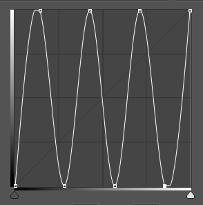
What is the “Solar Curve”?
The “Solar Curve” looks like a wave created from the normal linear curve inside of Photoshop. Normally 4 or 6 points make sense in this context. Mathematically one divides the entire range (0-255) into 5 or 7 parts and sets accordingly the points:
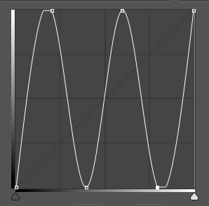
4-point Curve
If you want to set 4 new points, simply divide the 255 (maximum) by five and get 51. These points result accordingly:
Input / Output
0/0
51/255
101/0
152/255
203/0
255/255
It will look like that:
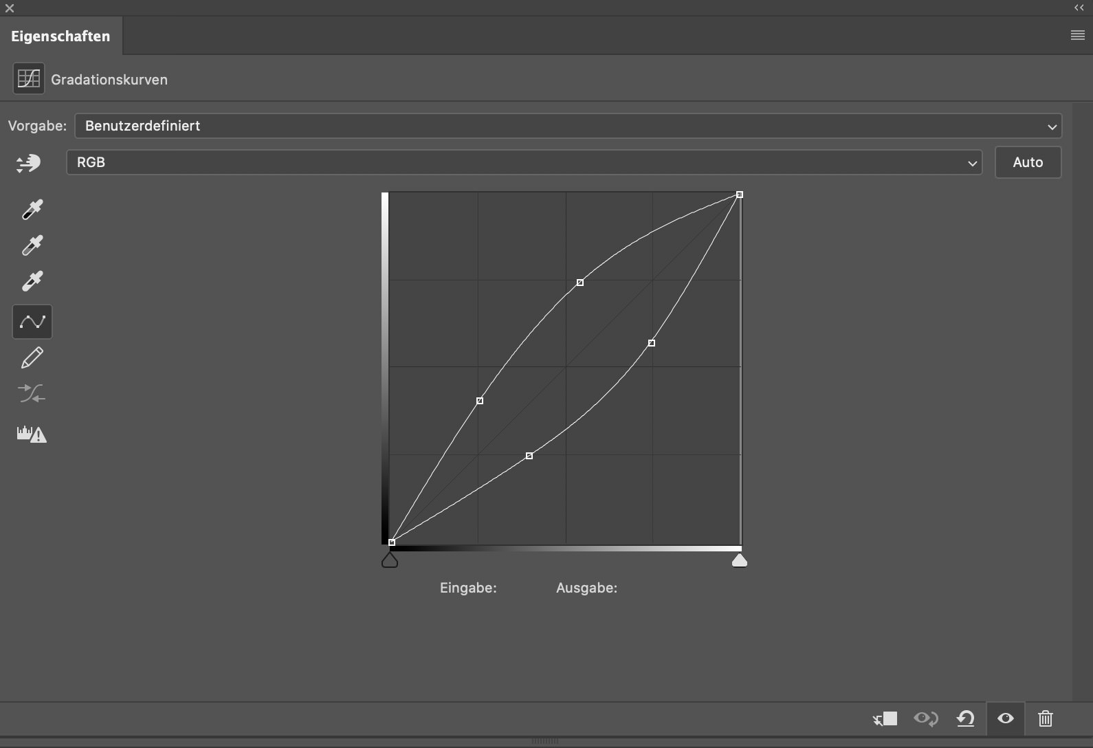
6-point Curve
If you want to set 6 new points, you simply divide the 255 (maximum) by seven and get 36. Accordingly, these points result in:
Input / Output
0/0
36/255
72/0
109/255 * actually 108, has been rounded up
145/0
181/255
218/0 * actually 217, has been rounded up
255/255
It will look like that:
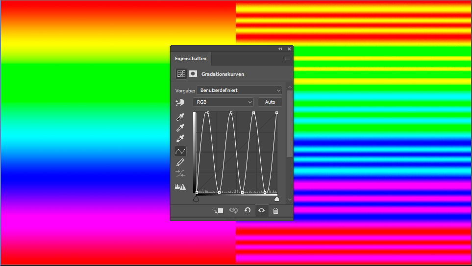
What does the Solar Curve do with the image?
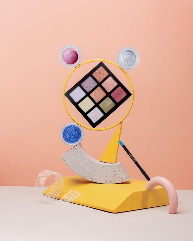
Example:

As you can see in the image, the Solar Curve converts small contrasts to extreme changes. This creates a very alienated but also enlightening view. This view is ideal for revealing sensor spots/freckles or a single hair, but also for better judging the subtle transitions between light and shadow.
Here it reveals everything that could be somewhat “dirty.” So here’s a round of critique of my own work (from a time when the solar curve was not yet part of my standard workflow):
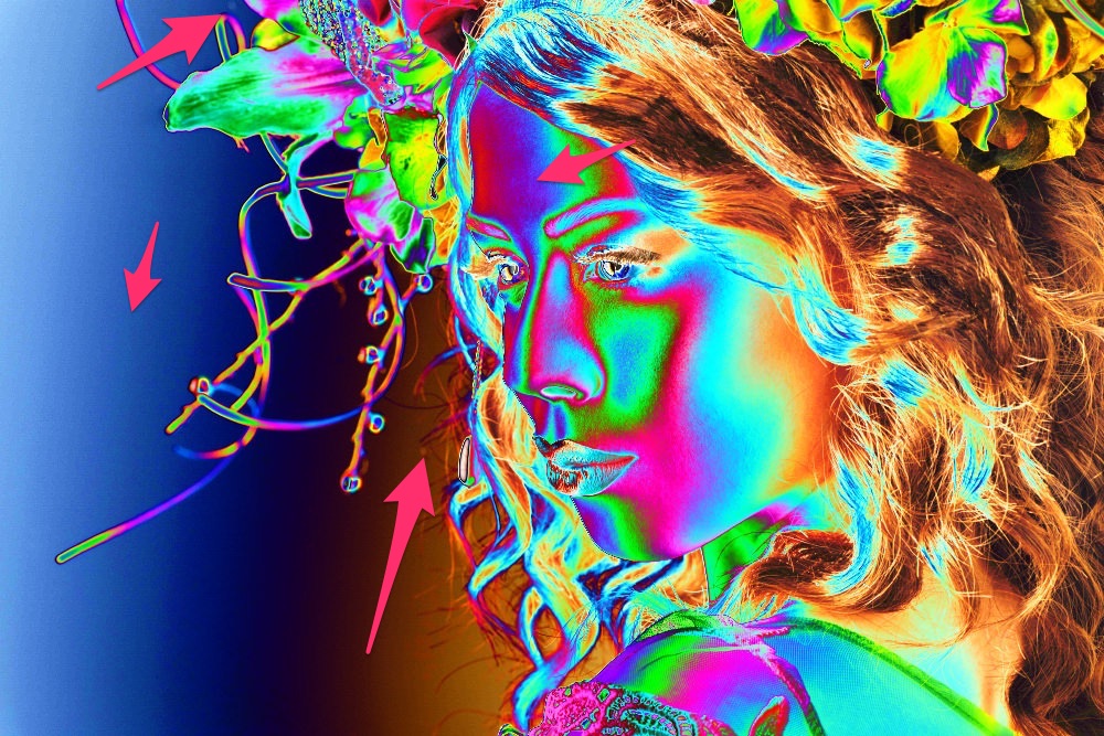
On the left, you can see a bit of banding; at the top, a sensor spot, and there are still a lot of spots on the forehead. Did you notice that in the image above?
Why do you need such precise editing?
Why do you need such precise editing? This question often comes up (“No one sees that anyway”), and usually, that’s true. One thing you must not forget: not every screen is the same. Those aspects that your screen may not display could be displayed on another screen (possibly a low-budget discount screen that has been in the public office of a pro-chain smoker association for years and has seen better days – if you can call it that) can look completely different – and indeed by unnatural extreme shifts. Such editing errors are no longer almost invisible.
Another example is backlit displays – everything that is printed and then backlit should be very smooth and clean. Mirror foil is also really mean and does not always reveal the best in retouching.
When working for a client, you never know what they will do with the files – maybe just a brochure is planned, but later on, an exhibition or fair might ask for a large format display. You never know.
Working with a visible Solar Curve?
Doesn’t that sound tempting? Immediately seeing where these minimal changes still need to be made, that sounds great, doesn’t it? I use the Solar Curve for sensor spots, clone stamp, double-check, and hair. To sum up, everything you want to remove 100% clean and has very low contrasts. Miraculously, you can use this view as a negative or with additional contrast enhancement to uncover even more problem areas.
For everything else: Leave it. You run the risk of retouching away any naturalness.
You can find more expert knowledge on Retouching Techniques in our blog section.
Have you found any mistakes, or do you have any suggestions, additions, or thoughts on whether this post is outdated? Then we look forward to your comment. You are welcome to share this post. We are very grateful for every recommendation.