No right-click allowed. © Mareike Keicher

Tag : photoshop

MK Retouching joins Domestika

Join Our New Retouching Course on Domestika!

What is Domestika?

We are thrilled to announce that we’ve joined Domestika, a leading provider of online courses and training programs in the creative field. 

At Domestika, you can choose from a vast range of courses, from illustration, craft, marketing & business, photography & video, design, 3D & animation, architecture & spaces, writing, web & app design, fashion, calligraphy & typography, music, and audio. ​By joining Domestika, you will have access to a wide range of courses and resources to stay ahead of the curve.

Whether you’re seeking to enhance your skills or learn something new, Domestika has the right course for you. At Domestika, they care about continuous learning and developing your creative side.

This corresponds to our principles of constant further training to continue to grow and master new challenges. 

We were very proud when they approached us with a request for cooperation. At Domestika, they work with top experts who share their knowledge in professionally produced online coursed. We believe our retouching expertise will be a valuable asset to their pool of content.

Why you should consider a/our Domestika course.

We give you five powerful reasons why you should consider a Domestika course:

  1. Domestika offers Ai-based translations throughout the whole platform. This means the translations will be accurate and error-free, making them perfect for learning in any of their eight languages (English, French, Spanish, Italian, Portuguese, German, Polish, & Dutch). Not only the platform itself, but the subtitles are also available in these eight languages. This makes it easy for you to learn and understand the material, no matter what language you speak.
  2. Lifelong access to your purchased courses, enabling you to learn at your pace and refresh your knowledge when needed.

  3. A global creative community to connect with, including the opportunity to share knowledge and ideas with other students and the teacher. You will also receive feedback on your final project.

  4. Additional resources to support your learning process including additional presentations, articles, videos, discount codes, plugins, actions and more!
  5. The rare opportunity to find mentorship and guidance in the creative industry, which can be incredibly helpful when starting in the creative industry (which we experienced on our own). Having a mentor who can guide you through the process can be incredibly helpful and save you a lot of time and trouble.

Why we joined Domestika!

We hope our new partnership will help us provide even more valuable content for our community. We truly believe that giving insights into our ways of working will build trust, and new possibilities for cooperations will grow from it. 

The course content – What is included in our course?
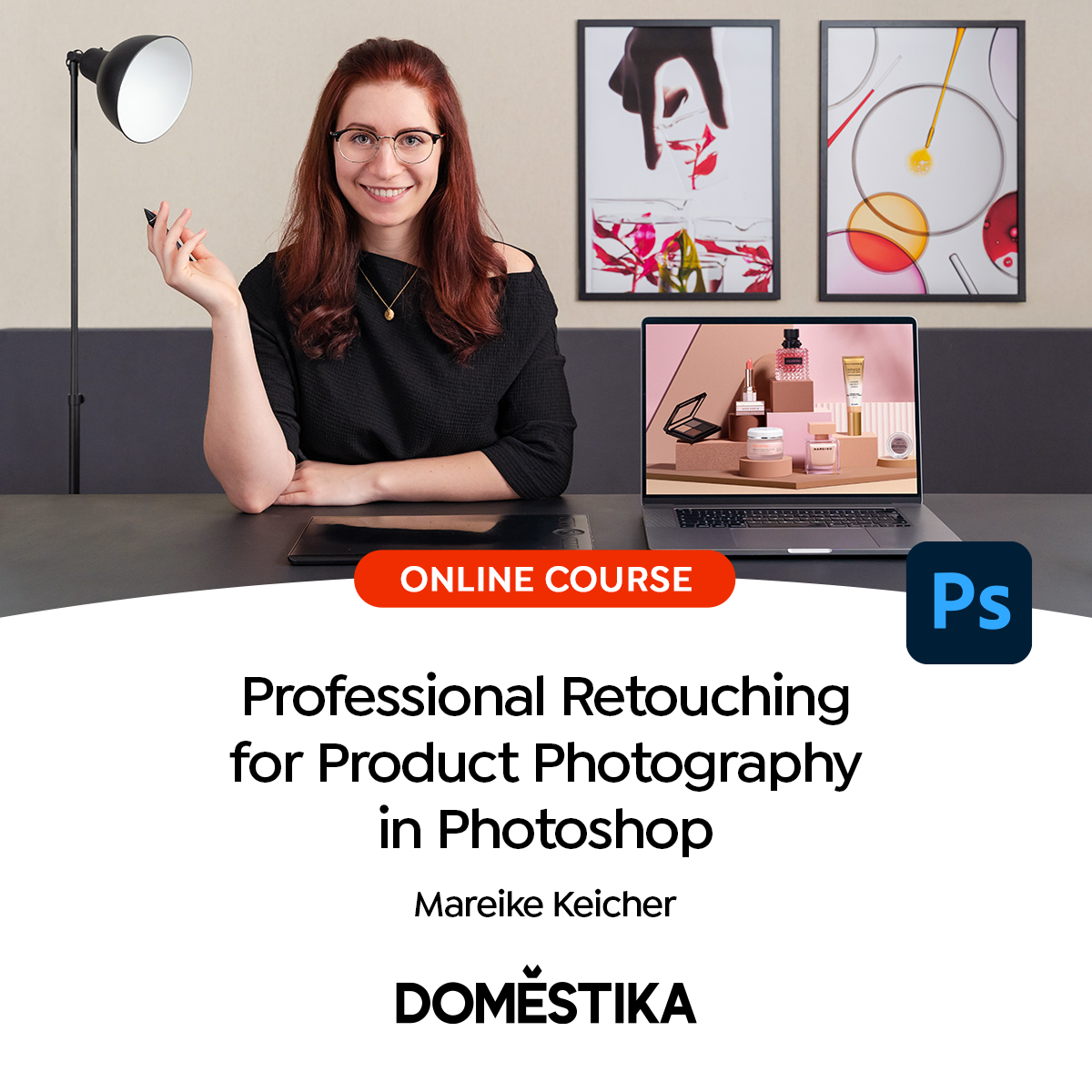
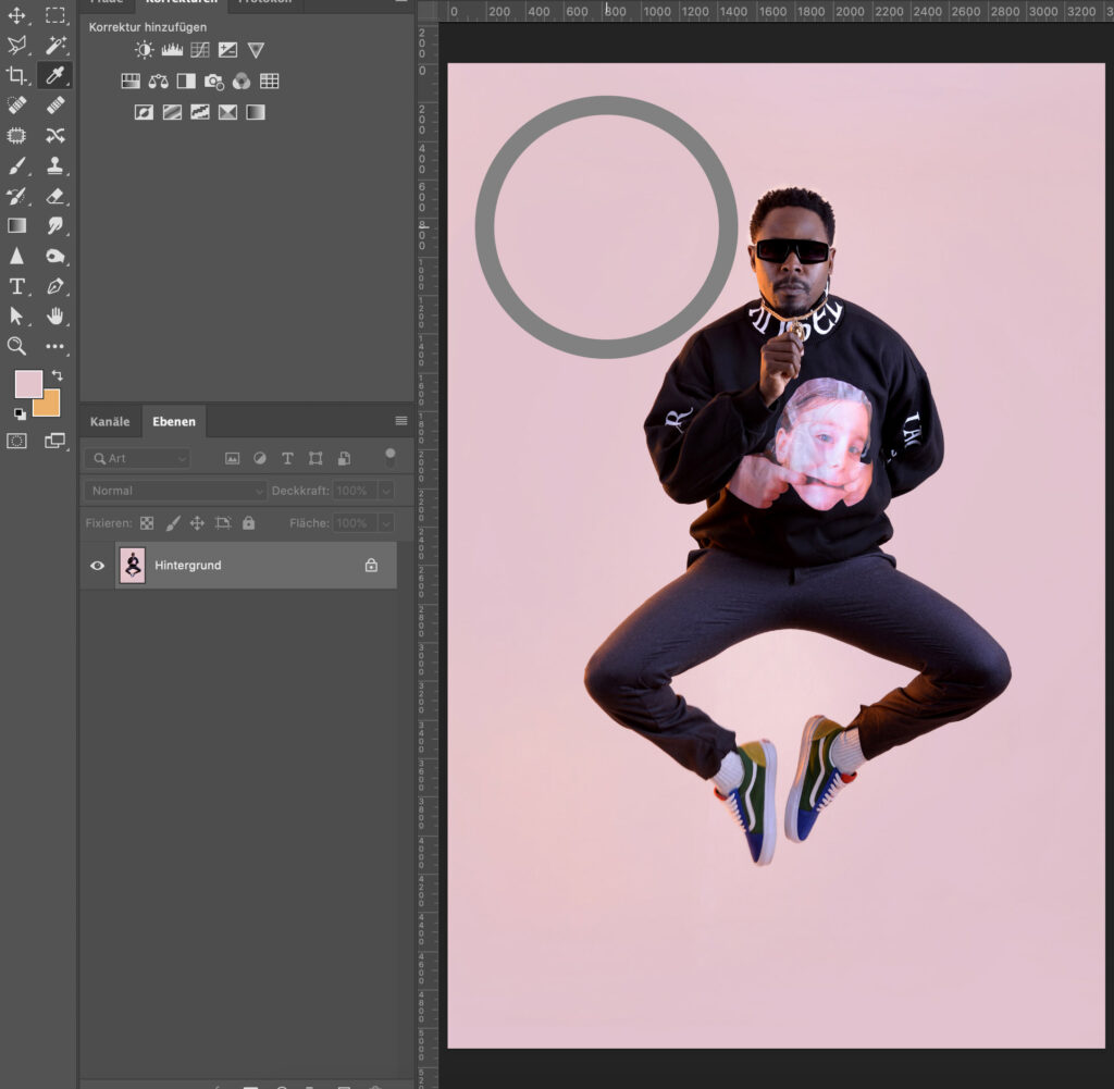
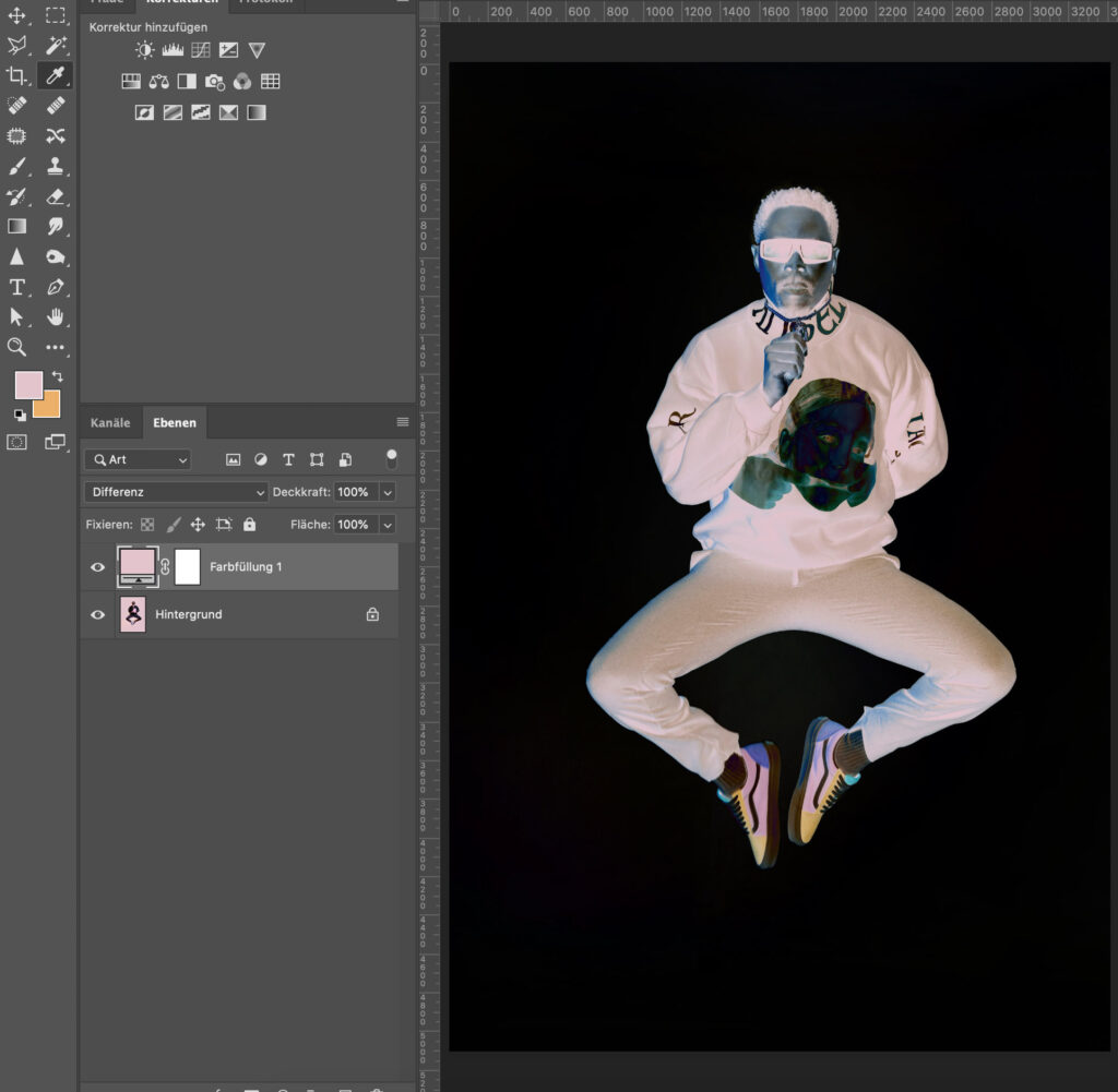
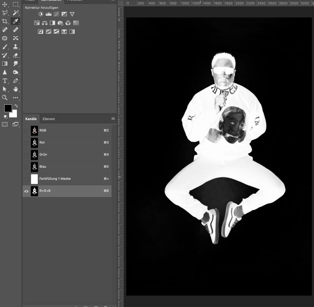
The course is called Professional Retouching for Product Photography in Photoshop” (GER: “Professionelle Produktfoto-Retusche in Photoshop“). It’s about creating a structured Photoshop file while digitally optimizing each element of a commercial product composition. It was produced in the German language, and Subtitles are available in eight additional languages.

The different lessons include topics like:

  • Positioning
  • Brand and image used as a guide for retouching
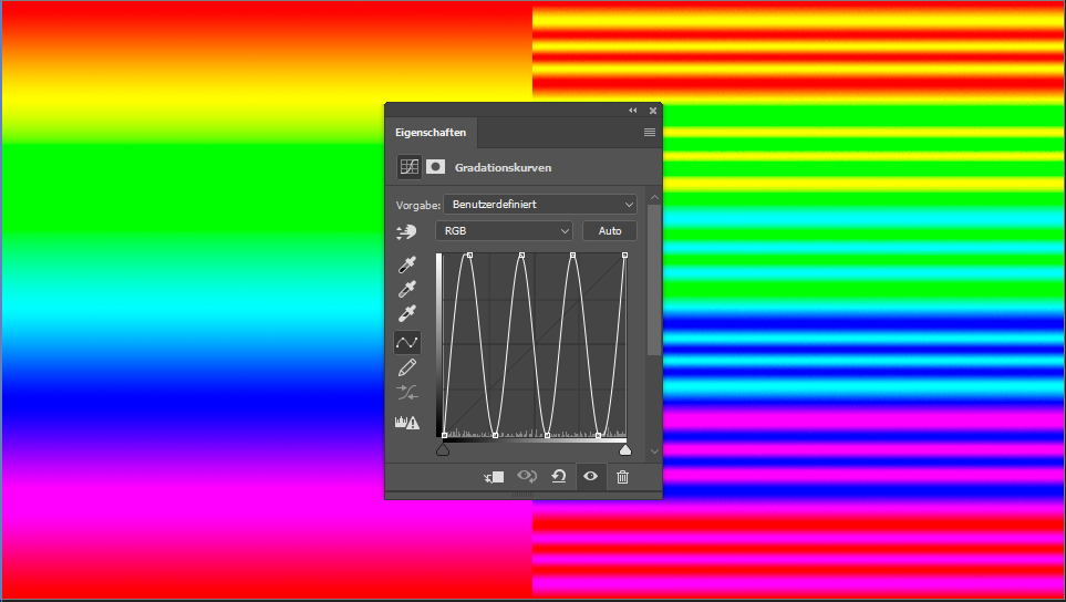
  • The choice of color profiles
  • Image preparation
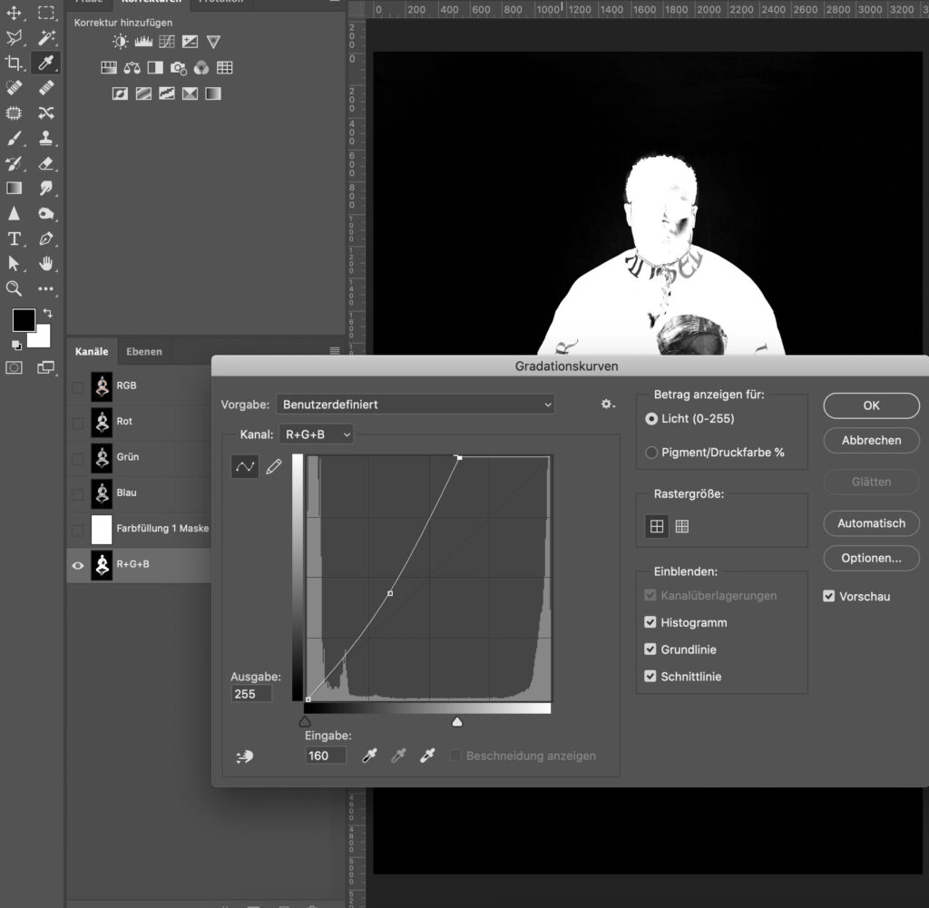
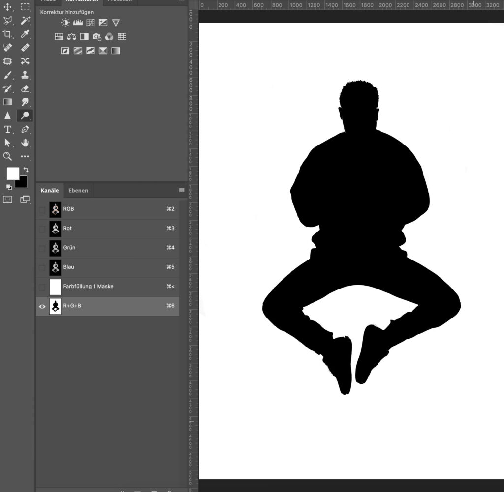
  • A non-destructive workflow
  • Background and shadow creation
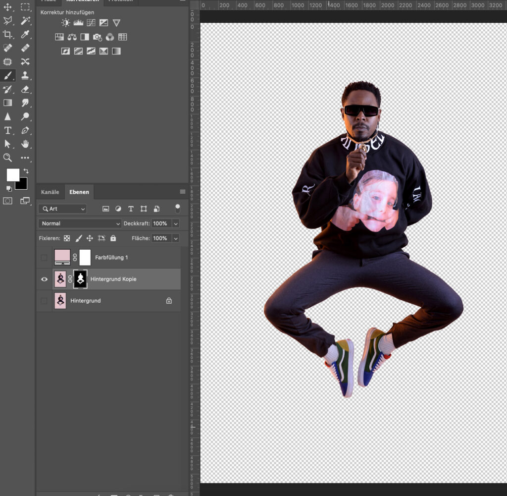
  • Optimizing set items
  • Optimizing products
  • Help layers
  • Preparing client data in an intelligent way
  • Smart export for web

The additional resources include:

  • Source of lighting effects
  • A special Retouching Toolkit discount
  • Practicing files and many more

This course content is unique! It’s not similar to anything else on the market at the moment—most of the workflow and strategies are developed by experience and experiments. 

What are the benefits of taking the course?

Besides enriching your skill set with new hidden gems, tricks, and industry standards, you can also showcase what you’ve learned. 

Exceptionally talented students have the chance to work together with MK Retouching. 

Who is this course for?

The course is perfect for product photography professionals, design professionals, and anyone curious about professional retouching for product photography.

What level of knowledge is required for taking the course?

Previous photo-editing experience is recommended, and you need to be familiar with the Photoshop interface, terms, and workspaces, as well as have a working knowledge of layers, paths, channels, and basic shortcuts.

The only materials needed are a computer with Adobe Photoshop installed. If you have a Creative Cloud subscription, it would be helpful, but by no means essential, to install Adobe Bridge. The same applies to a graphics tablet (using a mouse is fine, but might take you a little longer). Before starting, ensure your computer or laptop has enough RAM, disk space, and a good graphics card.

Where can I find the course?

To access our course, click here, or you can find the link on Mareike’s Instagram profile in her Domestika Course highlight. Here you can find the teacher’s profile. We can’t wait to see you there!

How long do the sessions last?

It very much depends on the depth of learning. You can either rush through it, pausing when the most exciting parts for you happen (~2.5hrs), or trying to understand every single step, being active in the forum, practicing, and thinking about how to implement it in your workflow (~12hrs+).

How much does the retouching course cost?

The price of the course depends on the time when you buy it. Take advantage of the important periods of the year with special discounts for specific courses, for example, during Summer Sale or on Black Friday. This way, you can get the most out of your learning experience!

If you’re interested in taking a new course but don’t want to pay the full price, Domestika has a special pre-sale offer and an early-bird discount. This means you can get discounts on courses before they are released to the public or very early on.

You can also profit from being a Domestika Plus member based on a subscription. You will receive one Token per month to choose a course based on your interests. Furthermore, you have access to 100+ open courses every year, 20% extra savings on courses and bundles, exclusive content and resources, and a certificate when you complete a course.

You can see the current price for our course at any time on the course page

Can I get a refund?

You can request a refund for your order as long as it is done within 14 days of the time of purchase or the course’s release. This period also applies to purchasing Domestika subscriptions and memberships from the date of their commencement. For their current conditions, please recheck their website here.

Should you have issues entering the course, with payment for the course, or any other technical problems with the Domestika platform, please review this page or contact Domestika directly at hola@domestika.org.

All in all, I had a great experience working with Domestika. Their support was quick and helpful, and I never had to wait too long for someone to respond to my questions.

Additional Insights: What was the experience like on set?

We were guided in a very structured manner from start to finish.

Of course, the success of each course is highly dependent on the teacher’s motivation and way of working. The majority must be implemented on one’s own responsibility when it comes to pre-production. We received a lot of creative freedom to create the course we wanted to create.

The course production itself was split into two parts. One was based on the screencast content. We had very professional equipment in hardware to guarantee clear audio results. A dedicated team regularly checked these video results to avoid audio and visual errors.

The other part was based on actual experience on set: recording the course trailer and intro, as well as being part of a photoshoot. It was very exciting to work with the Domestika team. They are very interested in feedback, optimizing processes, and producing good results. They are always on hand with problems and uncertainties and provide support wherever possible.

Do you have any suggestions or additions, is this post out of date, or have you found any mistakes? Then we look forward to your comment.
You are welcome to share this post. We are very grateful for every recommendation.

@radu_marcusu from Unsplash

Are you a Photographer or a Retoucher? Read these books.

Every retoucher’s first steps. 

When I was starting out, and I was retouching my own photographs, I remember I didn’t have a clue about what I should be doing. For several months, I tried to learn as much as possible from YouTube, paid tutorials, and “how-to” videos on the internet. As soon as I learned a new trick, I tried to apply it to one of my images. I felt I was getting more and more comfortable with the tools provided by Photoshop and Capture One, but I knew I was still missing the real point. 

Every time, regardless of the actual content of an image, I just went through my “trick list”:

  • Frequency Separation on skin ✅ 
  • Colorize the skin-tone to make it uniform ✅ 
  • Dodge and Burn contouring ✅ 
  • Heavily colorize shadows and highlights. ✅ 
  • Add Sharpening ✅ 
  • Add Vignette ✅ 

Yikes right?! 

I was working on autopilot, and there was absolutely no thought process behind it. After a while, I started to realize that my beloved “trick list” was just working against me. 

Where to find better sources of knowledge? 

Step by step tutorials and “how-to” videos can be great, but unless you have a solid understanding of what an image needs, they can be useless or even detrimental to your work.

Over the past couple of years, I started to do some research to improve my understanding of visual arts and increase my knowledge regarding colors and composition. 

These books that I’m about to recommend to you are not recreational reads. Most of the concepts are difficult to understand. They do not often offer a practical way to implement what you read. Nonetheless, they point you in the right direction. They force you to become more thoughtful and change your perspective. They will give you interesting insights that will inevitably question workflow, whether you are a photographer or a retoucher. It can sound daunting, but in reality, this is actually a good thing since experimenting and re-evaluating our own beliefs is the only way to improve. 

Aspects that you can improve

You will realize why a certain combination of colors works and why another does not. Also:

  • how composition rules affect the perception of your images,
  • the relativity of the human vision,
  • the importance of correct color reproduction workflows,
  • the complexity of printing processes, and much more. 

It won’t be easy, but it will be worth it! 

Here is the list of color theory books (if you are not a retoucher but a photographer or artist these will also help you a lot):

Theory of Colours. Goethe (1840) 

It talks about the nature, function, and psychology of colors. It is Goethe’s attempt to derive the laws of color harmony while he rejects Newton’s ideas about the color spectrum. His theories have been largely disproved over the years, so it cannot be considered a work of science; however, it is a fascinating read that illustrates the phenomena of colored shadows, after-images, and complementary colors that happen in our brain.


Point and Line to Plane. Vasilij Kandinskij (1926) 

In this book, Kandinskij analyzes the geometrical elements that form a painting and describes their characteristics. For instance, a line always indicates movement; it inevitably leads somewhere, forcing the eyes to move along its path. Depending on its correlation and position with other lines or points, the painter is able to evoke visual tension or comfort. Since we are still talking about bi-dimensional visuals, the same concepts can be used to improve your understanding of camera framing and composition.


Color Science and the Visual Arts. Roy S. Berns (2016) 

This is a highly technical book, and it covers topics like color measurement, color inconstancy, metamerism, physical characteristics of light, color management,  and color reproduction. Even though this read is mainly intended for curators, conservators or painters, the key points can be appreciated by photographers and retouchers as well.


Color Choices. Stephen Quiller (2002) 

This is both a theoretical and practical book, which shows how to use the color wheel to understand color relationships and mix colors more effectively. Then it explains how to develop five color schemes and use color in an impactful way. This book was intended to educate painters, but since it’s full of visual examples, it is highly recommended for retouchers and photographers as well to help them develop their color sensibility during their pre and post-production processes.


Interaction of Color. Joseph Albers (1963) 

This book allows us to understand the relativeness of colors thanks to its comprehensive visual examples. To the human eye, there are no “real” colors; in fact, Albers defines them as passive, unstable, but predictable. With the aid of practical exercises, he shows us how to change the perception of one color, make two colors look identical, make three colors look like two, etc. Albers does not dictate which colors you should use and how, but instead, he encourages exploration and experimentation, affirming that experience is always the best teacher.


The Art of Color. Johannes Itten (1961) 

Subjective feelings and objective color relations are the two main topics of this book. Itten defines the color’s role and function in a practical way while he analyzes the color wheel, the effects of color composition, and color expression.
In this book, he provides his famous list of seven color contrasts that can be used as inspiration to create striking effects and pleasing harmonies: the contrast of hue, of light and dark, of cold and warm, of complements, of saturation, of extension, and simultaneous contrast.

Want to read more about Johannes Itten? Check out this article: Type of artist & their behaviour with the color

Photo by ROMBO from Pexels

Sharpening & Contrast: The Ultimate Guide to Achieve Perfectly Sharp Photos

You keep seeing them again and again: images that are over-sharpened to the point of looking ridiculous. Halos around people’s heads make them look like funny versions of Jesus, hair appears super dry, and somehow everything just looks cheap.

So, what exactly is sharpness?

Sharpness refers to the contrast between different elements in an image. This can include differences in brightness at edges and details, as well as color contrast or saturation contrast. In fact, even the content of an image can affect its sharpness.

When sharpening images, Adobe Photoshop looks for edges and enhances them by making one side lighter and the other darker. However, Photoshop doesn’t take color contrast into account – it can only manipulate luminance contrasts:

Let’s take a closer look and do the same thing again:


Take a look at the eye – it looks really sharp in this image. Unfortunately, this comes at the cost of the skin texture, which looks a bit rough, and the hair, which appears dry and straw-like. The hands also seem to be overly bright and have an unnatural glow to them.

Fortunately, there is a great “manual tool” available for adjusting luminance in images: Dodge & Burn. With this tool, you can adjust the brightness of specific areas of the image to bring out more detail and make the image look more polished.

In this particular example, I used Dodge & Burn to manually sharpen the image. As you can see, the eye looks sharp without any negative side effects. Interestingly, this only took me about 2 minutes to do.

Sharpness through color contrasts

Let’s take a look at this image here:

These two colors are very similar – the red and the orange are almost identical, with only a small difference in their hues. The saturation and luminance of both colors are the same. However, if we change the hue of one of the color fields (while keeping the saturation and luminance the same), we get a completely different result:

The contrast between the two fields is so strong that even JPG compression struggles to accurately display the image. As a result, we can see visible artifacts in the middle. It’s amazing to see how much of a difference a simple change in color tone can make.

If you were to apply this concept to an image, you could do so in the following way:

By making only a minimal adjustment to the color tone, a sharper image was produced. It’s a very subtle effect, but it works wonders without any negative side effects.

Conclusion

In conclusion, if you want to achieve sharp images, it’s important to keep contrasts and contrast edges in mind when retouching your photos. This approach can often make subsequent sharpening unnecessary. When using Dodge & Burn, I always try to darken the edges a little more and lightly lighten the other side of the edge. With colors, it’s important to pay attention to color harmonies, so that you can achieve harmonious and sharp contrasts at the same time.

A little hint at the end

A final tip: if you try to sharpen your image while using the raw converter or increase the saturation, you may get a sharper image initially, but it will require twice the amount of work to eliminate any resulting problems. It’s better to use raw conversion to create a flatter, but balanced image and then deliberately increase the sharpness during retouching.

Stay tuned for our next blog article on sharpness, which will be published next week!

Do you have any suggestions, additions, is this post out of date, or have you found any mistakes? Then we look forward to your comment.
You are welcome to share this post. We are very grateful for every recommendation.

Foto von Dazzle Jam von Pexels

Masking with Difference masking: Easy!

When to use this masking method

There are many options for masking objects and models in Adobe Photoshop. If the current methods fail, you have to resort to unknown and creative ways to help yourself.

This method is also suitable for more complex objects and hair. The background should be as solid as possible (not white, grey, or black).

Method – Step by Step Guide

  1. Use the Eyedropper (I) tool to sample a larger area of the background (minimum of 5×5 px average).
  2. Create a solid color fill layer with the sampled color OR choose Edit>Fill…>Contents Use: Foreground Color with an empty layer (both options will work)
  3. Use blending mode Difference: Looks at the color information in each channel and subtracts either the blend color from the base color or the base color from the blend color, depending on which has the greater brightness value.
  4. The sampled color area should be now almost or entirely black. You can also add another help layer to enhance the results.
  5. Now go to the channels and check whether the red, green, or blue channel is suitable for a selection (or all together; use the same method as with paths).
  6. Either you can already use the selection and apply it to your image, OR you can duplicate the channel of your choice and edit it with the Dodge or Burn Tools, with the Brush or other tools of your choice (e.g. cmd + M (gradation curve) & cmd + L (tonal correction) until it is suitable for your selection mask.
  7. Final checks, delete the Difference layer & the new channel.
  8. Done!

Do you have any suggestions, additions, is this post out of date, or have you found any mistakes? Then we look forward to your comment.
You are welcome to share this post. We are very grateful for every recommendation.

Maximizing Efficiency: The Benefits of Using Capture One 20 for Dust Spot Removal

Up until now, removing dust spots has been one of the first steps in retouching. Previously, there were two ways to do this: While the limited number of 100 points within the Remove Spot option in Capture One 12 was quite inflexible and, of course, limited; Photoshop was more time-consuming but more accurate and flexible in the shape of the correction area. There we used a combination of our Solar Curve (= Dust Spot Finder) and Healing Brush/Spot Healing Brush.

With the past upgrade to Capture One 20, our workflow has undergone a significant change. Not only has the software eliminated the lack of flexibility and limitation of the previous version, but it also allows for the automatic recalculating of dust spots in all successive images of one photoshoot – even at the early stage of tethering.

The new workflow

Here’s our new workflow for Capture One cleanup:

  • +1 New Filled Adjustment Layer (Dust Spot Finder/help layer -> save as preset, delete later)
  • +1 New Heal Layer (Dust Removal)

Of course, you can use different options as help layers. You can manually set our previous Solar Curve (use the input and output numbers) in Capture One (Window: Curve), or you could also use these great settings from Paul Reiffer. Maybe a mixture of both help layers works great for you (+2 New Filled Adjustment Layers with adjusted opacity). Just play around, and don’t forget to save your personal one (right-click on the layer, save as style).

Here are the adjustments from Paul Reiffer as an overview:

  • (Exposure)
    Contrast: +50
    Brightness: -10 to -20
    Saturation: -50 to -60
  • (High Dynamic Range)
    Highlight: -100
    Shadow: +100
  • (Clarity)
    Clarity: +50 to +70
    Structure: +50 to +70

If you have time, have a look at the full video of Paul Reiffer below.

In summary, Capture One 20’s new dust spot removal tools revolutionize the retouching workflow by allowing for automatic recalculation and increased flexibility. By taking advantage of the new tools and utilizing customizable help layers, you can prepare the images perfectly for later retouching or speed up your editing process.

If you have any suggestions, additions, if this post is out of date, or if you have found any mistakes, we look forward to your comment. You are welcome to share this post. We are very grateful for every recommendation.

Solar-Curve-6-points_colorpreview

Discover the Power of a “Solar Curve” for Precise Photo Editing

What is the “Solar Curve”?

The “Solar Curve” looks like a wave created from the normal linear curve inside of Photoshop. Normally 4 or 6 points make sense in this context. Mathematically one divides the entire range (0-255) into 5 or 7 parts and sets accordingly the points:

4-point Curve

If you want to set 4 new points, simply divide the 255 (maximum) by five and get 51. These points result accordingly:

Input / Output
0/0
51/255

101/0
152/255
203/0
255/255

It will look like that:

6-point Curve

If you want to set 6 new points, you simply divide the 255 (maximum) by seven and get 36. Accordingly, these points result in:

Input / Output
0/0
36/255
72/0
109/255 * actually 108, has been rounded up
145/0
181/255
218/0 * actually 217, has been rounded up
255/255

It will look like that:

What does the Solar Curve do with the image?

Example:

As you can see in the image, the Solar Curve converts small contrasts to extreme changes. This creates a very alienated but also enlightening view. This view is ideal for revealing sensor spots/freckles or a single hair, but also for better judging the subtle transitions between light and shadow.

Here it reveals everything that could be somewhat “dirty.” So here’s a round of critique of my own work (from a time when the solar curve was not yet part of my standard workflow):

On the left, you can see a bit of banding; at the top, a sensor spot, and there are still a lot of spots on the forehead. Did you notice that in the image above?

Why do you need such precise editing?

Why do you need such precise editing? This question often comes up (“No one sees that anyway”), and usually, that’s true. One thing you must not forget: not every screen is the same. Those aspects that your screen may not display could be displayed on another screen (possibly a low-budget discount screen that has been in the public office of a pro-chain smoker association for years and has seen better days – if you can call it that) can look completely different – and indeed by unnatural extreme shifts. Such editing errors are no longer almost invisible.

Another example is backlit displays – everything that is printed and then backlit should be very smooth and clean. Mirror foil is also really mean and does not always reveal the best in retouching.

When working for a client, you never know what they will do with the files – maybe just a brochure is planned, but later on, an exhibition or fair might ask for a large format display. You never know.

Working with a visible Solar Curve?

Doesn’t that sound tempting? Immediately seeing where these minimal changes still need to be made, that sounds great, doesn’t it? I use the Solar Curve for sensor spots, clone stamp, double-check, and hair. To sum up, everything you want to remove 100% clean and has very low contrasts. Miraculously, you can use this view as a negative or with additional contrast enhancement to uncover even more problem areas.

For everything else: Leave it. You run the risk of retouching away any naturalness.

You can find more expert knowledge on Retouching Techniques in our blog section.
Have you found any mistakes, or do you have any suggestions, additions, or thoughts on whether this post is outdated? Then we look forward to your comment. You are welcome to share this post. We are very grateful for every recommendation.