No right-click allowed. © Mareike Keicher

Tag : retouching label

Magazine page - Lois Vuitton - L'Ame du Voyage with retouching lable

Revisiting the Photographie Retouchée Label: Is it effective?

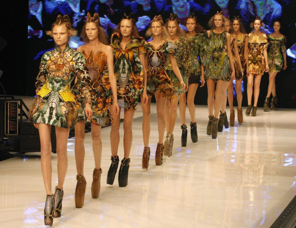
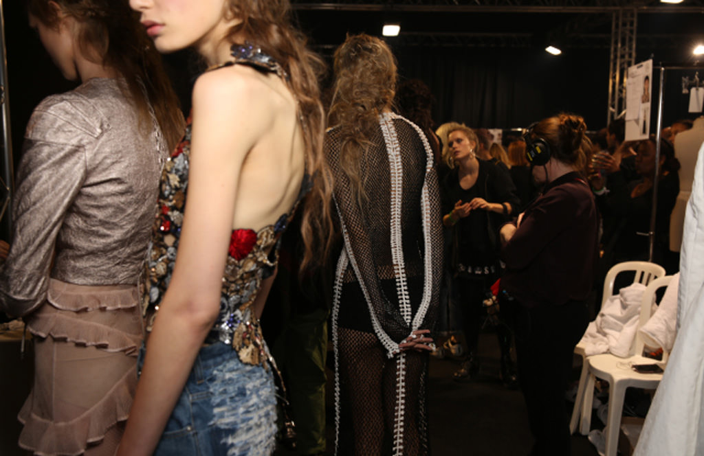
France is often described as the standard-bearer of the world for high-end culture and fashion, representing the ultimate in effortless sophistication. Iconic designers present the very latest of designs twice a year, ushering in the next chapter of sartorial ideals that spark the musings of designers everywhere. What coincides neatly with this is the image of the chic Parisian woman who translates these visions into everyday class and style. Countless blogs, videos, and tutorials exist to teach audiences how to mimic her essence. She’s the epitome of the fashionable feminine with a tall, slim silhouette and prominent bone structure.

Yet behind this iconic imagery — of the photographed model who embodies the fashion world, and the everyday French woman who’s watched with envy from afar — is a challenging reality of visual media representation that’s in the throes of change.

French new legislation

In 2015, the French government passed a law stating that in order to walk the runway, models needed to provide a doctor’s note showing proof that they had a body mass index of at least 18. Failure to comply can result in a fine. The goal is to scale back the influence of images of extremely thin models. It’s been part of the country’s effort to rein in the prevalence of eating disorders and more responsibly manage unrealistic and unhealthy beauty standards. The image of the Parisian woman, it seems, has gone too far with her slimness. Italy, Spain and Israel followed suit with the same runway model bans. 

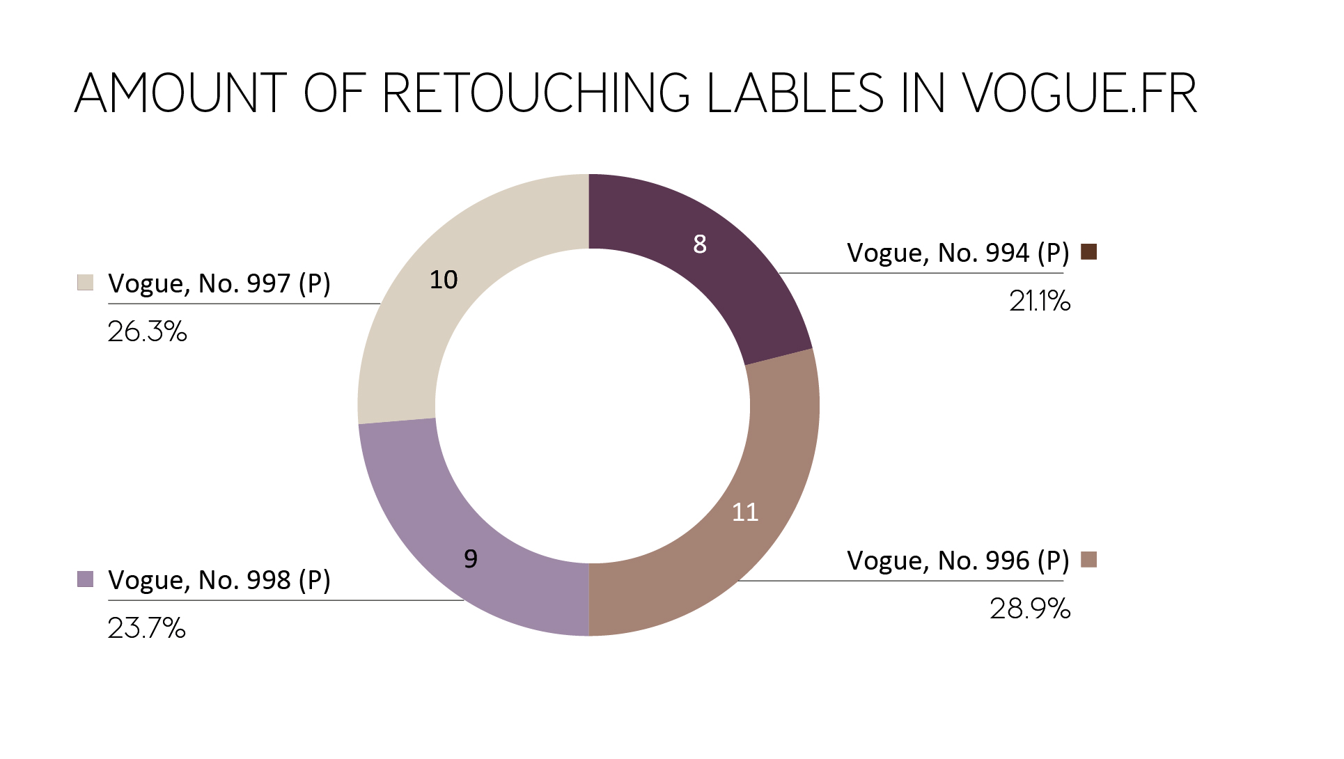
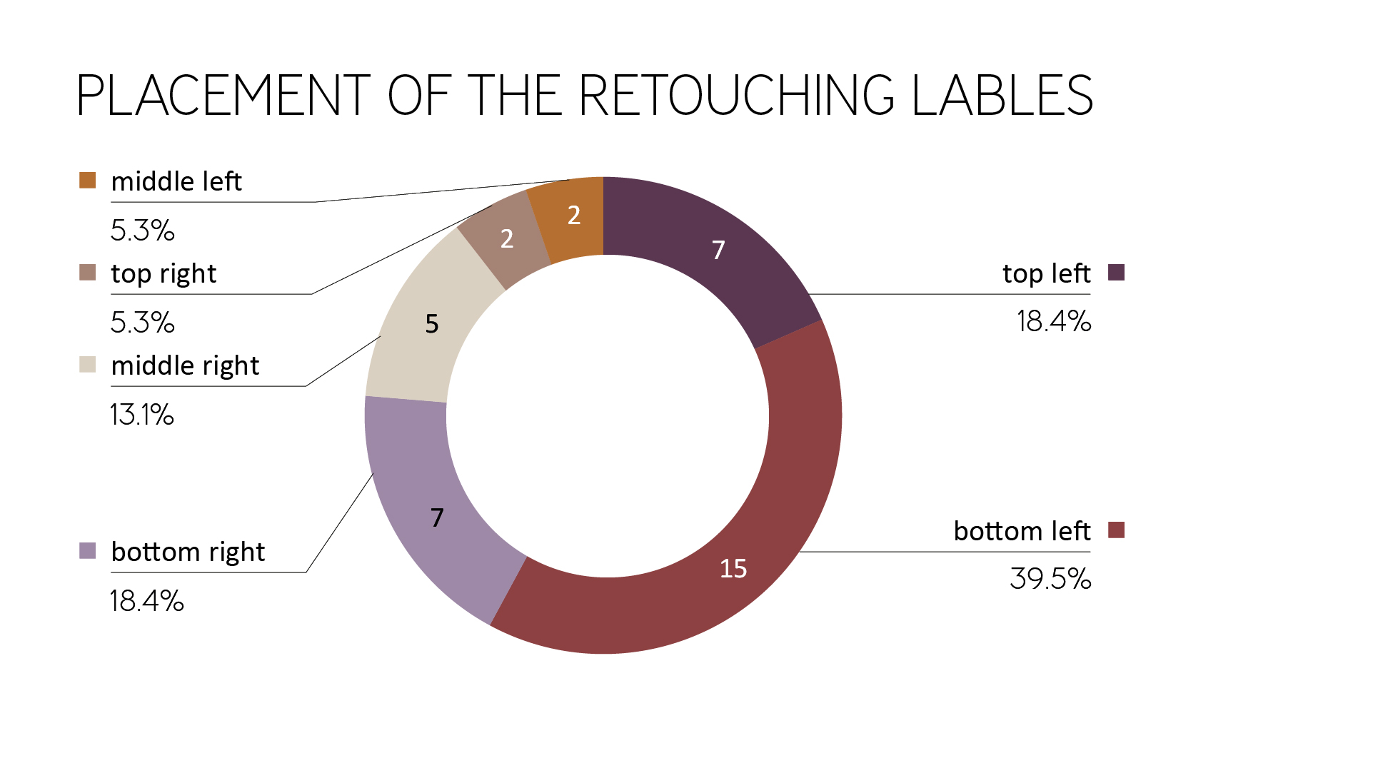
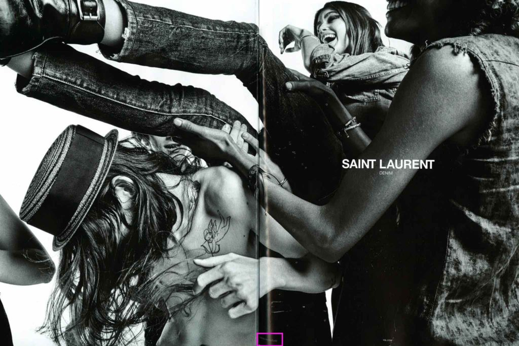
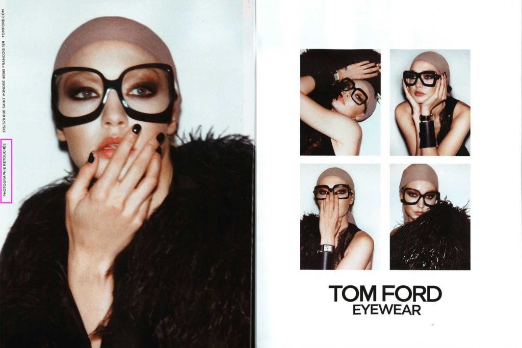
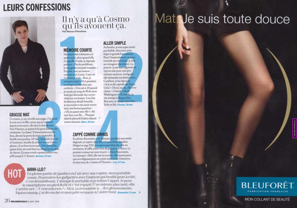
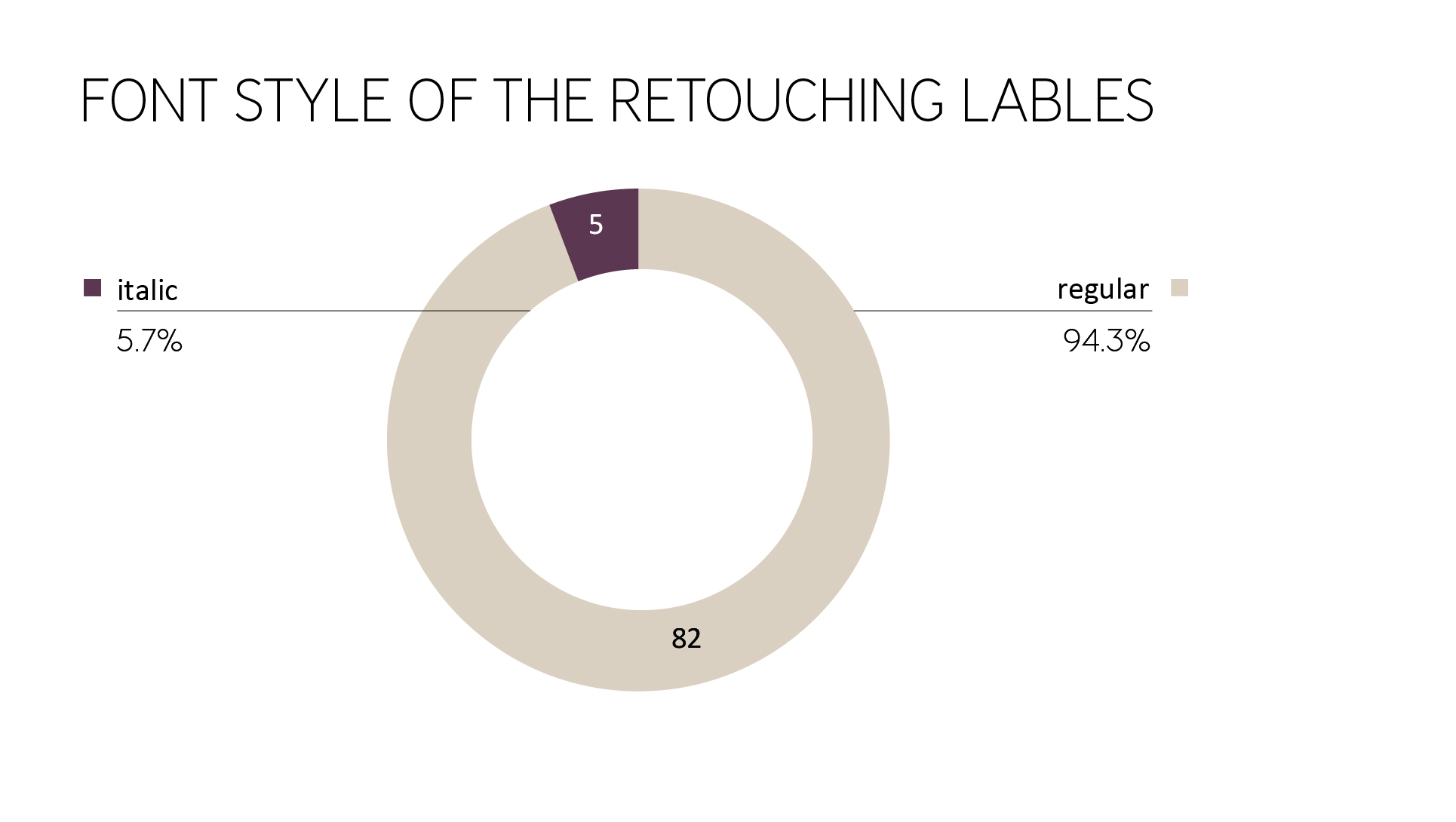
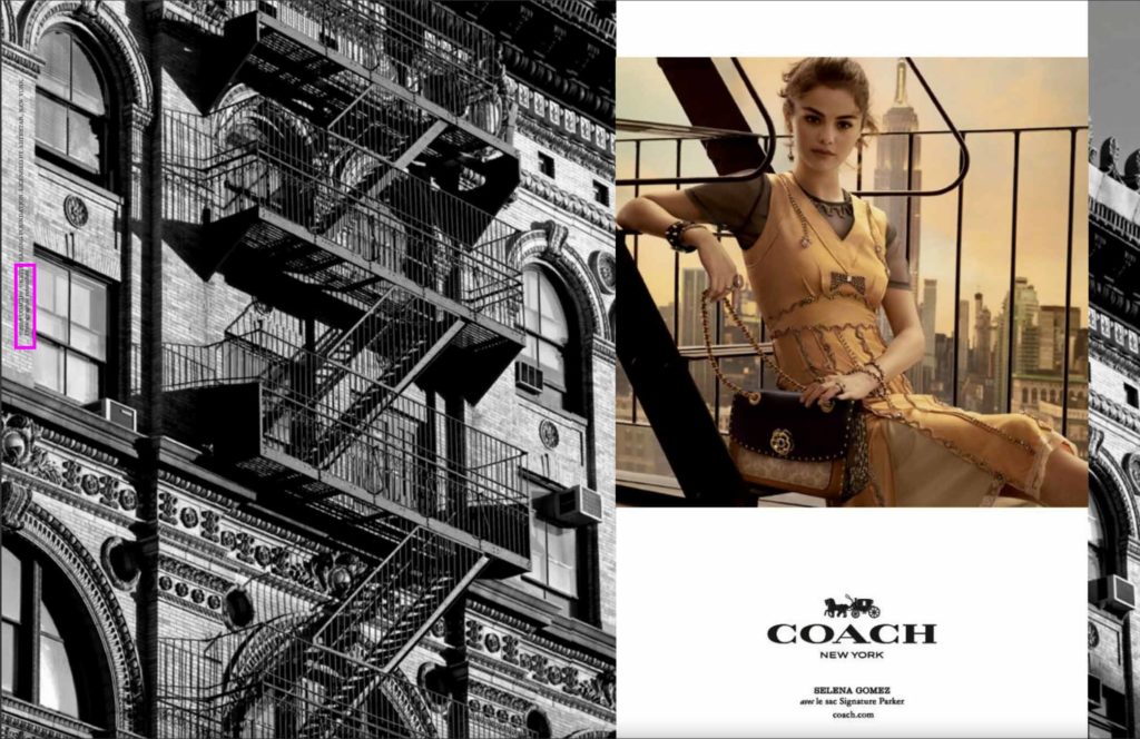
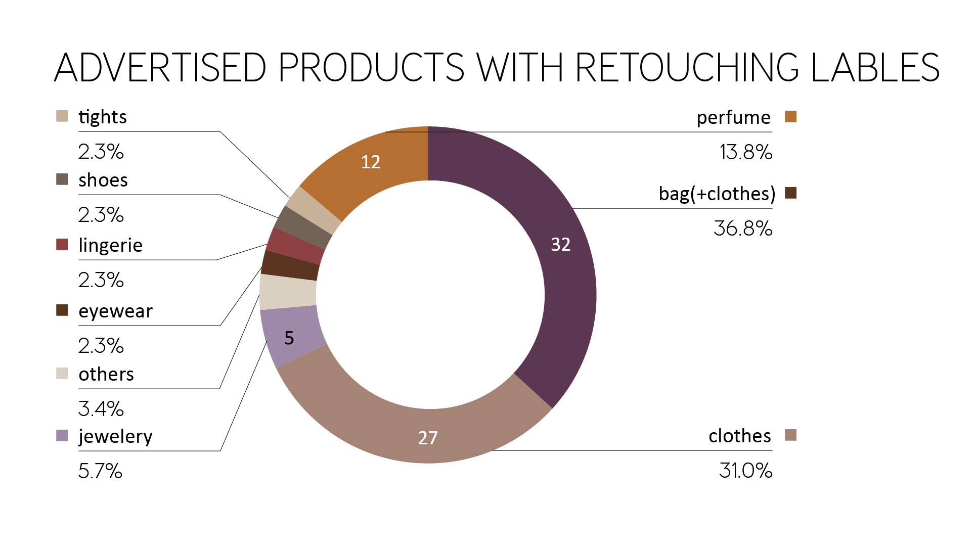
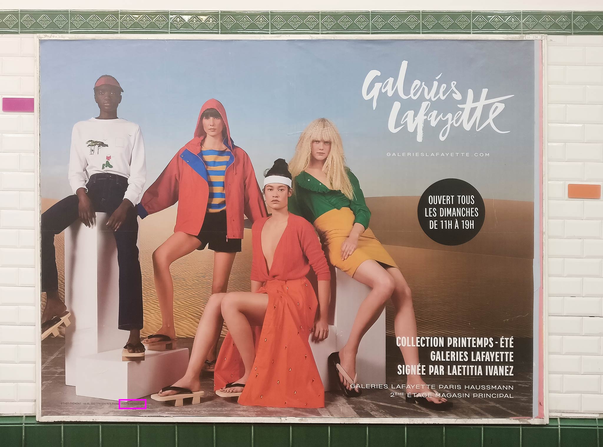
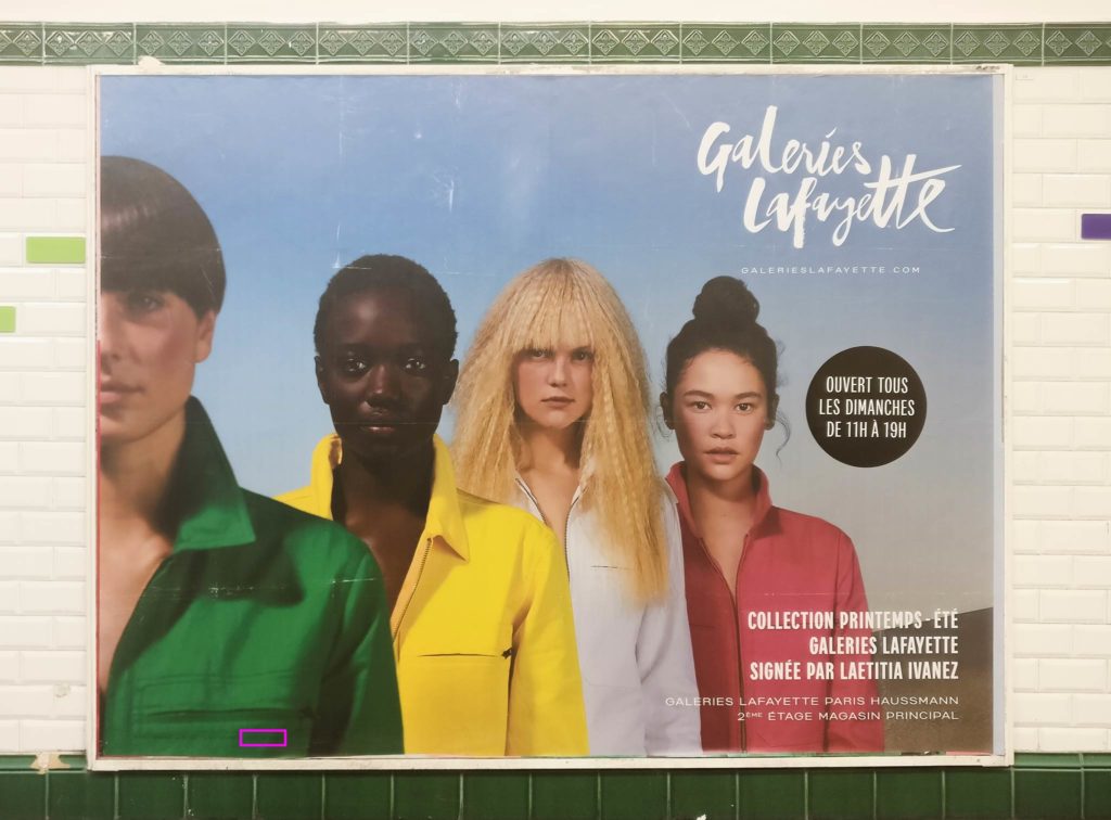
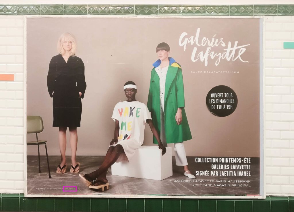
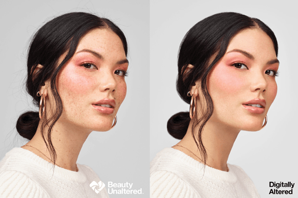
Two years later, the French government passed another law with a similar goal: any commercial photograph showing bodies that have been digitally altered to appear thinner or thicker must also have a notice of “photographie retouchée,” meaning, “retouched photograph.” Failure to comply could result in a fine of 75,000 euros, or up to 30 percent of advertisement funds. 

The legislation has been championed by French politicians, including former health minister Marisol Touraine. Touraine expressed, “It is necessary to act on body image in society to avoid the promotion of inaccessible beauty ideals and prevent anorexia among young people.” Numerous articles at the time cited alarming statistics about the epidemic of eating disorders that uniquely affects France:

    • About 600,000 young people are believed to suffer from eating disorders in France [as of 2017] 
    • Eating disorders are reportedly the top cause of death among 15- to 24-year-olds in France, making it the second leading cause of death in that age group [as of 2017]
    • Anorexia affects between 30,000 to 40,000 people in France, 90% of whom are women [as of 2017]
    • Seventy percent of girls ages 10 to 18 report that they define perfect body image based on what they see in magazines [as of 2015]
    • Out of all Western Europeans, French women have the lowest BMI, at 23.2 [as of 2009]
    • 11 percent of French women are considered “extremely thin” [as of 2009]

Altogether, the content paints a portrait of French beauty ideals that are more damaging than desirable.

Developments towards body authenticity

Across the Atlantic, American brands made strides in the spirit of body positivity and authenticity as well. Getty Images announced that year that they would no longer accept creative visuals and stock photography that featured altered body shapes (despite acknowledging that retouched photos are rare in stock photography). Getty spokeswoman Anne Flanagan remarked, “Our perceptions of what is possible are often shaped by what we see… Positive imagery can have direct impact on fighting stereotypes, creating tolerance, and empowering communities to feel represented in society.” 

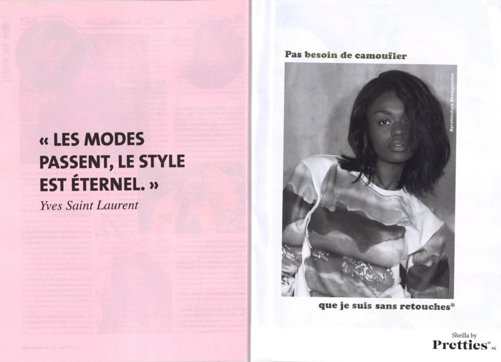
The push for body authenticity and accurate representation often draws praise from those within the body positivity movement who are pleased to see “regular women.” At long last, real women can see themselves represented in fashion via magazines, social media, commercials and print advertising. And if they don’t see themselves because the image has been retouched, they can rest assured knowing that the image they’re seeing isn’t even accurate.

But questions remain, rather quietly in the background of the fashion and beauty industries: Is labeling a photo as retouched an effective means of preventing eating disorders? Have eating disorders slowed or even fostered the sort of body positivity that proponents work towards? Do people feel better about themselves when they see that an image has been altered?

The background of eating disorders

Answers to these questions run the gamut. Eating disorders are complex psychological conditions that can arise for a number of reasons. Traumatic experiences, genetic links, sports performance requirements, and family dynamics can all be precipitating factors, according to the Eating Recovery Center. The center recognizes that culture plays a role in causing eating disorders, too: “Every day, we are besieged with messages about beauty, unrealistic body images and fad diets.” 

That the overwhelming pressure to be thin can trigger body dissatisfaction and disordered eating habits isn’t news. But it just so happens to be what proponents consistently use as their main argument for skinny-model bans and retouch labels. Findings from clinical research tell a slightly different story.

Studies & discussions about the retouching label

In a study conducted by Elisa S. Danthinne and Rachel F. Rodgers, they found no empirical evidence that supports the usefulness of retouch labels in slowing body dissatisfaction and eating disorders. In fact, they have the opposite effect. They write: 

“A majority of research evidence indicates that single exposure to the presence of a label alone is not effective in improving body image, and can in fact be harmful by increasing comparison tendencies. This finding does not seem to have reached many policy makers and players in industry, who have continued to favor labeling practices.”

Another study, conducted in 2015 before the bill became law, arrived at similar conclusions. Belinda Bury of Flinders University conducted four experiments about the effect of retouch labels, one of which included giving subjects an informational message that preceded advertisements. She concluded:

“The thesis found no overall benefit from the use of either generic or specific disclaimer labels appended to thin ideal fashion magazine advertisements. Rather, specifically worded disclaimer labels actually directed visual attention toward body areas specified as altered, with this increased visual attention itself resulting in increased body dissatisfaction and being worse for women high on trait appearance comparison. The presentation of digital alteration information before exposure to advertisements with disclaimer labels did nothing to enhance the effectiveness of the labels, nor did instructional set.”

Interestingly, a number of proponents of skinny-model bans and retouch label legislation who work in the field of eating disorders recognize the lack of effect. Tom Quinn of Beat — a charity geared towards eating disorders — told the BBC, “It’s simplistic to suggest that looking at Photoshopped images will cause eating disorders. But many people who look at altered images have low self-esteem.” He added, “We support any measures that contribute to a society having a healthier view of body types and everyone being more aware of which pictures have been touched up.”

Last year, Dr. Luke Evans MP, of England, proposed the Digitally Altered Body Images Bill, which would require a logo to indicate a person’s face or body has been digitally altered. He wrote, “Knowledge of when an image has been digitally manipulated will have positive mental health benefits for a wide cross section of our society affected by body image.” In support of the bill, the UK’s Mental Health Foundation responded: 

“Labelling edited images is just one approach and unfortunately there is a scarcity of research to show it will solve the overall problem. For labelling (or any other industry change) to work, it will need to be co-produced with experts by experience and its implementation needs to be carefully evaluated.”

The timing of Dr. Evans MP’s bill is notable. He introduced it in September, five years after the passage of France’s skinny-model ban and three years after the passage of its retouch label law. Just one month prior, in France, researchers conducted an online cross-sectional study of college students at the University of Rouen-Normandy. The aim was to identify the characteristics of eating disorder categories and help- and care-seeking among college students. They surveyed nearly 1,500 students. They concluded:

    • The prevalence of likely cases of eating disorders was 24.8 percent, with a higher prevalence in female students (31.6 percent) than male students (17 percent). 
    • Of that 24.8 percent, 13.3 percent were considered to have a bulimic eating disorder, 8.6 percent hyperphagic eating disorder, and 2.9 percent restrictive eating disorder. 
    • The pressures of academic performance caused significant stress, which causes “a change in the habits of young people related to their practice of physical activity and food.”

It bears repeating what is widely known about eating disorders: They’re incredibly complex and can have several precipitating factors, not just visual media. How much can we reasonably expect a retouch notification to achieve — especially if studies show that it has the opposite effect? And why do politicians keep introducing these bills if they don’t accurately address eating disorder prevention and awareness? 

Back in 2009, Valérie Boyer, then a member of the French parliament who also has a background in health administration, drafted a bill to address digital retouching that would require all advertising images to carry a retouch label. She said she was inspired by watching her teenage daughters manage the pressures of having a thin body and perfect skin. In a New York Times article, she remarked, “If someone wants to make life a success, wants to feel good in their skin, wants to be part of society, one has to be thin or skinny, and then it’s not enough… one will have his body transformed with software that alters the image, so we enter a standardized and brainwashed world, and those who aren’t part of it are excluded from society.”

In that same article, Anne-Florence Schmitt, editor of Madame Figaro magazine, called it a “fake debate.” Former model and clothes designer Inès de La Fressange said it was “demagogic and stupid” because the causes of anorexia are complex. And French fashion photographer Dominique Issermann said that Boyer has not only “misunderstood the problem” but the nature of photography altogether. “There is this illusion that photography is ‘true’ … As soon as you frame something, you exclude something else,” Issermann said. 

She then added a poignant detail about the inherent limitations of a single snapshot, seeming to gesture to the notion that whatever is in the frame doesn’t tell a complete story: a photograph is “a piece of reality, but the reality of the world is different.” 

Current developments during Covid-19

As you can see in the video above, eating disorders have resurged and become even worse as a result of the pandemic. Comparisons of the numbers of the recent years cannot give any neutral information about the effectiveness of the retouching label. But coupled with the studies above, reality seems to favor the underlying psychology that precipitates eating disorders, as opposed to visual media being the main culprit. If stressful, overwhelming and traumatic situations can trigger setbacks and prompt new body dissatisfaction or disordered eating habits, how much can we expect a retouch notification to accomplish?

Do you have any suggestions, additions, is this post out of date, or have you found any mistakes? Then we look forward to reading your comments. You are welcome to share this post. We are very grateful for every recommendation.

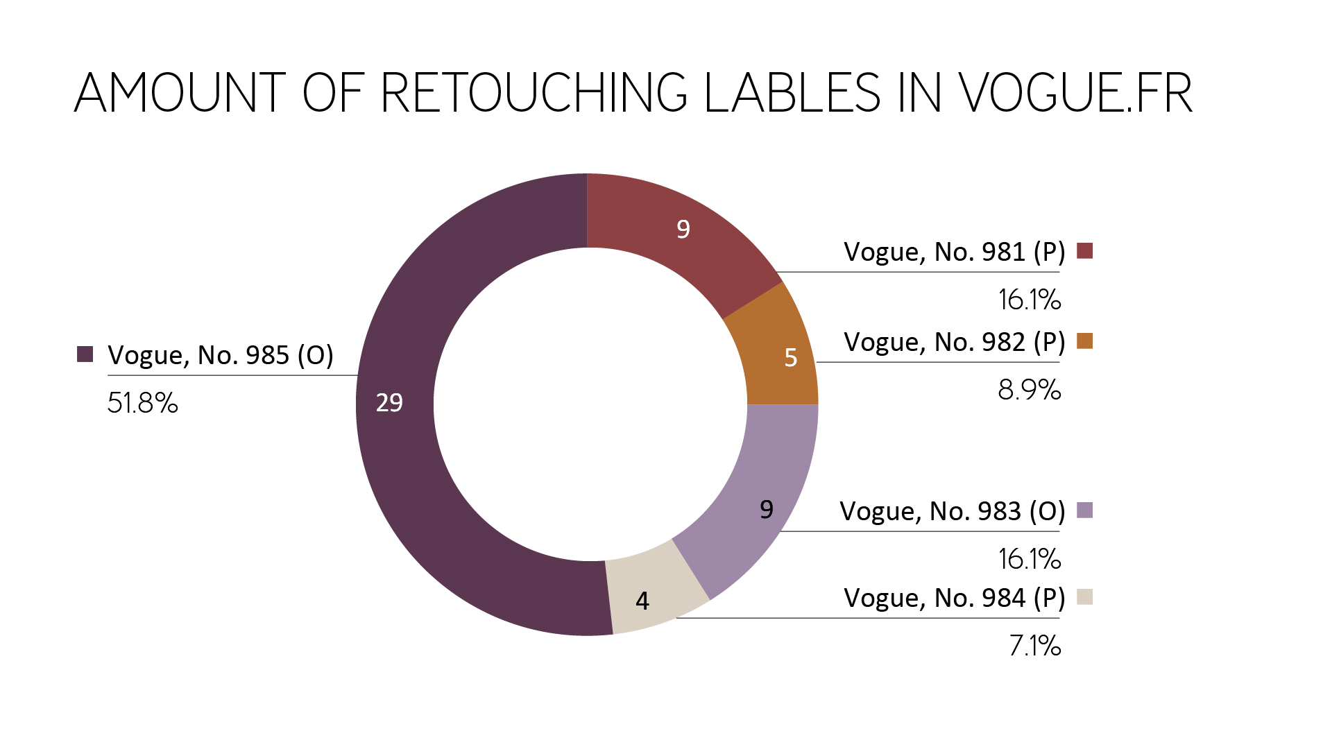
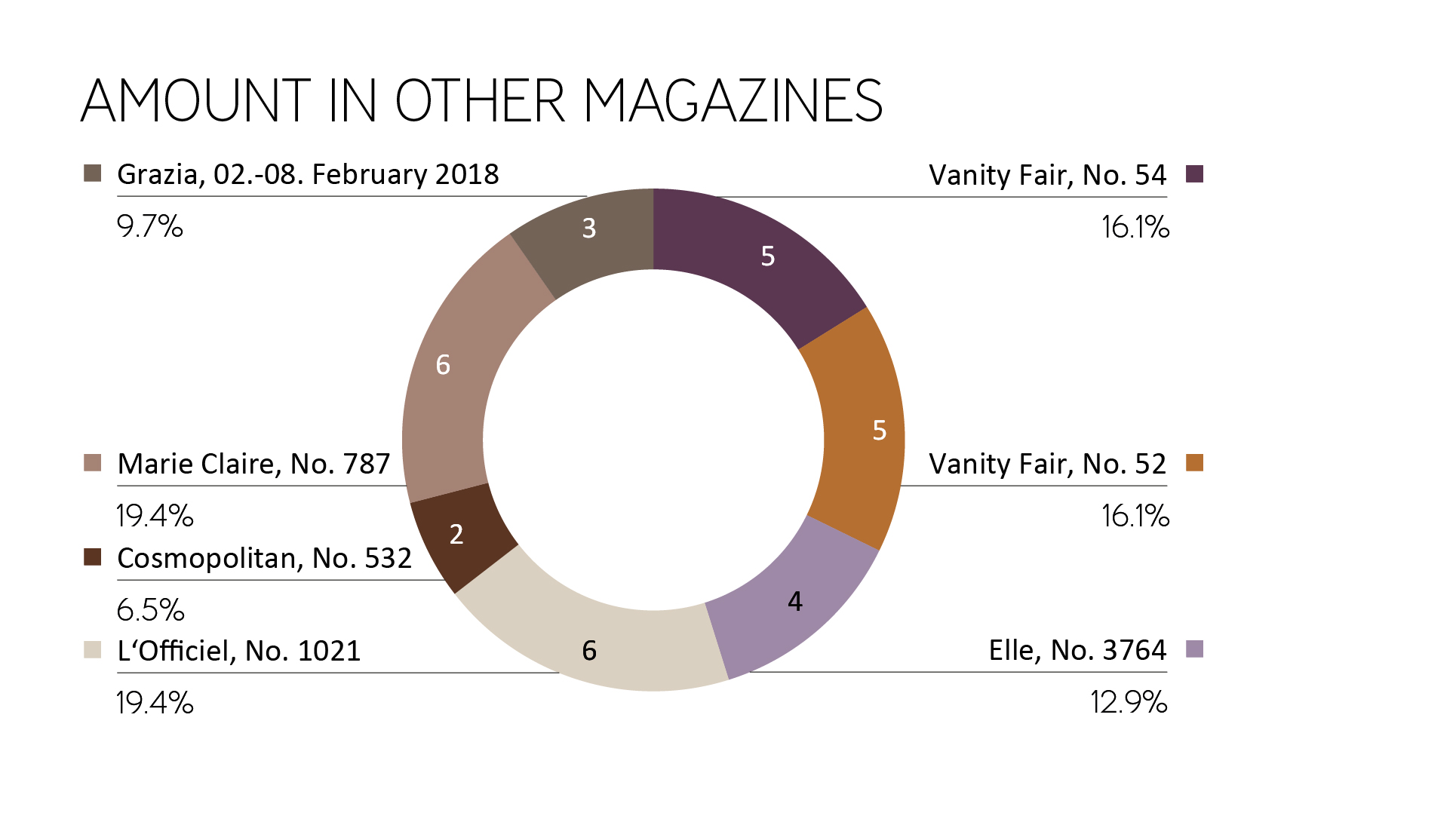
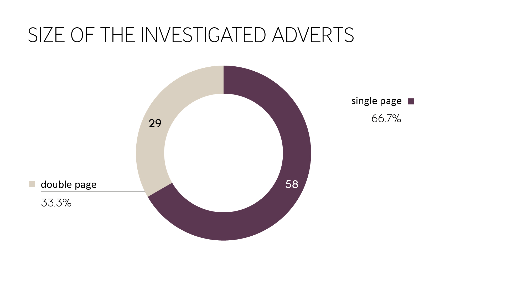
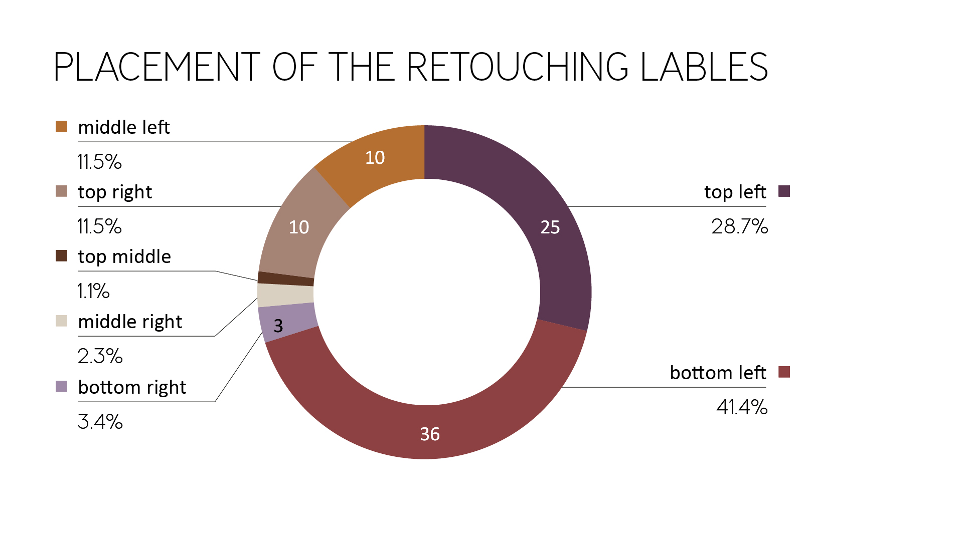
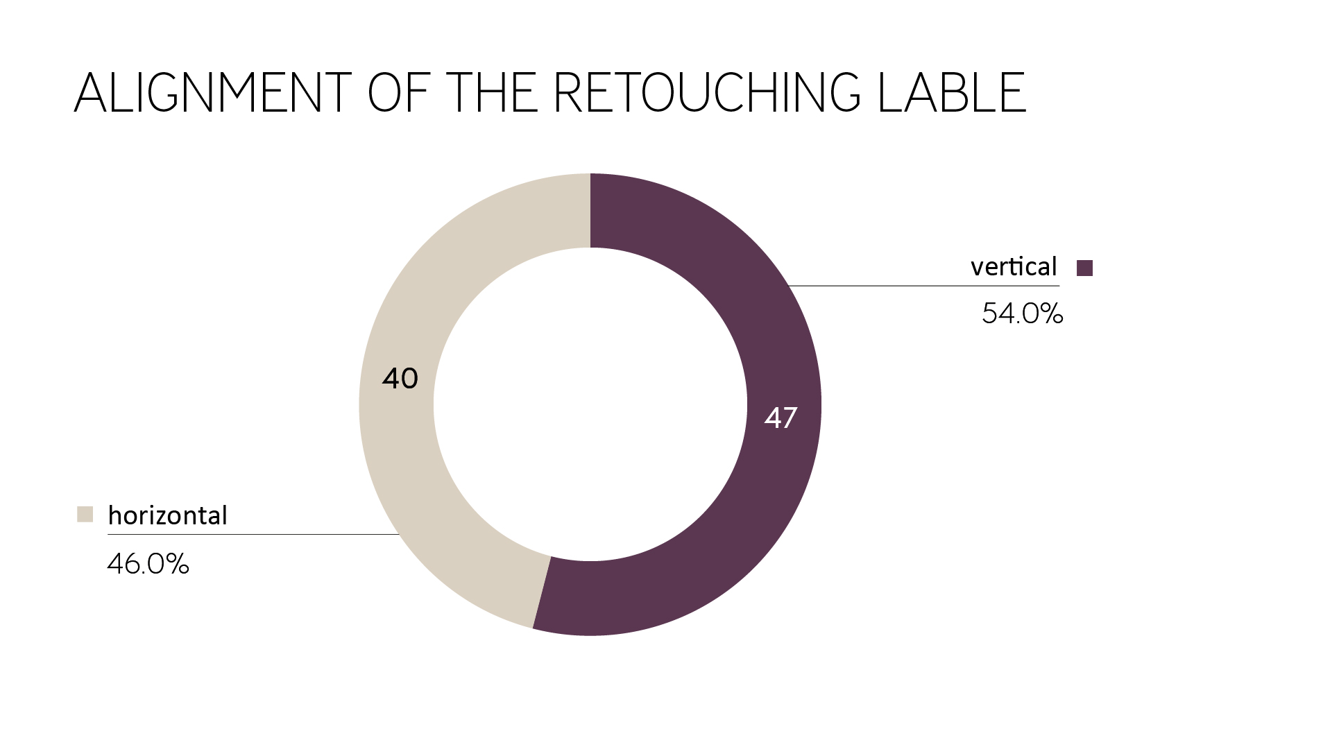
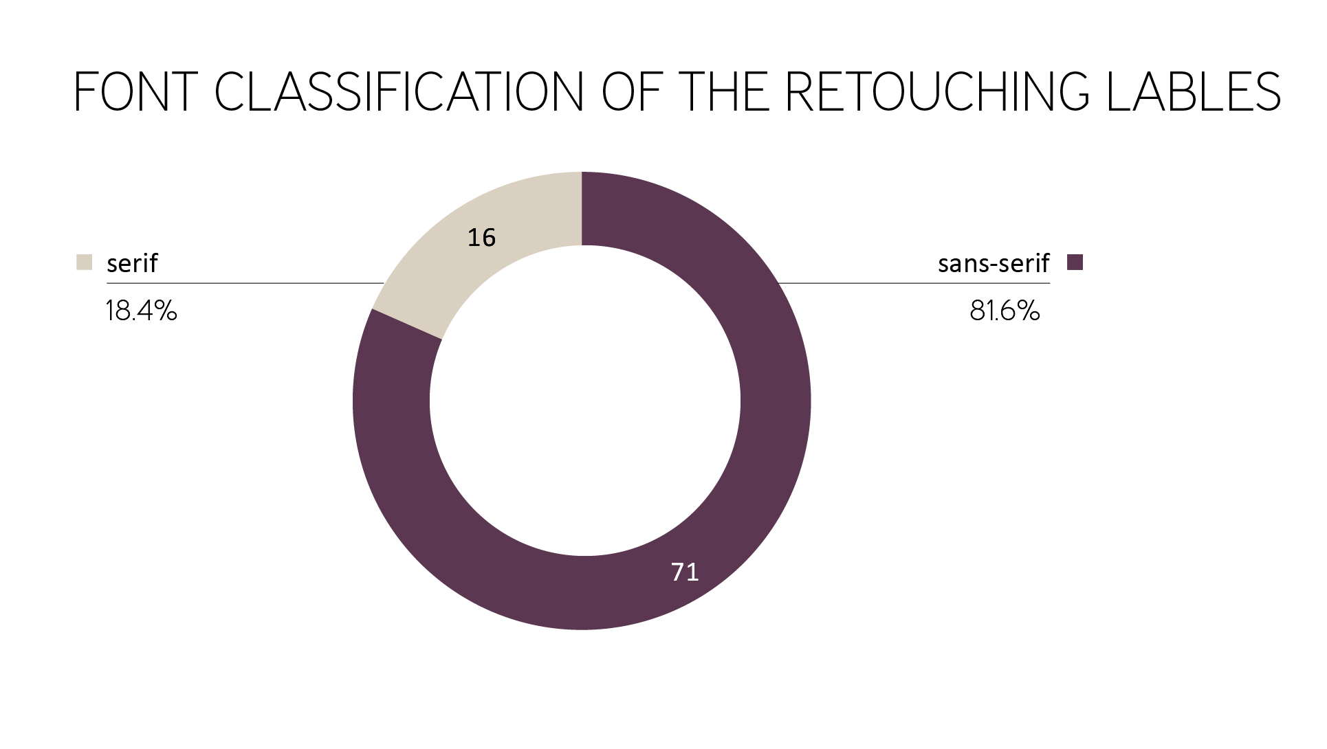
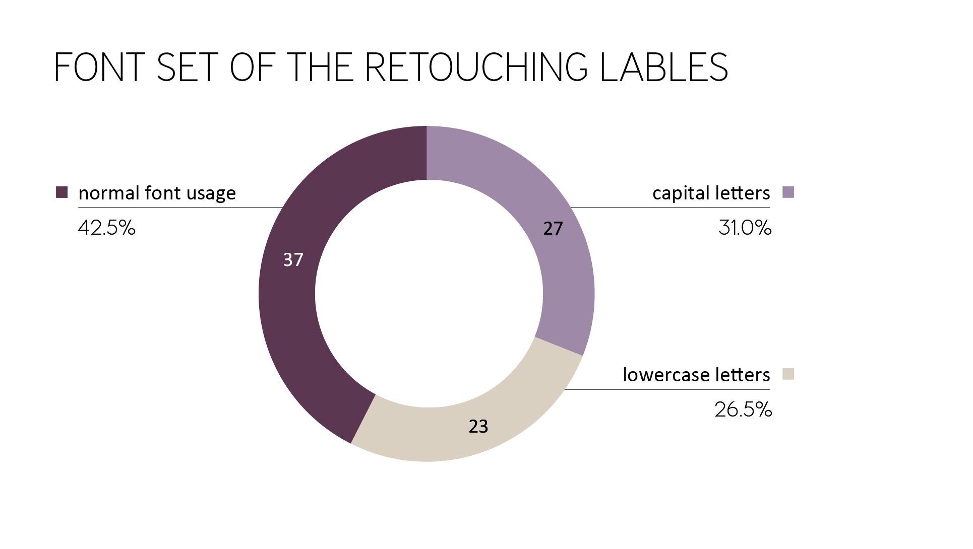
Do you want to read more about the execution of the french law? Find out more in our previous articles Presence analysis of the retouching label “Photographie retouchée” 2018 or Retouching label “Photographie retouchée” – A tour through France.

Magazine page (Fendi advertising) with retouching lable

Presence analysis of the retouching label “Photographie retouchée” 2019

MK Retouching investigated different Vogue Paris on retouching labels in 2019 after the first investigation in 2018. Here you can read about the latest developments and possible forecasts.

It is recommended to read the general legal context and the first study from 2018 to understand the overall meaning.

In the last study, it could be determined that the advertisements do not change depending on the magazine.
Therefore, this time only Vogue Paris was chosen as the magazine that had the most retouching labels in the past.

The following different Vogue Paris magazines were examined several times.

  • VOGUE Paris (Print), 994, February 2019
  • VOGUE Paris (Print), 996, April 2019
  • VOGUE Paris (Print), 997, Mai 2019
  • VOGUE Paris (Print), 998, June/July 2019

Amount of Retouching labels

A total of 38 retouching labels were found on advertisements from 18 brands in the 4 magazines mentioned above, with the words “Photographie retouchée”, “Photographie Retouchée”, “Photo retouchée” or “Photographies Retouchées”.

The average number of retouching labels per magazine has increased slightly. In order to make a valid statement, however, not only the quantitative increase must be considered, but also the relationship between images with retouching label and images without retouching label (percentage).

Brand-Variety

As already described, 18 different brands were identified that used a retouching label. The ones with the highest amount of retouching labels in this study were Saint Laurent (5), FENDI (4), DIOR (4), Lancôme (4), Estee Lauder (3), and HERMES (3).
The two studies gave a good insight into the brand strategies. The following list gives an example of the biggest brands and their use of the retouching label.

  1. Brands that always use retouching label(s):
    Saint Laurent, Lancôme, HERMES
  2. Brands strictly without retouching label(s):
    Gucci, Chanel, Dolce & Gabbana, MaxMara, Moschino, Chloé
  3. Brands with a reduced number of retouching instructions compared to last year:
    Prada, Louis Vuitton, Armani, MIU MIU, Dior

In comparison, there were also some brands that did less advertising and some that did more advertising than in the previous study.
Michael Kors did less advertising; therefore the number of retouching labels decreased as well. FENDI did more advertising; that’s the reason why FENDI had almost the most retouching labels in 2019.

Further findings

The monthly editions have a relatively constant amount of retouching labels (Figure 1). At first glance, one can assume that the advertisements are very well chosen to keep the number consistent. Compared with the previous study, however, this thesis can be refuted.

Figure 1: Amount of retouching labels in different editions of Vogue Paris

Placement on the magazine pages

Likewise, the placement of the retouching labels on the magazine pages was checked. As a reference point, the magazine page with the retouching label was used.

As shown in Figure 2, there is a strong preference for placement in the bottom left or top left, similar to 2018. Nevertheless, the number of retouching labels in the bottom left, middle left, top left decreased, and the lower right position is seen more often.
The consumer can’t focus on the left part of the ad or the left part of the magazine page anymore, the chance of finding the retouching label is almost equal on the left and the right side.

Figure 2: Placement of the retouching labels (magazine page as reference point)

Furthermore, the hint has less often been found near the fold. This is an overall improvement for recognizing the retouching label.

As in the previous year, it could be observed that the reference position was often placed as distanced as possible from the center or the model.
In Figure 3 and 4 you can see further examples of the model being located on the right page of the magazine and the retouching label on the left one.

Figure 3: Distance between model and retouching label (Vogue Paris, No. 996)

Figure 4: Distance between model and retouching label (Vogue Paris, No. 996)

Alignment on the magazine page

In this section, the orientation of the text is been discussed. It is much harder to read labels that are not aligned horizontally because they are contradicting the usual reading habits. Whether a retouching label should be placed vertically or horizontally is not clear from the corresponding legal text.

Since 2018 the amount of vertically placed labels raised from 54% up to 71.1%.
Similar to the previous study, retouching labels were surrounded by other information.
In 2018 87% of the retouching labels weren’t surrounded by additional information. In 2019 this amount decreased to 63%.

That means the retouching labels are harder to read and to find than in the previous study (Figure 5).

Figure 5: Example of vertically used retouching label surrounded by information (Vogue Paris, No. 996)

Average size

The printed retouching labels were measured. For vertical retouching labels, the longer side was defined as the width and the shorter side as the height to achieve a precise average.
The average retouching label in the investigated print magazines this year (2019) was:

  • width: 25.6 mm (2018: 26.1 mm)
  • height: 1.5 mm (2018: 1.7 mm)

The typography of the Retouching label

  • Typographically, three parameters were examined. As in the previous study, the majority of the retouching information in magazines consists of sans-serif fonts. Serif typefaces are still only used by a few brands such as Lancôme (and Jean Paul Gaultier).
  • Regarding the font set, the lowercase option “photographie retouchée” or “photo retouchée” almost disappeared (only one retouching label). Capital letters (31% ->42.1%) and the combination of the normal capital letter and lowercase letters (42.5% ->55.3%) increased equally.
  • If we take a look at the font style of the retouching label, it is always used as a regular font. The only exception is still Lancôme (italic).

Contrast values

Another aspect of the investigation was the contrast values from text to the background. Similar to the previous year, there were some examples of insufficient contrast between background and text.
The following campaign by Saint Laurent (Figure 6, Figure 7) is an excellent example of a lack of contrast between background and font (dark gray on black, dark gray on light gray).

Figure 6: Example of bad contrast between background and text (Vogue Paris, No. 998)

Figure 7: Example of bad contrast between background and text (Vogue Paris, No. 998)

Recognition value

Overall, there is only a low recognition value, since the reference in the positioning and design differs depending on the brand. In some cases, there were even different versions within the brands (different campaign styles). Labels within a magazine are therefore different in its appearance and must first be searched for. The same ads in various magazines are identical.

In general, one can see that the visibility of the retouching label was not improved from 2018 until 2019. On the contrary, it has even gotten a little worse/invisible.

Effectiveness/Credibility of the labeling obligation

It is noticeable, the advertising campaigns, which contain several pictures (Figure 8, Figure 9) or many women at once (Figure 10), had only one retouching label (which used singular in wording, not “Photographies retouchées”). This raises the question of which and how many images of the campaign are affected by the change in body shape. Often, however, this is not noticeable in comparison. As a result, the following conclusions are drawn for the consumer:

a) The changes in image processing concerning the body are minimal when tagged images are not visibly different from unmarked ones. This means that the models are depicted almost with their natural body shape; the beauty ideal is getting strengthened again. The label loses its original purpose.

b) Every picture is doubted. Either not all changes made are marked by the label, or too many labels are used similar to general use of the label to avoid potential costs of not marking in principle.

Figure 8: Example of many campaign images but only one retouching label (Vogue Paris, No. 994)

Figure 9: Example of many campaign images but only one retouching label (Vogue Paris, No. 996)

Figure 10: Example of many models in one image but only one retouching label (singular) (Vogue Paris, No. 997)

To avoid unwanted conclusions from consumers, legislation should be more detailed about certain cases.

Also, an example of the wrong usage of the label was found. It is evident that a clear product image can not show changed body proportions of a woman.

Figure 11: Example of wrong retouching label usage (Vogue Paris, No. 997)

Are you a fan of Vogue? Those might be interesting for you:


Do you have any suggestions, additions, is this post out of date, or have you found any mistakes? Then we look forward to your comment.
You are welcome to share this post. We are very grateful for every recommendation.

Book from MK Retouching with studies about the retouching lable Photographie retouchée

Presence analysis of the retouching label “Photographie retouchée” 2018

MK Retouching investigated popular fashion magazines on retouching labels in research in Paris. These were then sorted and evaluated according to their appearance. To visit Paris is unavoidable, as the access to resources in Germany is very limited.

For this purpose, various editions of the following different magazines (french edition) were examined several times.

  • Vogue Paris (No. 981, October 2017)
  • Vogue Paris (No. 982, November 2017)
  • Vogue Paris (No. 983, December 2017)
  • Vogue Paris (No. 984, February 2018)
  • Vogue Paris (No. 985, March 2018)
  • Vanity Fair (No. 52, November 2017)
  • Vanity Fair (No. 54, February 2018)
  • Elle (No. 3764, 9. February 2018)
  • L’Officiel Paris (No. 1021, February 2018)
  • Cosmopolitan (No. 532, March 2018)
  • Marie Claire (No. 787, March 2018)
  • Grazia (02.-08. February 2018)
  • Pretties (No. 31, February-March 2018)

Amount of Retouching labels

A total of 87 retouching labels were found on advertisements from 31 brands in the 13 magazines mentioned above, with the words “Photographie retouchée”, “Photographie Retouchée”, or “Photo retouchée”.

To get an idea of the amount of retouching labels from the start of the new legislation over a specific time frame, Vogue Paris was examined from October 2017 to March 2018. Other journals were used for comparison for general statements and as a cross-section of the current retouching label rate. Vogue No. 983 and No. 985 are available online, so a comparison to the online presence of the hint could also be made.

Brand-Variety

As already described, 31 different brands were identified that used a retouching label. The ones with the highest amount of retouching labels were Prada (9), Louis Vuitton (9), Armani (7), Saint Laurent (7), Michael Kors (6), and Lancôme (5). It can be seen that well-known brands, which are priced in the upper price segment, use body deformations in image processing.
Right from the beginning of the decree, the industry reacted and implemented the labels.

Further findings

The monthly editions have a relatively constant amount of retouching labels. However, in the March issue was a significantly increased number of labels to find. This could be attributed to seasonal fluctuations. However, a valid statement would require further long-term studies.
In Figure 1 it can be seen that in online issues and printed versions, both have retouching labels. It can be assumed that printed and online versions are identical.

Figure 1: Amount of retouching labels in different editions of Vogue Paris

For comparison, the following pie chart shows the number of retouching labels of the remaining magazines (this means excluding Vogue.fr) with a total of 31 retouching labels. The reviewed magazines are close to the last investigated Vogue Paris edition in terms of time and show a constant, but a significantly lower percentage of advertisements with retouching information. This may have its origin in the unique role of Vogue Paris since Vogue Paris is very attractive for advertisers.

Figure 2: Amount of retouching labels in different magazines on February/March 2018

Position in Magazines

Only in the first section of the magazine and on the last page advertisements are positioned. Articles and editorial sections (definition: artistic photo series in fashion magazines) can be found in magazines usually in the middle or at the end of the magazine. That means, by using the magazines chronologically, the consumer is confronted with the advertisements with and without the retouching labels first.

Layout integration of the Retouching label

By analyzing the advertisements, it was found that the retouching labels could only be found on full-page or even double-sided advertisements. The pictures took a lot of space accordingly. As seen in Figure 3, two thirds can be found in single-page advertisements. A single page was scored as such if the image was placed without protrusion to the accompanying magazine page. If an image was placed (partly) on two magazine pages, it was scored as a double page. Two photographs of one brand ad on the left and right page were scored as two single pages.

The origin of a higher amount of single image adverts is based on the fact that predominantly portrait format is used in photography (instead of landscape format). Reasons for the resolution of the images can be neglected since the quality of the advertisement images is usually very high.
A total of three advertising images were found, which were placed as a portrait format each on two magazine pages. These were rotated – the consumer had to turn the magazine to see the advert in the right perspective.

Figure 3: Size of advertising images that used a retouching label.

Placement on the magazine pages

Likewise, the placement of the retouching labels on the magazine pages was checked. As a reference point, the magazine page with the retouching label was used.

As shown in Figure 4, there is a strong preference for placement in the bottom left or top left. If the consumer focus on the left part of the ad or the left part of the magazine page, the chance of finding the retouching label is higher.

It is not clear if the placement follows a certain placement strategy. It could be the case that the reading direction or the distance to the retouched model are key factors for choosing a certain placement for the retouching label.

Figure 4: Placement of the retouching labels (magazine page as the reference point)

Furthermore, the hint has often been found near the fold and is hardly visible there. Also, with the placement vertically centered on the edge of a magazine page, the attention of the hint may suffer because the hand is often placed there to turn over the pages (see Figure 5 and Figure 6).

Figure 5: Example of a retouching label placed near the fold of the magazine (Vogue Paris, No. 985)

Figure 6: Possible placement for the hand on the magazine page by turning over the page (Cosmopolitan, No. 532)

It could be observed that the reference position was often placed as distanced as possible from the center or the model. In Figure 7 and 13 you can see that the model is located on the right page of the magazine, but the retouching label on the left one.

Figure 7: Distance between model and retouching label (Vogue Paris, No. 985)

Alignment on the magazine page

In this section, the orientation of the text is been discussed. It is much harder to read labels that are not aligned horizontally because they are contradicting the usual reading habits. Whether a retouching label should be placed vertically or horizontally is not clear from the corresponding legal text. Therefore, it is not surprising that, as Figure 8 shows, there is no clear preference for orientation in the advertising.

It was also noticeable that with vertical alignment of the retouch label, the rotation of the text can be found both 90°clockwise and counterclockwise.

Also noteworthy was the fact that retouching labels were surrounding by other information. Some were surrounded by website links, addresses, shop notes, or credits. In this case, the label is harder to find and therefore less noticeable during the search process (see Figure 9).

Figure 8: Alignment of the retouching label

Figure 9: Retouching label surrounded by the address of the brand (Vogue Paris, No. 983)

Average size

How big and legible is the average size of a retouching label in print? The printed retouching labels were measured. For vertical retouching labels, the longer side was defined as the width and the shorter side as the height to achieve a clear average. The average retouching label in the investigated print magazines was:

  • width: 26.1 mm
  • height: 1.7 mm

The typography of the Retouching label

Typographically, three parameters were examined. As can be seen in Figure 10, the majority of the retouching information in magazines consists of sans-serif fonts. Serif typefaces were only used by a few brands such as Lancôme and Jean Paul Gaultier.

Figure 10: Font classification of the retouching labels

Another effect on the readability and presence of the hint has the font set. While capital letters appear optically more giant and lowercase letters look smaller, the combination of the standard capital letter and lowercase letters are easier to read. By a short page-turning time or quick passing by billboards as in Métro stations, therefore, the standard capital letter plus lowercase letters would be recommended. Because the label is printed very small in its size and the label itself is very short, capital letters should also be an option when it comes to the intended perception of the hint. As shown in Figure 11, all three options were used almost equal. Small capitals were not found.

Figure 11: Font set of the retouching labels

If you take a look at the font style of the retouching label, the result of the investigation is clear: the retouching hint is predominantly to almost exclusively represented as a regular font. The exception is Lancôme (see Figure 12).

Figure 12: Font style of the retouching labels

Contrast values

Another aspect of the investigation was the contrast values from font to background. Almost half of the ads showed too little contrast. Examples of insufficient contrast between background and font were, for example: medium gray (font) – light gray (background), black (font) – medium gray (background), white (font) – light blue (background), white (font) – beige (background). Besides, in some cases, a busy background made it difficult to recognize the label. As shown in Figure 13, black lettering was placed on a grayscale brick building and is hardly recognizable due to its low contrast and size.

Figure 13: Example of bad contrast values (Vogue Paris, No. 985)

Mainly used product categories

As the last parameter, it was examined which products were advertised with retouching labels. Significantly ahead of all other product types were clothing or handbags. The category “Other” in Figure 14 summarizes the following three product discoveries: “hat”, “watch”, “lipgloss”.

The shown body parts of the models in the advertised articles tended to be significantly higher for clothing – or clothing, including bags (in contrast to jewelry, perfume, or eyewear advertisements). Overall, no other than the listed items (captured with models) were advertised in the magazines. That means, e.g., watch ads without models are included in the magazines, but those are not affected by the legislation.

Figure 14: Advertised products with a retouching label

Recognition value

Overall, there is only a low recognition value, since the reference in the positioning and design differs depending on the brand. In some cases, there were even different versions within the brands (different campaign styles). Labels within a magazine are therefore different in its appearance and must first be searched for. The same ads in various magazines are identical.

Effectiveness of the labelling obligation

The full assessment of the effectiveness of the retouching advice can only be made after a certain amount of time and further studies. However, it is already clear that the scope of the retouching label is limited to specific cases: Only advertising images are marked, excluding editorial model images that are very popular. Images in the back of the magazines are, therefore, without retouching labels, even if the models were actually altered in body shape. The question of the credibility and recognition of such retouching changes seems increasingly difficult and complex.

It is questionable whether these labels characterized by a certain passivity and casualness in the reception situation and the likewise decreasing observation time and intensity of an average of 1.5 to 3 seconds are even perceived.

Nevertheless, the new regulations in the motherland of fashion are one step towards new international beauty standards to protect young models from discrimination and anorexia.


Do you have any suggestions, additions, is this post out of date, or have you found any mistakes? Then we look forward to your comment.
You are welcome to share this post. We are very grateful for every recommendation.

Metro station advertising with retouching lable for Galeries Lafayette - Printemps - Été Collection Paris

Retouching label “Photographie retouchée” – A tour through France

Presence of the retouching label in public

How to deal with an avoidable retouching label in public?
Through a 3-day stay (15.02.2018 – 17.02.2018) for orientation and material procurement in Paris, MK Retouching was able to get an idea of the current distribution of the retouching label “Photographie retouchée” in public places.

Overall, it was noticeable that very few advertising posters with a hint of retouching were to be found in the streets of Paris. Even in the expensive department store Paris Galeries Lafayette, where advertisements are displayed larger than life-size, only one hint could be found at that time (as you can see below).

Image 1: A retouched image placed in the Galeries Lafayette department store (approximate size: 2.5 m × 1.5 m)

Image 2: One of the findings of the retouching label in the underpass of the MétroStation.

Image 3: One of the findings of the retouching label in the underpass of the MétroStation.

Image 4: One of the findings of the retouching label in the underpass of the MétroStation.

Since this analysis was made several months after the implementation of the new legislation, this raises the question whether the corresponding posters with retouching information are to be found deliberately in places where large crowds under time pressure pass, so that the observation time and thus the detection of the hint should be kept low.

Contrary to the rules, google.fr, the French version of the Google search engine, could only find the counterparts of the ads without the retouching label.


Do you have any suggestions, additions, is this post out of date or, have you found any mistakes? Then we look forward to your comment.
You are welcome to share this post. We are very grateful for every recommendation.

Magazine page - Special Collection Gigi Hadid for Vogue eyewear - with retouching lable

Warning signs for adverts: The French retouching label “Photographie retouchée”

Background to the adoption of legal measures

In France, studies have come to the following conclusion: Worrying developments regarding women, such as the increase in eating disorders, are probably due to the medially widespread and their slimming norms. France sought a way to protect its population from unattainable, unrealistic body images, and to avoid anorexia (anorexia) among adolescents. This resulted in the restrictive decree “2017-738”, which came into force on 1st October 2017.

Advertising bans and restrictions

But what is meant by an advertising restriction? In general, a distinction is made between advertising bans and advertising restrictions. While advertising bans constitute a comprehensive and profound interference, advertising restrictions have only a narrow scope and even only marginally affect the freedom of individuals. The new decree of France is an advertising restriction. What is restricted in what form becomes clear in the following sections.

Decree “2017-738”

In May 2017, France forced the decree number “2017-738”, which was discussed for around eight years. The decree entered into force on 1st October 2017. Various articles of this decree define the more precise framework conditions.

(1) For example, Article L. 71232 of the Labor Code defines the type of model and that its altered body silhouette on commercial photographs, as described in Article L.21332 of the Health Code, must be marked by the words “Photographie retouchée. Likewise, in this article, the fines for violations are regulated.

(2) Article R. 21334 of the Health Code regulates the medium to which the labeling refers:

  • posters,
  • online communications,
  • press releases,
  • advertising mail or on print matter.

(3) Article R. 21335 of the Health Code supplements the general conditions for the presentation of the note: it should be seen in an easily legible and clearly visible.

(4) Finally, article R.21336 of the Health Code mentions the advertiser as responsible for compliance with the regulation.

Further restrictions, for example, on image editing software or processing techniques or differentiation between thickened and streamlined body silhouette, are not made. Furthermore, this rule is limited to commercial advertising in France. It does not include editorials.

Possible causes of legislation

What led to the decree? In the global context, it becomes clear: France sets the world’s biggest demands for slimming models. They were then followed by cities like Milan and London. While international dress size 34 or a small 36 seems entirely adequate, the standard sizes in Paris are 32/34.

Similarly, shocking advertisements, such as those of the label Yves Saint Laurent last year, that led to protests in France because of sexism and underweight, although previously in 2015 France, the law against dangerous underweight regarding models had been implemented.

“Without retouching” labels

Other countermovements can be seen within the magazines. A striking one is the Pretties, a magazine for teenagers that directly advertises pictures without retouching. Therefore, written notes with a corresponding contra message such as “sans retouches” (without post-production/retouching), or quotes such as “Tu es trop occupée à être toimeme, tu ne réalises pas que tu es exceptionelle.” (You are too busy to be yourself, you do not realize that you are extraordinary.) Further notes were: “Les modes passent, le style est internet” (The fashion goes by, the style is eternal.) in combination with the note “Pas besoin de camoufler que su suis sans retouches” (No need to camouflage that I am without retouching). Also, hashtags for social media with the corresponding message were found there (for example, #bodypositive).

Accordingly, there’s a kind of splitting of the magazines into those that express themselves explicitly against body retouching and those that follow the previous presentation. The reasons are therefore complex and lay in the social development as well as in the advertisement, by which France saw itself as responsible for acting. The action is accompanied by further representations in terms of naturalness, to reinforce a countertrend.

Recommendations of the presentation

The “authorité de régulation professionnelle de la publicité” (here: ARPP), which is a private organization for the self-regulation of advertising in France, gives rough recommendations for mentions and references relating to the content of a message and the consumer.

These are also transferable to the hint of retouching, as no detailed presentation recommendations can be derived from the decree of France. The recommendations of the ARPP include the following: Under normal reading conditions, the information must appear horizontally to be readable. Similarly, the information should:

  • be of sufficient size and
  • normally spaced,
  • as well as containing a font that allows easy reading (without the font in the advertisement necessarily being uniform).
  • Also, a color that contrasts with the color used for the background of the advertisement should be used.

(translated from https://www.arpp.org/nous­con­sulter/regles/regles­de­deontologie/mentions­et­renvois/).

Many of the recommendations do not apply to the current use of the retouching instructions (even if the details of the recommendations are hardly tangible, for example, the term “sufficient size” can be interpreted very differently).

Posted 2018

Do you have any suggestions, additions, is this post out of date, or have you found any mistakes? Then we look forward to your comment.
You are welcome to share this post. We are very grateful for every recommendation.