Intro
The lighting environment is as essential in printing as in post-production. As a newcomer to the subject, you rarely get a really good overview; hours of research are often necessary, including specialist websites, with a lot of technical jargon. To make it a lot easier for you, I did a short interview with Paul Santek about this important topic.
So Paul, how did you learn so much about lighting, press, and color management?
Through my educational background and technical interest, I find it really easy to dive deeper into those topics and suck up everything I can find. Including scientific stuff e.g. knowing how a photo spectrometer (= a device for color measurement) works. The best way of learning was to compare articles and books with fundamental scientific theses. Talking with other professionals also played a huge role which worked best by being interested in their work.
Let’s start with the actual interview and talk about the room conditions for the light setup for post-production: How should the room be designed? How can we minimize unwanted influences and guarantee neutral conditions? (e.g. clothing, windows, color furniture, etc.)
It’s really simple: Get rid of everything colorful which can reflect or filter light. Examples would be toned curtains, wearing pink shirts, and a red wall behind the screen / between two desks.
At first glance, a room with almost no color seems a bit boring. However, if you train your eye to see the smallest light color casts, you would notice someone wearing a red shirt entering the room because the color changes – even if the entrance is behind you.
If you want to introduce some more or less colorful things into the post-production office like plants, or pictures, … think about the location and the color spill. Do you really need a plant next to your screen, having green color in your viewing field all day long? An alternative to that could e.g., be to take breaks and get out of the office for a few minutes and give your eyes some rest and yourself some fresh air.
*Pro tip: Women work less efficiently with gray walls (psychological effect)
If you look around in your office as an image editor — which conditions and lamps are critical, and which ones need alternatives? // Which conditions would be intolerable for image editing?
Critical and important lamps are those which directly brighten workspaces. Like the one above a desk, those above a cutting/viewing desk, and the one above a printer.
In my case, the one above the printer is the least critical one as I examine prints on my viewing desk.
It’s also mandatory to have stable conditions. If it’s a sunny day or if it’s midnight, the room should always be almost the same.
Just to get you an idea with some numbers:
Above my computer desk, there is a daylight lamp with two 58 watts tubes with every 3350 lumens and D50.
Above my viewing desk, there are 4 lamps (two rows, each 3 m long), each with two tubes with 3350 lumens. The rows are separately switchable to be prepared to have one row with D50 and the other one with D65 tubes or to adjust the brightness to the work I do like cutting and examining prints and samples all day long where I have all lights switched on. On the other hand, if I’m wrapping parcels to get prints shipped, I’ve only one light switched on as I don’t need full brightness for that task.
Intolerable conditions for our light setup for post-production are:
- The background behind the screen is too bright (e.g. window)/too dark or too colorful.
- Plus, lighting conditions that change over the day like direct sunlight in the morning and then being in a dark shadow until the afternoon when the sun shines into the office from the opposite direction.
- And wearing pink shirts – proofed by my girlfriend: she wondered why every image had a color cast until she took a break and realized that she was wearing something pink. That’s why I always wear black or dark, neutral shirts when I do color-critical work.
Let’s assume, we could design the perfect lighting setup from scratch and have an unlimited budget. Which standards and norms are decisive for the choice? Could you elaborate on them?
If the budget is unlimited: Hire a company doing all the light planning like “Just Normlicht” etc. Here it’s important to get e.g., certificates or measurements of light distribution, and spectral distribution of light compared to the D50 or D65 standard.
But for most of us, the budget is limited…
Which manufacturers and alternative solutions would be possible depending on a specific budget? Where do the price differences come from? What do you have to pay attention to when it comes to cheap alternatives?
If the budget is limited, the first thing is to avoid cheap LED and other ‘daylight’ bulbs. They may have their white point somewhere around 5000 – 6000K, but they are missing the correct spectral distribution, including UV light. That results in printed colors being visually off or optical brighteners in paper having no effect. Paper with and without optical brighteners could look similar.
Get some D50 fluorescent tubes like Osram Color Proof or Philipps Graphics and a white fixture with mirrored reflectors. Those reflectors help to distribute the light where it’s needed. It’s important that you get a light distribution diagram with the fixtures so you would know what you get. And set your screen to the right brightness and white point. Those tubes have 5300K (D50) or 6500K (D65), including the UV spectrum, to fulfill the industry requirements and standards.
What would be the optimal choice of lighting objects, divided into must-haves and optional purchases?
Must-haves: Daylight D50 / D65 bulbs, white/gray or near neutral colored walls, maybe a viewing booth (depends on clients/work specifications). If you have to refresh the paint on the walls, get a paint without or really few optical brighteners.
*Pro tip: Always check Ra or CRI numbers for bulbs/tubes. They are supposed to be >90 for perfect color rendering.
Optional could be a viewing booth (e.g., Just Normlicht), a proof printer from Epson or Canon with proofing paper, or special wall paint colored neutral gray.
Which watt or lumen number is important when buying? (15W = 100lm = dark; 300W = 4000lm = bright)
The watts and lumens from a bulb are not that important. You must get enough light on the desk and in the room to have it bright enough during sunshine hours and not too dark when the sun has moved away. For example, I’ve got around 6600 lumens / 126 watts above my desk, and that’s bright enough to minimize the change over a sunny day — it feels like sitting in the sun. In the end, it’s all about the distribution and control of the light to minimize reflections and bright or dark spots around workplaces. That minimizes the continuous adaptation of the eyes to changed surroundings.
In my first office, 3300 lumens were enough because the room was not that high and smaller, facing to the north.
I’d try to get my screen to around 100 ~ 120cd/qm and then adjust the light in that room, although it’s easier the other way around. Put some lights on the ceiling and adjust the screen brightness to that light. A gray card should be near a neutral gray on screen.
Now we also have the choice of light color in our working conditions. As a note, we also have to consider this when calibrating our monitor(s). When is which light color advisable, and is it even advisable to change? Does it depend on the images that have to be edited and the requirements of the client?
As a rule of thumb: If you work in print and graphics, get D50 lighting; if you have to design objects and choose a paint, then get D65. Sometimes you have to change the lighting when proofing. If you have to, I guess someone will state that in a brief, or it’s documented somewhere, or someone tells you something about it.
Where would you not cut corners or never compromise when buying lights?
I’d never ever buy mediocre LED lighting, even if they are way cheaper and consume next to nothing energy-wise. Don’t get fooled by advertisements or reviews. If you don’t get data sheets with measured values or a spectral distribution of light, you’d better save that money. They have a horrible spectral distribution of light, and they could flicker with the double mains’ frequency.
What would be the last step once you have bought the lamps, have the lighting conditions in the post-production room under control, and calibrated the monitor? (e.g., gray card, 100cd/qm at the monitor)
I’d never buy mediocre LED lighting, even if they are way cheaper and consume nothing energy-wise. Don’t get fooled by advertisements or reviews. If you don’t get data sheets with measured values or a spectral distribution of light, you’d better save that money. They have a horrible spectral distribution of light, and they could flicker with the double mains’ frequency.
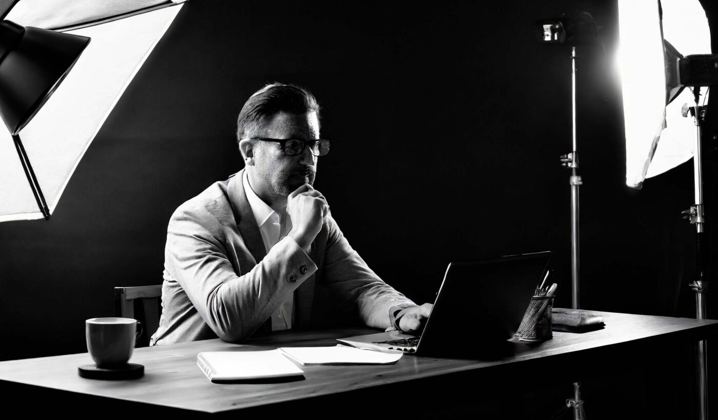
After everything is set up and working correctly, the last step would be to get a cup of coffee, sit down, think about the situation, and reassess if there is anything left out or forgotten. And then, of course, test drive everything with critical colors and maybe ask someone to have a look if you’re not sure about something. The last step is to set up the monitor brightness to a level where neutral grey is shown as bright as a neutral grey reference next to the monitor.
Are there any further options to optimize the viewing conditions while editing?
There is not much more one can do. A good point is to allow your eyes to adapt to the light for about 30 minutes. Take breaks, and don’t overstrain your eyes and body in front of a screen. Learn to see the slightest color casts.
Did you have any other experiences — real-life learnings, so to speak, that you would like to pass on?
There are quite a few. The most important are:
- Never try to examine if a calibration result is good enough if you have several ‘light’ sources and output devices displaying the same image as printed. Especially if you try to estimate if the print profile is good enough by eye, and you have both a calibrated and a not calibrated display in front of you. Everything will be off, including the calibrated display. Switched off the uncalibrated display, and everything was fine.
- Don’t try to calibrate a screen to a specific Gamut, except you have to because of company guidelines or soft proofing for a large printing press with a smaller gamut than AdobeRGB.
- The soft proof will not work with fine art inkjet printers unless there are screens with a way larger gamut than AdobeRGB (because printers can have a larger gamut – depending on the used papers and inks – than high-end displays with AdobeRGB).
If you want to use the brightest and most intense colors an inkjet printer can produce, use ProPhotoRGB. I’m happy to share some test prints if you don’t believe that. A good resource about that is the profile white papers, including the math for color conversions.
With which sources and specialist literature can you deepen your knowledge, divided into beginners to professionals? Is there also a YouTube channel, a podcast, or an audiobook on the subject that you recommend?
If you really want to dig into that topic, try to read and understand some whitepapers on color.org. There you will find information about color conversions (yep, the math behind that magic!), proof conditions, etc. And there is a good collection of knowledge from Bruce Lindbloom on brucelindbloom.com.
Don’t try to take shortcuts; they will get you everywhere except in the right direction. As lighting is a part of color management, get confident in that field, and stay away from people who can’t / don’t want to share resources or prove their statements.
Outro
Thank you, Paul, for helping to improve the quality of image processing. What is the best way to contact you if people want to produce printing projects with you?
I like to get in touch with people, so the easiest way is to call or write a short email to mail@fineartprint.pro, whatever you prefer. More info on https://www.fineartprint.pro
Make sure to check out part 2 and 3 as soon as these are available on our blog page.
Do you have any suggestions or additions, is this post out of date, or have you found any mistakes? Then we look forward to your comment.
You are welcome to share this post. We are very grateful for every recommendation.