MK Retouching investigated different Vogue Paris on retouching labels in 2019 after the first investigation in 2018. Here you can read about the latest developments and possible forecasts.
It is recommended to read the general legal context and the first study from 2018 to understand the overall meaning.
In the last study, it could be determined that the advertisements do not change depending on the magazine.
Therefore, this time only Vogue Paris was chosen as the magazine that had the most retouching labels in the past.
The following different Vogue Paris magazines were examined several times.
- VOGUE Paris (Print), 994, February 2019
- VOGUE Paris (Print), 996, April 2019
- VOGUE Paris (Print), 997, Mai 2019
- VOGUE Paris (Print), 998, June/July 2019
Amount of Retouching labels
A total of 38 retouching labels were found on advertisements from 18 brands in the 4 magazines mentioned above, with the words “Photographie retouchée”, “Photographie Retouchée”, “Photo retouchée” or “Photographies Retouchées”.
The average number of retouching labels per magazine has increased slightly. In order to make a valid statement, however, not only the quantitative increase must be considered, but also the relationship between images with retouching label and images without retouching label (percentage).
Brand-Variety
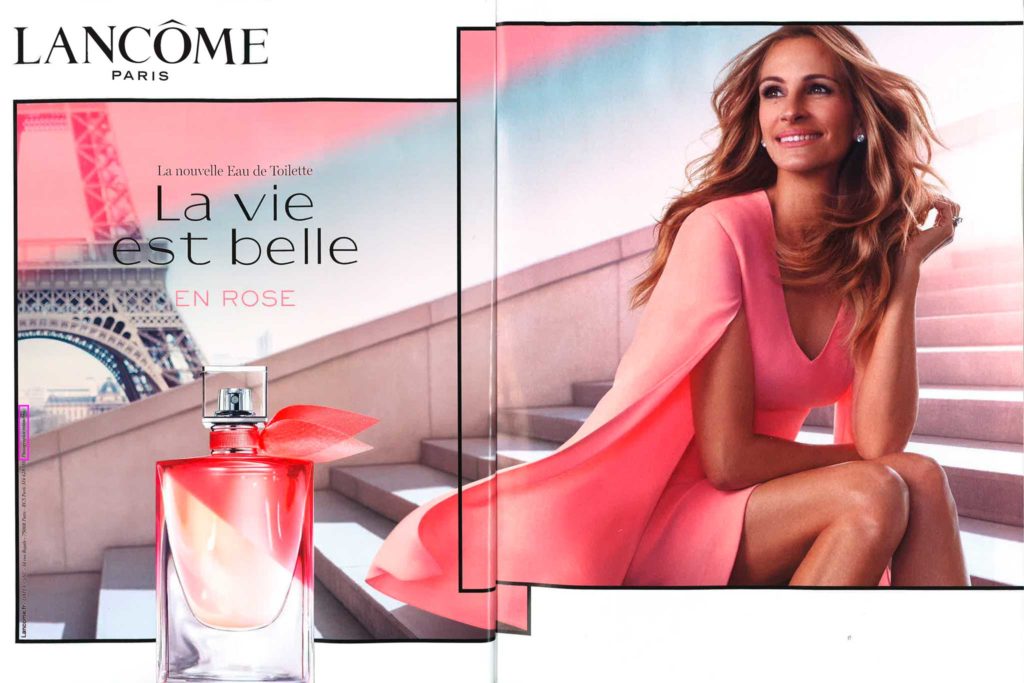
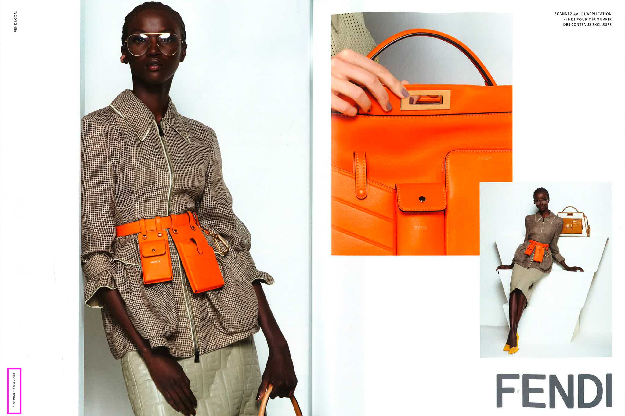
As already described, 18 different brands were identified that used a retouching label. The ones with the highest amount of retouching labels in this study were Saint Laurent (5), FENDI (4), DIOR (4), Lancôme (4), Estee Lauder (3), and HERMES (3).
The two studies gave a good insight into the brand strategies. The following list gives an example of the biggest brands and their use of the retouching label.
- Brands that always use retouching label(s):
Saint Laurent, Lancôme, HERMES - Brands strictly without retouching label(s):
Gucci, Chanel, Dolce & Gabbana, MaxMara, Moschino, Chloé - Brands with a reduced number of retouching instructions compared to last year:
Prada, Louis Vuitton, Armani, MIU MIU, Dior
In comparison, there were also some brands that did less advertising and some that did more advertising than in the previous study.
Michael Kors did less advertising; therefore the number of retouching labels decreased as well. FENDI did more advertising; that’s the reason why FENDI had almost the most retouching labels in 2019.
Further findings
The monthly editions have a relatively constant amount of retouching labels (Figure 1). At first glance, one can assume that the advertisements are very well chosen to keep the number consistent. Compared with the previous study, however, this thesis can be refuted.
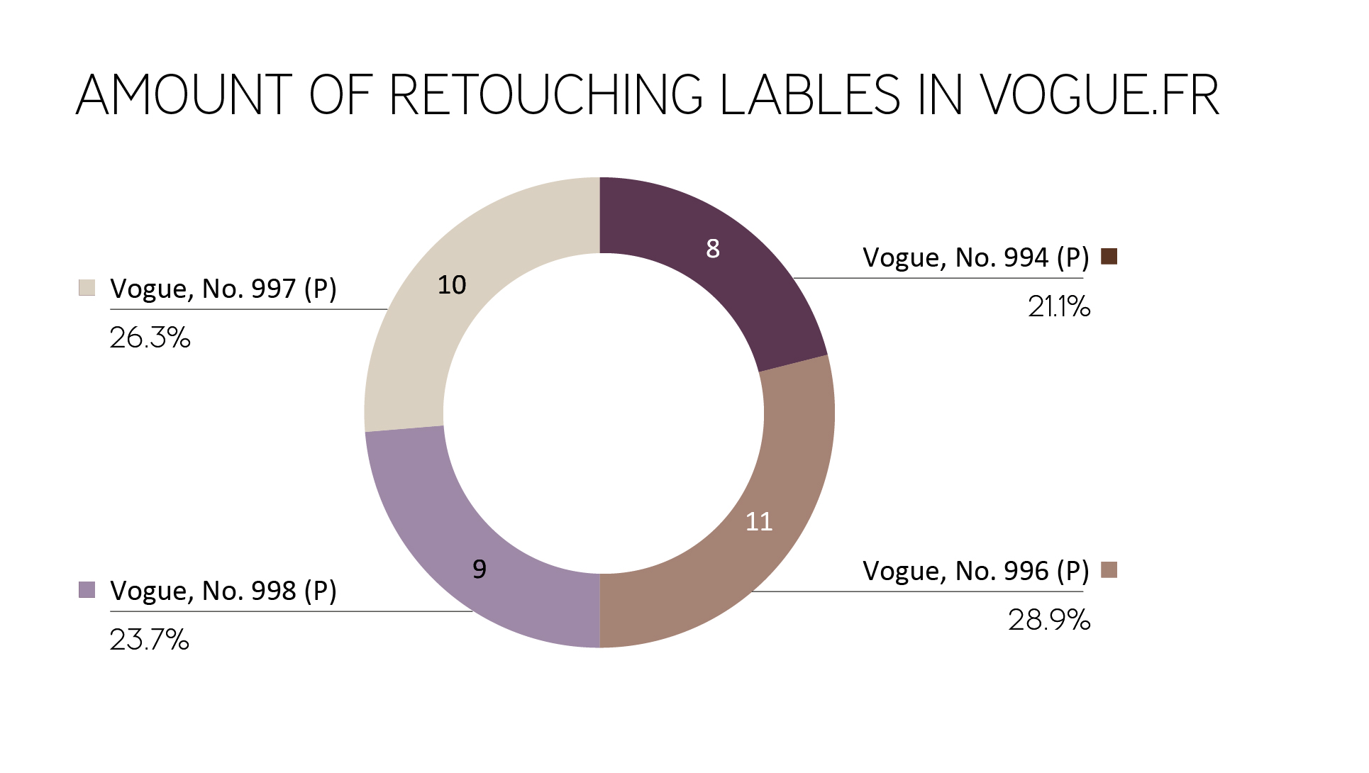
Figure 1: Amount of retouching labels in different editions of Vogue Paris
Placement on the magazine pages
Likewise, the placement of the retouching labels on the magazine pages was checked. As a reference point, the magazine page with the retouching label was used.
As shown in Figure 2, there is a strong preference for placement in the bottom left or top left, similar to 2018. Nevertheless, the number of retouching labels in the bottom left, middle left, top left decreased, and the lower right position is seen more often.
The consumer can’t focus on the left part of the ad or the left part of the magazine page anymore, the chance of finding the retouching label is almost equal on the left and the right side.
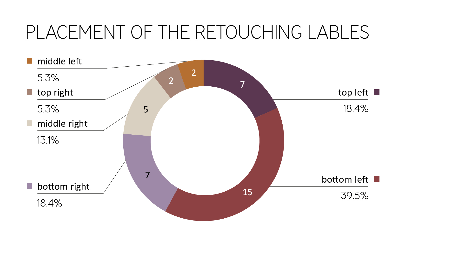
Figure 2: Placement of the retouching labels (magazine page as reference point)
Furthermore, the hint has less often been found near the fold. This is an overall improvement for recognizing the retouching label.
As in the previous year, it could be observed that the reference position was often placed as distanced as possible from the center or the model.
In Figure 3 and 4 you can see further examples of the model being located on the right page of the magazine and the retouching label on the left one.
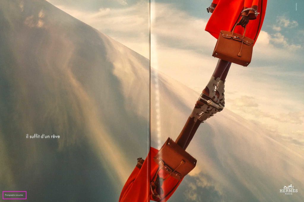
Figure 3: Distance between model and retouching label (Vogue Paris, No. 996)
Figure 4: Distance between model and retouching label (Vogue Paris, No. 996)
Alignment on the magazine page
In this section, the orientation of the text is been discussed. It is much harder to read labels that are not aligned horizontally because they are contradicting the usual reading habits. Whether a retouching label should be placed vertically or horizontally is not clear from the corresponding legal text.
Since 2018 the amount of vertically placed labels raised from 54% up to 71.1%.
Similar to the previous study, retouching labels were surrounded by other information.
In 2018 87% of the retouching labels weren’t surrounded by additional information. In 2019 this amount decreased to 63%.
That means the retouching labels are harder to read and to find than in the previous study (Figure 5).

Figure 5: Example of vertically used retouching label surrounded by information (Vogue Paris, No. 996)
Average size
The printed retouching labels were measured. For vertical retouching labels, the longer side was defined as the width and the shorter side as the height to achieve a precise average.
The average retouching label in the investigated print magazines this year (2019) was:
- width: 25.6 mm (2018: 26.1 mm)
- height: 1.5 mm (2018: 1.7 mm)
The typography of the Retouching label
- Typographically, three parameters were examined. As in the previous study, the majority of the retouching information in magazines consists of sans-serif fonts. Serif typefaces are still only used by a few brands such as Lancôme (and Jean Paul Gaultier).
- Regarding the font set, the lowercase option “photographie retouchée” or “photo retouchée” almost disappeared (only one retouching label). Capital letters (31% ->42.1%) and the combination of the normal capital letter and lowercase letters (42.5% ->55.3%) increased equally.
- If we take a look at the font style of the retouching label, it is always used as a regular font. The only exception is still Lancôme (italic).
Contrast values
Another aspect of the investigation was the contrast values from text to the background. Similar to the previous year, there were some examples of insufficient contrast between background and text.
The following campaign by Saint Laurent (Figure 6, Figure 7) is an excellent example of a lack of contrast between background and font (dark gray on black, dark gray on light gray).
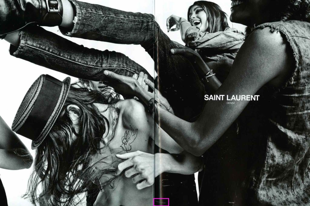
Figure 6: Example of bad contrast between background and text (Vogue Paris, No. 998)
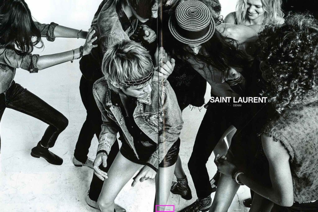
Figure 7: Example of bad contrast between background and text (Vogue Paris, No. 998)
Recognition value
Overall, there is only a low recognition value, since the reference in the positioning and design differs depending on the brand. In some cases, there were even different versions within the brands (different campaign styles). Labels within a magazine are therefore different in its appearance and must first be searched for. The same ads in various magazines are identical.
In general, one can see that the visibility of the retouching label was not improved from 2018 until 2019. On the contrary, it has even gotten a little worse/invisible.
Effectiveness/Credibility of the labeling obligation
It is noticeable, the advertising campaigns, which contain several pictures (Figure 8, Figure 9) or many women at once (Figure 10), had only one retouching label (which used singular in wording, not “Photographies retouchées”). This raises the question of which and how many images of the campaign are affected by the change in body shape. Often, however, this is not noticeable in comparison. As a result, the following conclusions are drawn for the consumer:
a) The changes in image processing concerning the body are minimal when tagged images are not visibly different from unmarked ones. This means that the models are depicted almost with their natural body shape; the beauty ideal is getting strengthened again. The label loses its original purpose.
b) Every picture is doubted. Either not all changes made are marked by the label, or too many labels are used similar to general use of the label to avoid potential costs of not marking in principle.

Figure 8: Example of many campaign images but only one retouching label (Vogue Paris, No. 994)
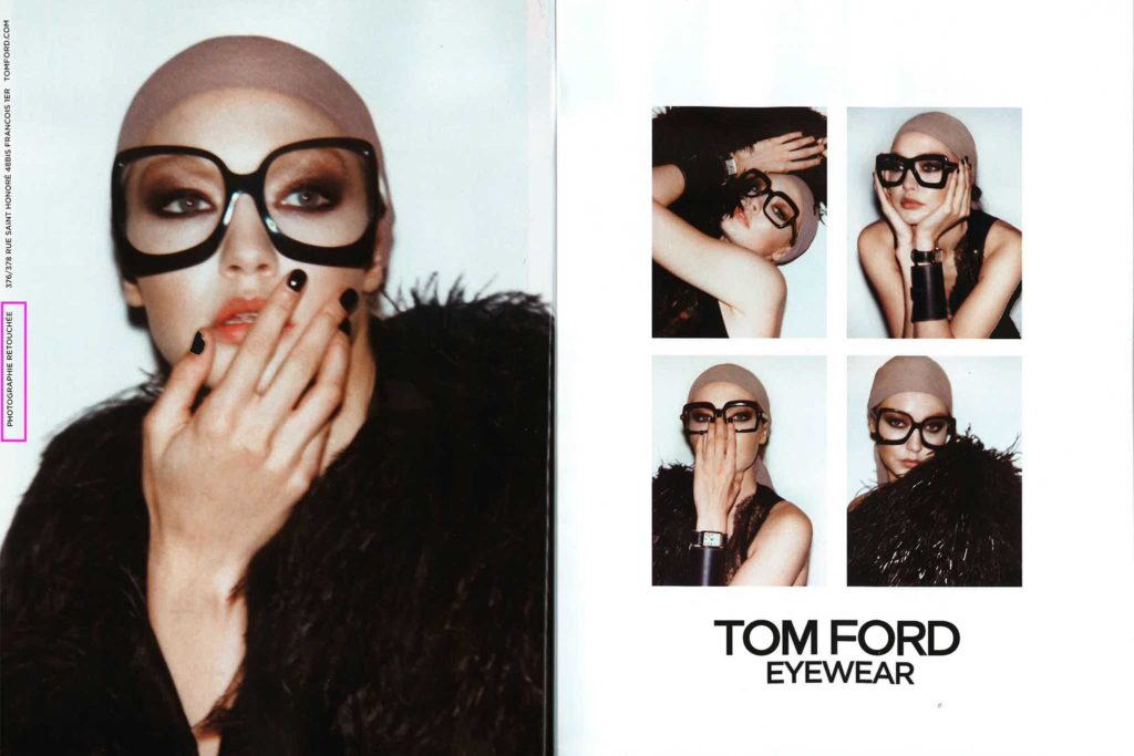
Figure 9: Example of many campaign images but only one retouching label (Vogue Paris, No. 996)
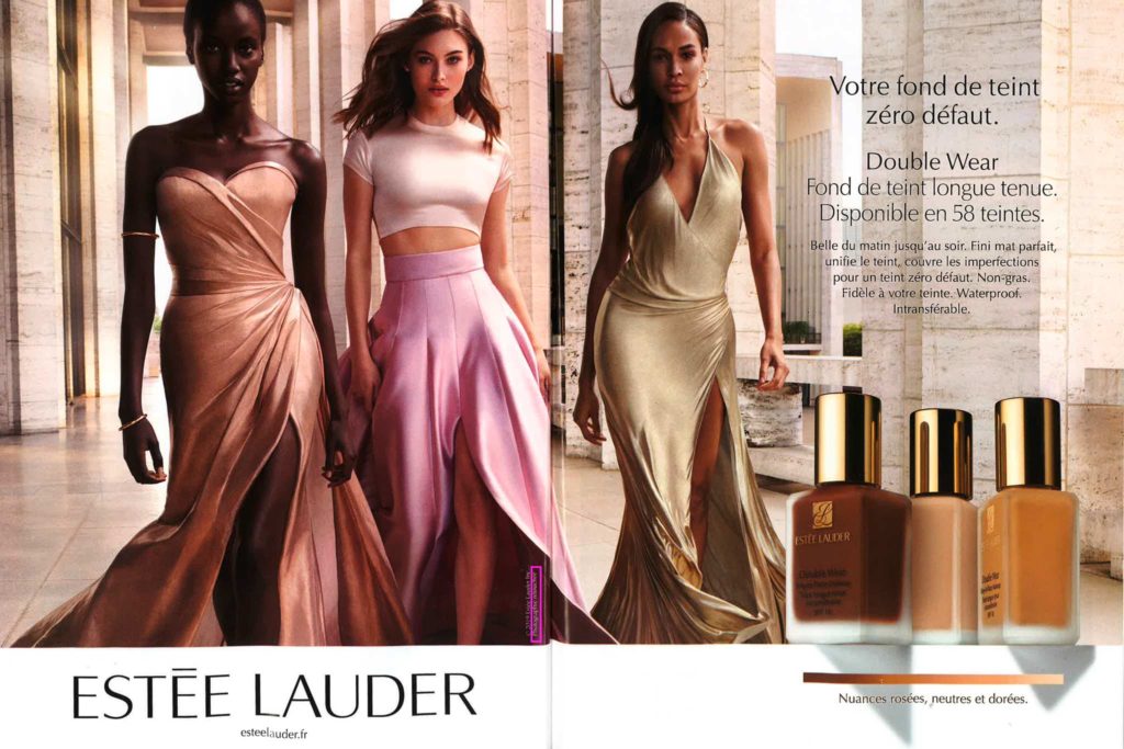
Figure 10: Example of many models in one image but only one retouching label (singular) (Vogue Paris, No. 997)
To avoid unwanted conclusions from consumers, legislation should be more detailed about certain cases.
Also, an example of the wrong usage of the label was found. It is evident that a clear product image can not show changed body proportions of a woman.
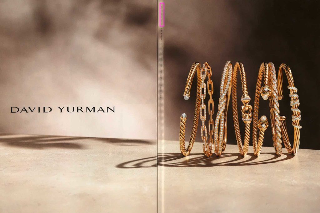
Figure 11: Example of wrong retouching label usage (Vogue Paris, No. 997)
Are you a fan of Vogue? Those might be interesting for you:
Do you have any suggestions, additions, is this post out of date, or have you found any mistakes? Then we look forward to your comment.
You are welcome to share this post. We are very grateful for every recommendation.
