No right-click allowed. © Mareike Keicher

Tag : image credibility

Magazine page (Fendi advertising) with retouching lable

Presence analysis of the retouching label “Photographie retouchée” 2019

MK Retouching investigated different Vogue Paris on retouching labels in 2019 after the first investigation in 2018. Here you can read about the latest developments and possible forecasts.

It is recommended to read the general legal context and the first study from 2018 to understand the overall meaning.

In the last study, it could be determined that the advertisements do not change depending on the magazine.
Therefore, this time only Vogue Paris was chosen as the magazine that had the most retouching labels in the past.

The following different Vogue Paris magazines were examined several times.

  • VOGUE Paris (Print), 994, February 2019
  • VOGUE Paris (Print), 996, April 2019
  • VOGUE Paris (Print), 997, Mai 2019
  • VOGUE Paris (Print), 998, June/July 2019

Amount of Retouching labels

A total of 38 retouching labels were found on advertisements from 18 brands in the 4 magazines mentioned above, with the words “Photographie retouchée”, “Photographie Retouchée”, “Photo retouchée” or “Photographies Retouchées”.

The average number of retouching labels per magazine has increased slightly. In order to make a valid statement, however, not only the quantitative increase must be considered, but also the relationship between images with retouching label and images without retouching label (percentage).

Brand-Variety

As already described, 18 different brands were identified that used a retouching label. The ones with the highest amount of retouching labels in this study were Saint Laurent (5), FENDI (4), DIOR (4), Lancôme (4), Estee Lauder (3), and HERMES (3).
The two studies gave a good insight into the brand strategies. The following list gives an example of the biggest brands and their use of the retouching label.

  1. Brands that always use retouching label(s):
    Saint Laurent, Lancôme, HERMES
  2. Brands strictly without retouching label(s):
    Gucci, Chanel, Dolce & Gabbana, MaxMara, Moschino, Chloé
  3. Brands with a reduced number of retouching instructions compared to last year:
    Prada, Louis Vuitton, Armani, MIU MIU, Dior

In comparison, there were also some brands that did less advertising and some that did more advertising than in the previous study.
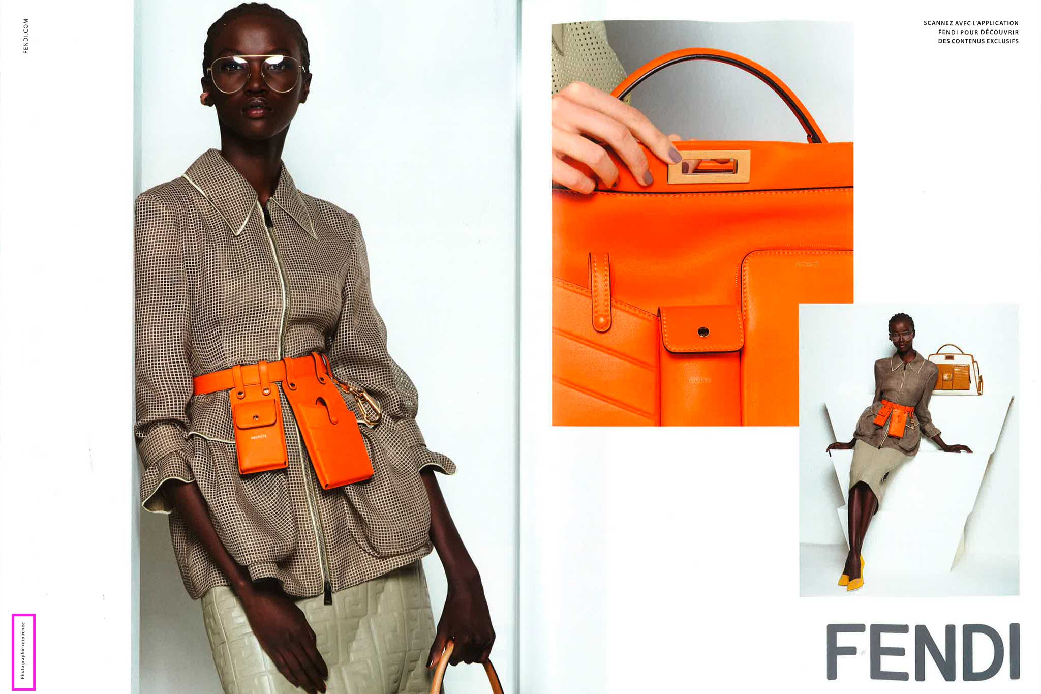
Michael Kors did less advertising; therefore the number of retouching labels decreased as well. FENDI did more advertising; that’s the reason why FENDI had almost the most retouching labels in 2019.

Further findings

The monthly editions have a relatively constant amount of retouching labels (Figure 1). At first glance, one can assume that the advertisements are very well chosen to keep the number consistent. Compared with the previous study, however, this thesis can be refuted.

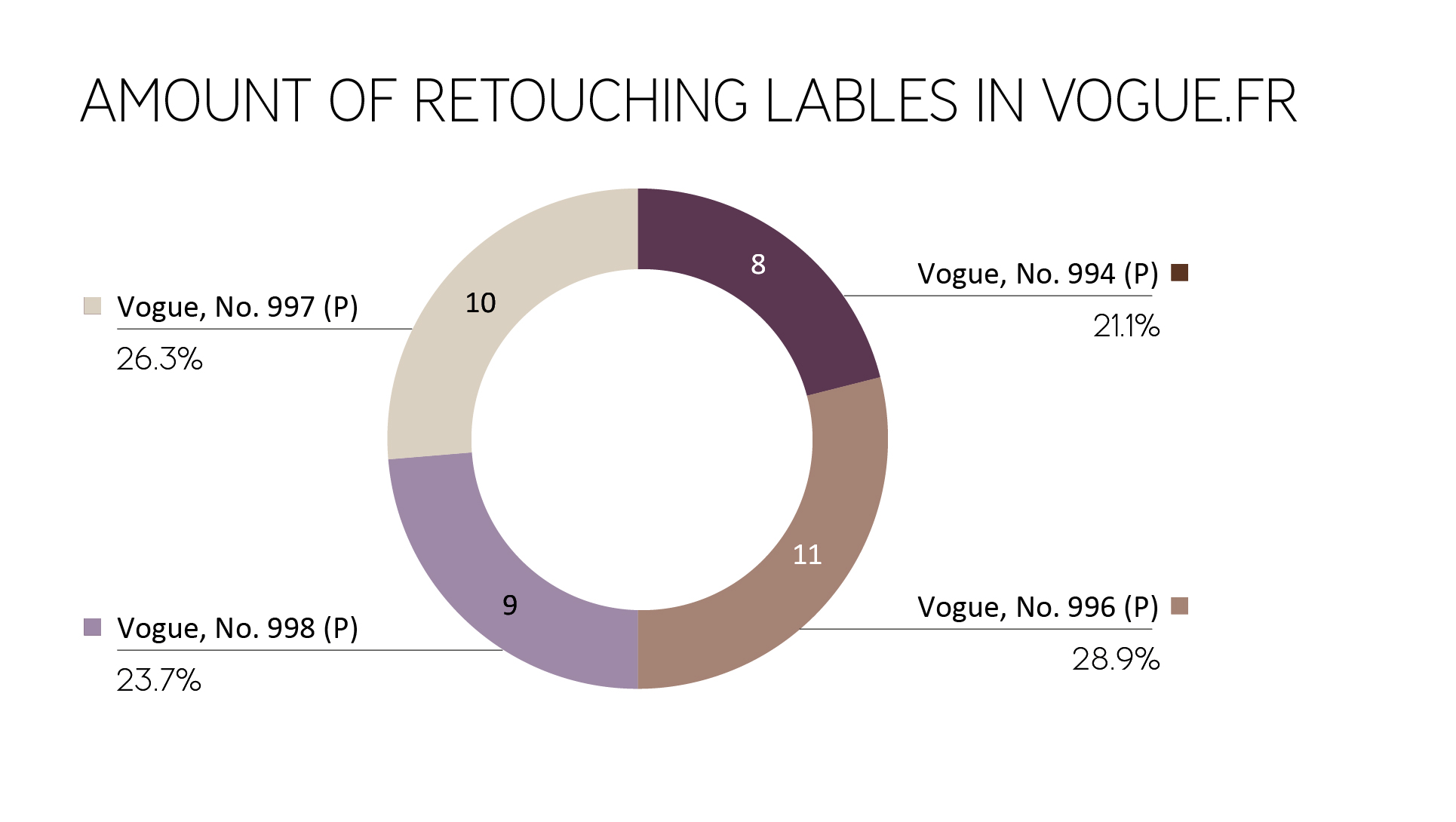
Figure 1: Amount of retouching labels in different editions of Vogue Paris

Placement on the magazine pages

Likewise, the placement of the retouching labels on the magazine pages was checked. As a reference point, the magazine page with the retouching label was used.

As shown in Figure 2, there is a strong preference for placement in the bottom left or top left, similar to 2018. Nevertheless, the number of retouching labels in the bottom left, middle left, top left decreased, and the lower right position is seen more often.
The consumer can’t focus on the left part of the ad or the left part of the magazine page anymore, the chance of finding the retouching label is almost equal on the left and the right side.

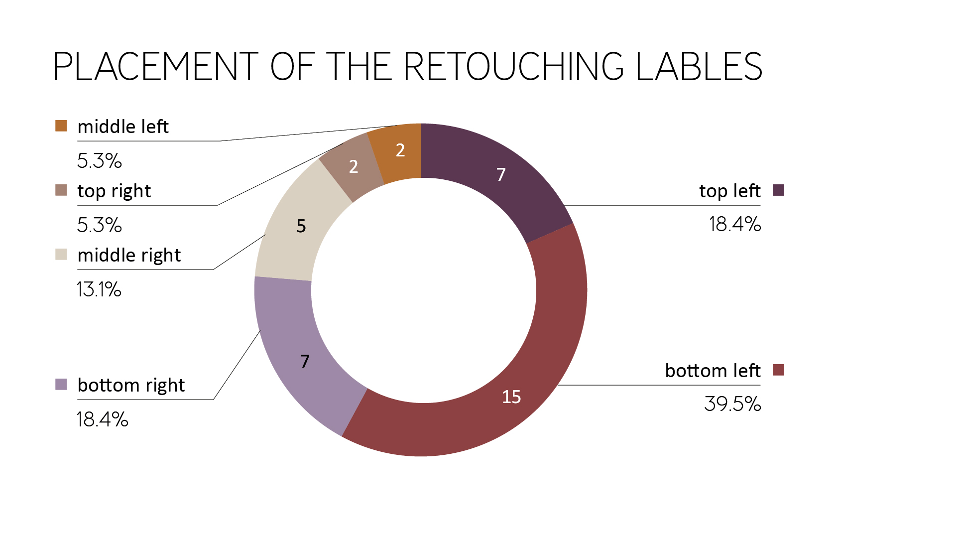
Figure 2: Placement of the retouching labels (magazine page as reference point)

Furthermore, the hint has less often been found near the fold. This is an overall improvement for recognizing the retouching label.

As in the previous year, it could be observed that the reference position was often placed as distanced as possible from the center or the model.
In Figure 3 and 4 you can see further examples of the model being located on the right page of the magazine and the retouching label on the left one.

Figure 3: Distance between model and retouching label (Vogue Paris, No. 996)

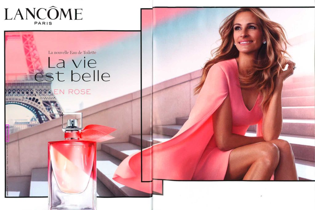
Figure 4: Distance between model and retouching label (Vogue Paris, No. 996)

Alignment on the magazine page

In this section, the orientation of the text is been discussed. It is much harder to read labels that are not aligned horizontally because they are contradicting the usual reading habits. Whether a retouching label should be placed vertically or horizontally is not clear from the corresponding legal text.

Since 2018 the amount of vertically placed labels raised from 54% up to 71.1%.
Similar to the previous study, retouching labels were surrounded by other information.
In 2018 87% of the retouching labels weren’t surrounded by additional information. In 2019 this amount decreased to 63%.

That means the retouching labels are harder to read and to find than in the previous study (Figure 5).

Figure 5: Example of vertically used retouching label surrounded by information (Vogue Paris, No. 996)

Average size

The printed retouching labels were measured. For vertical retouching labels, the longer side was defined as the width and the shorter side as the height to achieve a precise average.
The average retouching label in the investigated print magazines this year (2019) was:

  • width: 25.6 mm (2018: 26.1 mm)
  • height: 1.5 mm (2018: 1.7 mm)

The typography of the Retouching label

  • Typographically, three parameters were examined. As in the previous study, the majority of the retouching information in magazines consists of sans-serif fonts. Serif typefaces are still only used by a few brands such as Lancôme (and Jean Paul Gaultier).
  • Regarding the font set, the lowercase option “photographie retouchée” or “photo retouchée” almost disappeared (only one retouching label). Capital letters (31% ->42.1%) and the combination of the normal capital letter and lowercase letters (42.5% ->55.3%) increased equally.
  • If we take a look at the font style of the retouching label, it is always used as a regular font. The only exception is still Lancôme (italic).

Contrast values

Another aspect of the investigation was the contrast values from text to the background. Similar to the previous year, there were some examples of insufficient contrast between background and text.
The following campaign by Saint Laurent (Figure 6, Figure 7) is an excellent example of a lack of contrast between background and font (dark gray on black, dark gray on light gray).

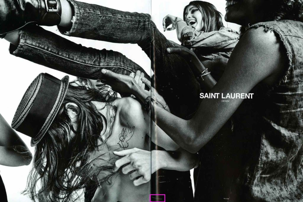
Figure 6: Example of bad contrast between background and text (Vogue Paris, No. 998)

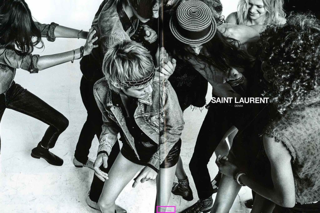
Figure 7: Example of bad contrast between background and text (Vogue Paris, No. 998)

Recognition value

Overall, there is only a low recognition value, since the reference in the positioning and design differs depending on the brand. In some cases, there were even different versions within the brands (different campaign styles). Labels within a magazine are therefore different in its appearance and must first be searched for. The same ads in various magazines are identical.

In general, one can see that the visibility of the retouching label was not improved from 2018 until 2019. On the contrary, it has even gotten a little worse/invisible.

Effectiveness/Credibility of the labeling obligation

It is noticeable, the advertising campaigns, which contain several pictures (Figure 8, Figure 9) or many women at once (Figure 10), had only one retouching label (which used singular in wording, not “Photographies retouchées”). This raises the question of which and how many images of the campaign are affected by the change in body shape. Often, however, this is not noticeable in comparison. As a result, the following conclusions are drawn for the consumer:

a) The changes in image processing concerning the body are minimal when tagged images are not visibly different from unmarked ones. This means that the models are depicted almost with their natural body shape; the beauty ideal is getting strengthened again. The label loses its original purpose.

b) Every picture is doubted. Either not all changes made are marked by the label, or too many labels are used similar to general use of the label to avoid potential costs of not marking in principle.

Figure 8: Example of many campaign images but only one retouching label (Vogue Paris, No. 994)

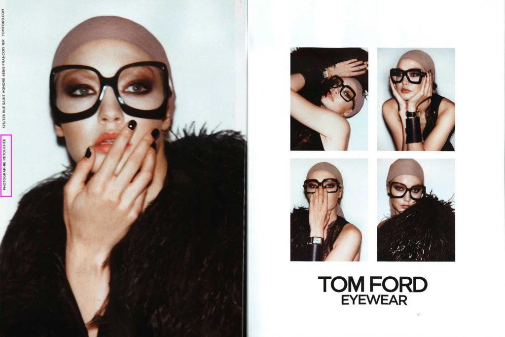
Figure 9: Example of many campaign images but only one retouching label (Vogue Paris, No. 996)

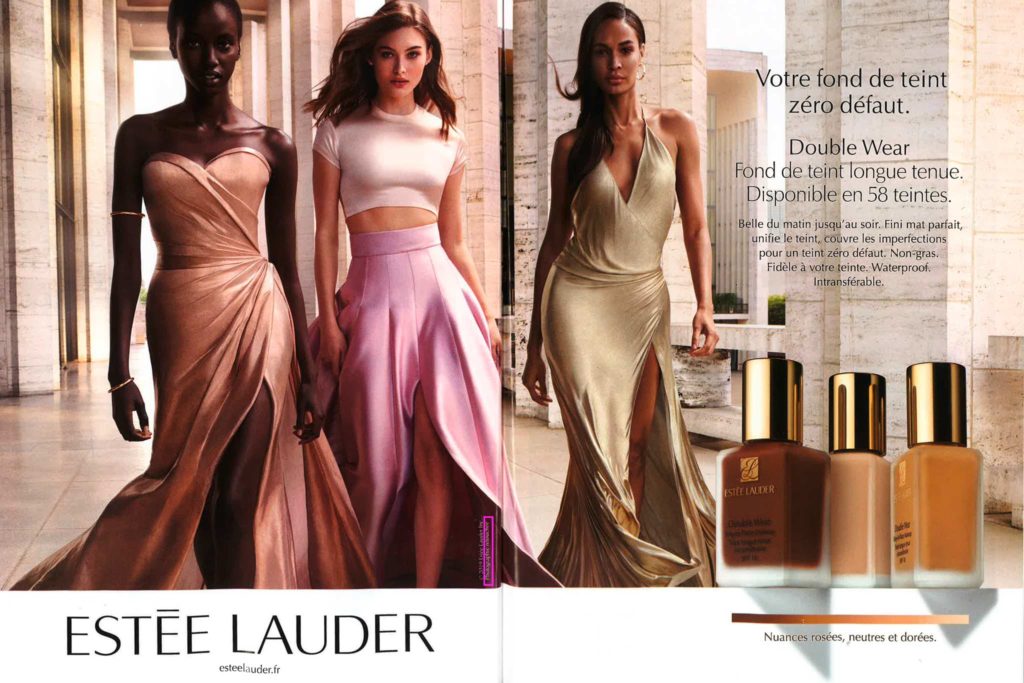
Figure 10: Example of many models in one image but only one retouching label (singular) (Vogue Paris, No. 997)

To avoid unwanted conclusions from consumers, legislation should be more detailed about certain cases.

Also, an example of the wrong usage of the label was found. It is evident that a clear product image can not show changed body proportions of a woman.

Figure 11: Example of wrong retouching label usage (Vogue Paris, No. 997)

Are you a fan of Vogue? Those might be interesting for you:


Do you have any suggestions, additions, is this post out of date, or have you found any mistakes? Then we look forward to your comment.
You are welcome to share this post. We are very grateful for every recommendation.

The Power of Images in Advertising: How Our Brains Process People Images

“Our language culture is in a rapid transition to a visual culture”
(Franke, 1997, quoted in Gläßel, 2010, p. 17).

Given the quote’s age, we already live in visual culture. How do our brains process images of the ideal body, and what tools and biologically programmed patterns does advertising use to make their images more effective? We will discuss these questions in the following sections.

Credibility of images

In addition to the impressive effect of images, there is another dimension – credibility. From the start, photography has created an impression of being objective and authentic; in other words, of capturing the real world (Schied, 2003, quoted in Gläßel, 2010, p. 18). This objectivity is associated with credibility. Similarly, images, particularly striking photographs, are more credible than linguistic information (Weinbub, 2012, p. 47). However, the effect of images is not only due to the promise of being authentic but also to the human perception system (Gläßel, 2010, p. 18), which we will further discuss in the following section.

Perceptual processes

Visual perception is most important to humans because it communicates about 90% of all sensory information (Mayer, Däumer & Rühle, 1982, quoted in Gläßel, 2010, p. 20). Visual perception is defined as a process that begins with the absorption and automatic selection of visual stimuli from the outside world of an individual. It also involves further processing and stimuli storage (Gläßel, 2010, p. 20). Why pictures are particularly suitable for commercial use and how the perception process can justify this is shown in the following section.

Def. Stimuli
The word stimuli refers to physical or sensory input that can elicit a reaction or response from an organism or a system. Stimuli can be anything from light, sound, touch, or temperature changes to more complex inputs such as thoughts, emotions, or social cues. The response to a stimulus can be automatic or learned, and it can vary in intensity depending on the nature and strength of the stimulus. In psychology and neuroscience, stimuli are often used to study the behavior and brain activity of humans and other animals in response to different types of inputs.

Low­-Involvement­-Situation

Today’s society has an ever-increasing amount of information that is mediated through the media. This has already led to a kind of efficiency increase when it comes to recording visual stimuli: the information offered is more superficially and selectively absorbed. In this context, one also speaks of low-involvement situations. These are situations where recipients are not interested in advertising, they ignore it, or they only perceive it incidentally (Brosius & Fahr, 1998, RöU, 1995, quoted in Gläßel, 2010, p. 14).

This increases the competitive pressure and the pressure to use more and more intrusive forms for advertising purposes – those that stand out and that can be picked up and processed as quickly as possible (KroeberRiel, 1996, quoted in Weinbub, 2012, p. 35) or forced advertising which you can only escape by making payments. Due to the short contact time between advertising and the recipients of 1.7 seconds (Dorer & Marschik, 2002, quoted in Gläßel, 2010, p. 14), a form of communication of the content must be used that works quickly.

Pictures can be processed with little cognitive involvement (Weinbub, 2012, p. 45). The process of viewing images is comparable to the usual visual consumption of communication content in our daily lives (Hunziker, 1996, quoted in Gläßel, 2010, p. 7). It only takes a few moments to understand the theme of an image. An average time of 1.5 to 2.5 seconds is needed to capture a picture of medium complexity so that it can be recognized later (KroeberRiel, 1990, quoted in Gläßel, 2010, p. 19). That’s why it is not surprising that images are called “quick shots into the brain” (KroeberRiel, 1990, quoted in Gläßel, 2010, p. 19).

Hemisphere theory

The hemisphere theory describes how the two halves of the brain process different types of information. The left half processes text in a logical and analytical way, while the right half processes images and emotions unconsciously (KroeberRiel, 1996, cited from Weinbub, 2012, pp. 46-47). When people view an advertisement that contains both text and images, the images tend to hold their attention for longer, as they require less processing time than text (KroeberRiel, 1993, cited from Gläßel, 2010, p. 20). This means that people unconsciously perceive and process images, which can influence their response to advertisements, particularly those that contain images of attractive women.

Image processing and evoked emotions

The processing of images and emotions is related because they are both processed in the right half of the brain (KroeberRiel, 1990, cited by Weinbub, 2012, pp. 46-47). Advertising images often aim to evoke emotions in the viewer, especially through the use of faces, which are particularly effective at eliciting emotional responses (Doelker, 2002, quoted in Weinbub, 2012, p. 46).

Emotional trigger

Attractive images of women are particularly well-suited for emotional conditioning, and erotic or family-oriented images can also trigger emotional reactions (Weinbub, 2012, p. 41).

Schemes

Schemes are the basis for the rapid perception of images. If an image is similar to a stored idea, it is quickly recognized and classified.

Scheme of eyes

The scheme of eyes is particularly important because it triggers emotions automatically and is one of the strongest biological schemes (Weinbub, 2012, p. 47). The eyes of the depicted model are the first focal point that attracts the attention of the viewer (Schweiger & Schrattenecker, 2005, quoted in Gläßel, 2010, p. 31).

Scheme of secondary sexual characteristics

Similarly, the scheme of secondary sexual characteristics, such as a slim waist, red cheeks and lips, breasts, and buttocks, is relevant and is triggered involuntarily and automatically through the biologically innate sexual motives of humans (see Brosius & Fahr, 1998; Schweiger & Schrattenecker, 2005, quoted in Gläßel, 2010, p.32).
Not only male recipients are not opposed to female sexiness on advertising images, but they also affect women. However, these prefer more subtle images (Gläßel, 2010, p. 32).

In advertising, it is a commonly used image scheme, while women are displayed much more often in this way. For example, Reichert & Carpenter (2004) assume that about half of all ads (Gläßel, 2010, p. 32) use this scheme, while Jäckel et al. (2009) already imply more than 70% of the cases in which female bodies are presented naked and uncovered (Jäckel et al., 2009, p. 38).

In addition to the emotional use of the scheme, such an advertising image should show how attractive, beautiful, and popular a woman can be if she carries/ uses/ owns the product (Moser, 1997, quoted in Gläßel, 2010, p. 32).

Image perception: People

People are the most important emotional key stimuli, as human communication is vital for survival (Weinbub, 2012, p. 50). When advertisements combine people and products, the “friend” scheme becomes active (Gläßel, 2010, p. 31), where the friend in the image is given more positive traits and abilities than others. The observer imitates the friend and builds a sense of group affiliation (KroeberRiel, 1998, quoted in Gläßel, 2010, p. 31). To be effective, the advertiser must take into account the social interactions and behavior between people, which is defined by social techniques (KroeberRiel, 1993, cited by Gläßel, 2010, p. 30).

Halo effect

Another effect from the attractiveness research is used subliminally in advertisements: The halo effect. This occurs as soon as above-average beautiful representations of women are seen (Klaus, 2005, quoted in Gläßel, 2010, p. 36).
The halo effect has the consequence that a depicted beautiful person is assessed in all respects more positively than comparatively unattractive people (EbnerGathmann & Wiedermann, 2002, quoted after Gläßel, 2010, p. 30; Davids 2007, cited after Weinbub, 2012, p. 23; Schemer, 2003, p. 525). They seem more sympathetic, intelligent, morally correct, and seem to be better acquainted with the advertised product (see Hanko, 2002, p. 145, quoted in Gläßel, 2010, p. 30). Their observers, with sufficient similarity, are more willing to imitate the behavior and to buy the product (BerglerPörzgen & Harich, 1992).

Since the model on the advertising image and the advertised product are side by side, the characteristics and emotions attributed to the model transfers to the product (Gläßel, 2010, p. 28) and is taken into consideration for the product evaluation. Even though both elements seem to have nothing to do with each other, the pattern of the spatial linkage gives rise to a transfer of objective or emotional qualities (Weinbub, 2012, pp. 49-50).

Advertising principle: Young age

A cult of youthfulness characterizes the aesthetic ideal of our time and culture (Weinbub, 2012, p. 14). People who are young, sporty, and attractive are portrayed and recruited, regardless of the media.
The aging human being, despite the demographic change, medially excluded. This confirms the advertising principle that advertising protagonists should, as a rule, be 15 years younger than the target audience mentioned since this corresponds to the approximate desired age (Kaupp, 1997, cited by Jäckel et al., 2009, p. 75).

Sources:

Books:

Theses:

  • Weinbub, A. (2012). Die Macht der Schönheit. Psychologische Auswirkungen von weiblicher Attraktivität in der Anzeigenwerbung auf jugendliche Rezipientinnen (Magisterarbeit). Universität Wien, Wien.

Are you interested in more scientific content? Check out our blog section Deep Dive.
Do you have any feedback, recommendations, or corrections regarding this post? We value your input and would appreciate your comments. Additionally, if you find this post helpful, we encourage you to share it with others. Thank you for your support!