Conny Wallström recently posted a video on YouTube titled “Brightness vs. Luminosity Inside of Photoshop.” Although the topic is somewhat technical, it is fascinating. The video discusses the various ways to transform an image into its black-and-white representation, primarily for use as a help layer during retouching. However, it’s crucial to be careful while doing so, or else color problems may occur.
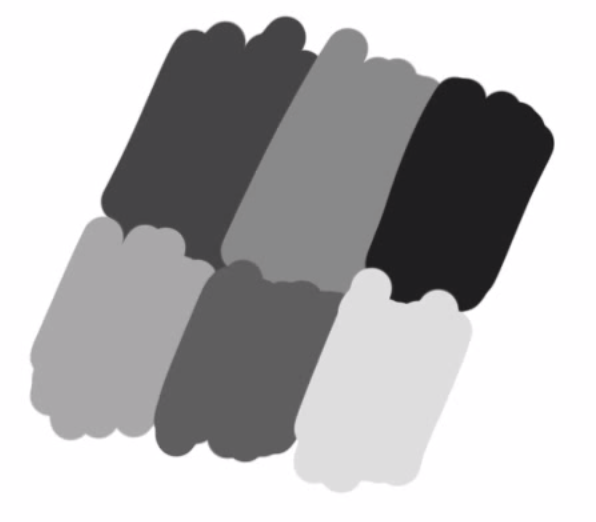
In the video, Conny shows the different interpretation possibilities within Photoshop using an example image with six color areas of different colors:
The initial image:
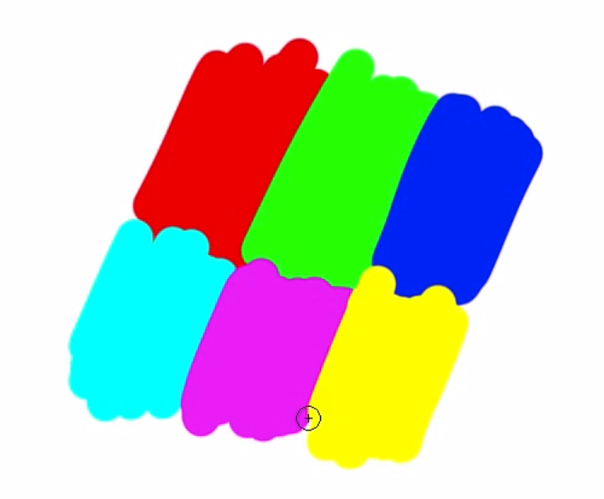
Here we have six color areas of different colors. If we look at red and green in Photoshop, we have the following values:
In the RGB color model:
RED: R=255, G=0, B=0
GREEN: R=0, G=0, B=0RGB = Red, Green, Blue.
In the HSB model, this is what it looks like
RED: H=0°, S=100%, B=100%
GREEN: H=120°, S=100%, B=100%HSB = Hue, Saturation, Brightness.
If the saturation is set to 0% in HSB mode, pure white is the result.
Reduced Saturation
If you make the example shown above black and white via Photoshop’s “Reduce Saturation”, this image results:
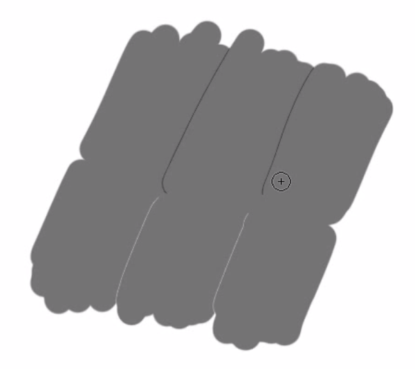
This indicates that this function is based on the HSL (Hue, Saturation, Lightness) color model. In the HSB model, all surfaces would be white; here they are neutral grey.
The “hue/saturation” adjustment layer also uses the HSB model.
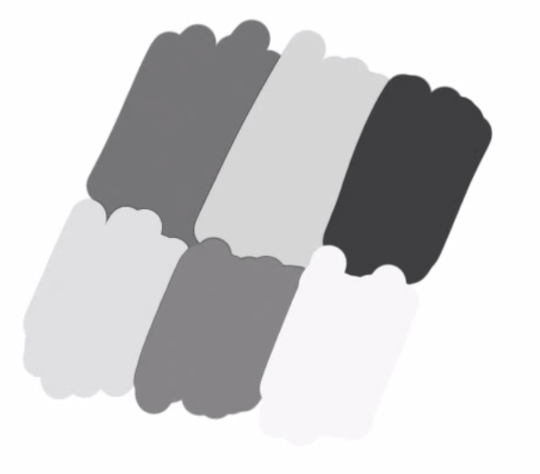
Image Mode “Grayscale”
When an image is desaturated via the menu item “Image -> Mode -> Grayscale,” a different image is created. It is not based on the HSL or the HSB model, but rather on perceived or subjective brightness (luminosity).
Blending Mode “Color”
One way to look at an image in the luminosity equivalent of the colors is to have a black or white color layer above the image in the “color” blending mode.
Luminosity and Brightness: In practice
Why should the difference between luminosity and brightness matter?
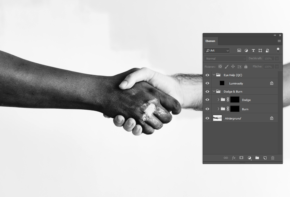
Especially in Dodge&Burn work, it is helpful to hide the colors via a help layer temporarily. However, it is important to choose a help layer that interprets the subjective brightness. This is not the case in HSB mode.
If you work on an image in HSB grayscales, you can change hue (doesn’t matter how much), you won’t see any difference in the image — at least not as long as you have the help layer active. This can destroy a few hours of work.
Conny has provided a lovely example:

Yellow is always perceived brighter than blue.

The same image desaturated in the HSB model, both colors appear equally bright.

In the HSL model desaturated, the subjective brightness is correct again.
Another example of his own:

A gradient across the color gamut.

This image is also only neutral grey in the HSB model.

With the black layer in blending mode “color”, the perceived brightness is maintained.

Here the HUE value was increased by 180° with the hue slider.
HSB conversion: everything turns grey again.

Here again with the layer in “color” blending mode.
Especially in portraits, where we are careful not to get color shifts and/or use a lot of time to correct them, the knowledge of these help layers is very important. Photoshop works in different places with these three modes – you should always be aware of which one is used where.
In conclusion, it’s essential to be aware of which color model is being used in Photoshop and how it affects the image. This article is a partial translation from Conny Wallström’s video and serves as an introduction to the topic. Watch the video to learn more and leave a comment if you have any suggestions or corrections.
Don’t have enough expertise yet? Check out our blog’s Retouching Techniques section for more content.
We look forward to your comment.
You are welcome to share this post. We are very grateful for every recommendation.