No right-click allowed. © Mareike Keicher

Tag : Stefan Kohler

sharpening for billboards

Learn the Optimal Image Sharpening Formula for Printing


We understand the issue at hand – you want to ensure your edited image is clean and print-ready, and therefore, seek appropriate resharpening techniques. Typically, most people tend to open a sharpen filter and adjust the radius until the image appears acceptably sharp. However, it is important to note that images require more sharpening for printing than for screen playback.

But was everything done correctly? Most likely not.

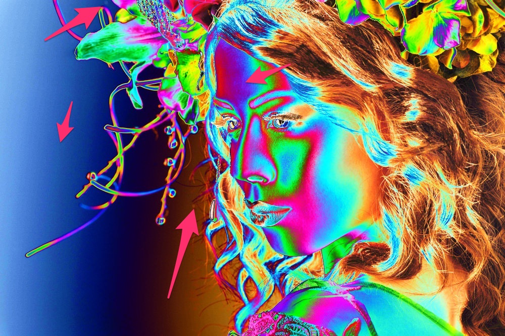
If you frequently work with images and are skilled in retouching, you can easily identify an image that has been over-sharpened. Often, over-sharpening leads to dry-looking hair and overly sharp skin.

The formula of happiness

Fortunately, there is a formula for printing that provides optimal sharpening!

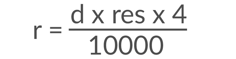
There are several variables to consider when sharpening images:

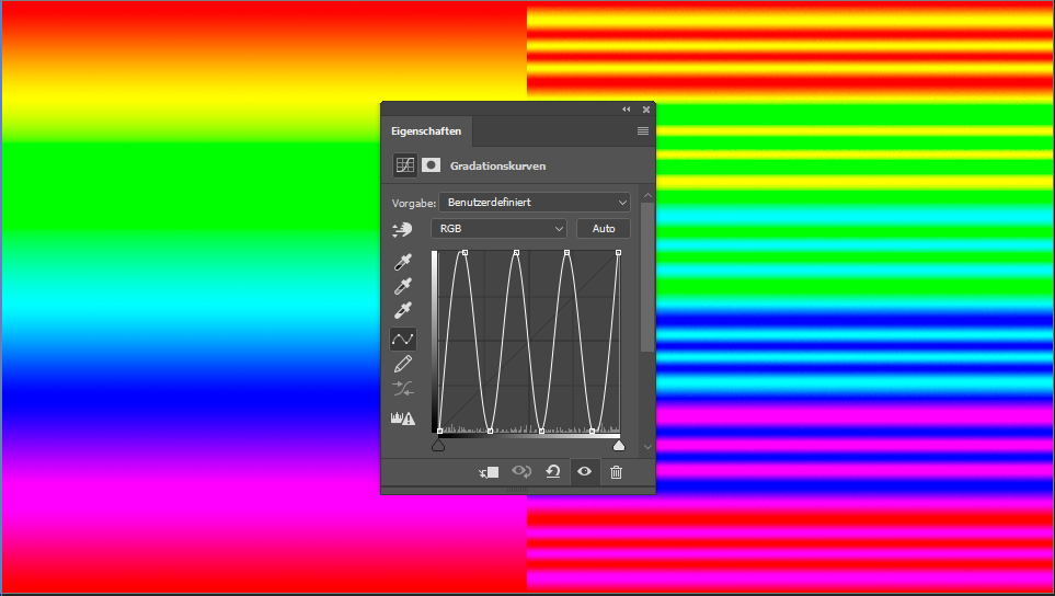
  • The first variable is the radius (r). The radius is a value used in Photoshop’s unsharp masking feature, as well as in sharpening methods in Capture One. The goal is to determine the appropriate radius value.
  • To do this, we must determine the distance (d) from which the image will typically be viewed. For this formula we use the unit inches for the distance (1 inch is equivalent to 2.54 cm).
  • In addition, we measure the image’s resolution (res) – a crucial factor – in dots per inch (dpi).

An Example

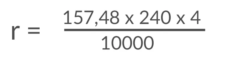
Let’s consider an example to see how this works in practice. Suppose I want to display a stunning family picture on my living room wall and aim for maximum sharpness. My couch is located 4 meters away from the picture, and I sit there every day. This viewing distance of 4 meters corresponds to 157.48 inches. Assuming my image has a resolution of 240 dots per inch (dpi), we can perform the following calculation:

The result of the calculation is a sharpening radius of 15.11808,  rounded to 15.1 since Photoshop does not allow for precise values.

However, it’s important to use this value with caution because it’s based on the assumption of an optimal print medium, which doesn’t always exist. For instance, if you plan to print on canvas or matte paper, you may need to consult with your print provider. As an alternative use techniques such as smart-objects or sharpening on separate layers for more precise adjustments.

Nonetheless, one important takeaway is that the size of the image doesn’t matter when it comes to sharpness. Only the viewing distance and resolution per inch determine the appropriate level of sharpening.

Background information: Why does viewing distance matter in the sharpening process?

The viewing distance is important because it determines which details our eyes can perceive from a distance, and these details should correspond to the sharpness radius. If you find the idea of manually filling out formulas daunting, you can use a convenient calculator available on the German website www.fineartprint.pro, which is worth bookmarking.

The insights in this article are based on the work of Paul Santek, the operator of the mentioned site. I had the pleasure of attending one of his sessions at the BarCamp event, and I was impressed with his knowledge of printing.

If you missed last week’s blog post, you can find additional information on sharpness here.

If you have any suggestions, additions, or notice any errors in this post, please feel free to leave a comment. We appreciate every recommendation and encourage you to share this post.

Photo by ROMBO from Pexels

Sharpening & Contrast: The Ultimate Guide to Achieve Perfectly Sharp Photos

You keep seeing them again and again: images that are over-sharpened to the point of looking ridiculous. Halos around people’s heads make them look like funny versions of Jesus, hair appears super dry, and somehow everything just looks cheap.

So, what exactly is sharpness?

Sharpness refers to the contrast between different elements in an image. This can include differences in brightness at edges and details, as well as color contrast or saturation contrast. In fact, even the content of an image can affect its sharpness.

When sharpening images, Adobe Photoshop looks for edges and enhances them by making one side lighter and the other darker. However, Photoshop doesn’t take color contrast into account – it can only manipulate luminance contrasts:

Let’s take a closer look and do the same thing again:


Take a look at the eye – it looks really sharp in this image. Unfortunately, this comes at the cost of the skin texture, which looks a bit rough, and the hair, which appears dry and straw-like. The hands also seem to be overly bright and have an unnatural glow to them.

Fortunately, there is a great “manual tool” available for adjusting luminance in images: Dodge & Burn. With this tool, you can adjust the brightness of specific areas of the image to bring out more detail and make the image look more polished.

In this particular example, I used Dodge & Burn to manually sharpen the image. As you can see, the eye looks sharp without any negative side effects. Interestingly, this only took me about 2 minutes to do.

Sharpness through color contrasts

Let’s take a look at this image here:

These two colors are very similar – the red and the orange are almost identical, with only a small difference in their hues. The saturation and luminance of both colors are the same. However, if we change the hue of one of the color fields (while keeping the saturation and luminance the same), we get a completely different result:

The contrast between the two fields is so strong that even JPG compression struggles to accurately display the image. As a result, we can see visible artifacts in the middle. It’s amazing to see how much of a difference a simple change in color tone can make.

If you were to apply this concept to an image, you could do so in the following way:

By making only a minimal adjustment to the color tone, a sharper image was produced. It’s a very subtle effect, but it works wonders without any negative side effects.

Conclusion

In conclusion, if you want to achieve sharp images, it’s important to keep contrasts and contrast edges in mind when retouching your photos. This approach can often make subsequent sharpening unnecessary. When using Dodge & Burn, I always try to darken the edges a little more and lightly lighten the other side of the edge. With colors, it’s important to pay attention to color harmonies, so that you can achieve harmonious and sharp contrasts at the same time.

A little hint at the end

A final tip: if you try to sharpen your image while using the raw converter or increase the saturation, you may get a sharper image initially, but it will require twice the amount of work to eliminate any resulting problems. It’s better to use raw conversion to create a flatter, but balanced image and then deliberately increase the sharpness during retouching.

Stay tuned for our next blog article on sharpness, which will be published next week!

Do you have any suggestions, additions, is this post out of date, or have you found any mistakes? Then we look forward to your comment.
You are welcome to share this post. We are very grateful for every recommendation.

Foto von cottonbro von Pexels

New tutorial – Limited Time Offer

There is excellent news for all our German fans! In the course of the last Coronavirus events, we took part in a great tutorial campaign to support other photography artists and recorded a 30-minute retouching video for retouching hair.

The tutorial should be available on March 26th up to March 28th 2020. Whole three days! Limited Offer! Click here to get to the shop.
We hope we can use it to fill your free time sensibly and hope you have a lot of fun with it!

Attending artists that also created tutorials include:

We hope to have good news for our international fans soon. Of course, we didn’t forget you!

Enclosed a link to a German podcast on the background of the campaign of die3tage.com.

Stay healthy!

Solar-Curve-6-points_colorpreview

Discover the Power of a “Solar Curve” for Precise Photo Editing

What is the “Solar Curve”?

The “Solar Curve” looks like a wave created from the normal linear curve inside of Photoshop. Normally 4 or 6 points make sense in this context. Mathematically one divides the entire range (0-255) into 5 or 7 parts and sets accordingly the points:

4-point Curve

If you want to set 4 new points, simply divide the 255 (maximum) by five and get 51. These points result accordingly:

Input / Output
0/0
51/255

101/0
152/255
203/0
255/255

It will look like that:

6-point Curve

If you want to set 6 new points, you simply divide the 255 (maximum) by seven and get 36. Accordingly, these points result in:

Input / Output
0/0
36/255
72/0
109/255 * actually 108, has been rounded up
145/0
181/255
218/0 * actually 217, has been rounded up
255/255

It will look like that:

What does the Solar Curve do with the image?

Example:

As you can see in the image, the Solar Curve converts small contrasts to extreme changes. This creates a very alienated but also enlightening view. This view is ideal for revealing sensor spots/freckles or a single hair, but also for better judging the subtle transitions between light and shadow.

Here it reveals everything that could be somewhat “dirty.” So here’s a round of critique of my own work (from a time when the solar curve was not yet part of my standard workflow):

On the left, you can see a bit of banding; at the top, a sensor spot, and there are still a lot of spots on the forehead. Did you notice that in the image above?

Why do you need such precise editing?

Why do you need such precise editing? This question often comes up (“No one sees that anyway”), and usually, that’s true. One thing you must not forget: not every screen is the same. Those aspects that your screen may not display could be displayed on another screen (possibly a low-budget discount screen that has been in the public office of a pro-chain smoker association for years and has seen better days – if you can call it that) can look completely different – and indeed by unnatural extreme shifts. Such editing errors are no longer almost invisible.

Another example is backlit displays – everything that is printed and then backlit should be very smooth and clean. Mirror foil is also really mean and does not always reveal the best in retouching.

When working for a client, you never know what they will do with the files – maybe just a brochure is planned, but later on, an exhibition or fair might ask for a large format display. You never know.

Working with a visible Solar Curve?

Doesn’t that sound tempting? Immediately seeing where these minimal changes still need to be made, that sounds great, doesn’t it? I use the Solar Curve for sensor spots, clone stamp, double-check, and hair. To sum up, everything you want to remove 100% clean and has very low contrasts. Miraculously, you can use this view as a negative or with additional contrast enhancement to uncover even more problem areas.

For everything else: Leave it. You run the risk of retouching away any naturalness.

You can find more expert knowledge on Retouching Techniques in our blog section.
Have you found any mistakes, or do you have any suggestions, additions, or thoughts on whether this post is outdated? Then we look forward to your comment. You are welcome to share this post. We are very grateful for every recommendation.

File structure to display the right black and white version for D&B

Why Luminosity and Brightness Matter in Photoshop: A Comprehensive Guide

Conny Wallström recently posted a video on YouTube titled “Brightness vs. Luminosity Inside of Photoshop.” Although the topic is somewhat technical, it is fascinating. The video discusses the various ways to transform an image into its black-and-white representation, primarily for use as a help layer during retouching. However, it’s crucial to be careful while doing so, or else color problems may occur.

In the video, Conny shows the different interpretation possibilities within Photoshop using an example image with six color areas of different colors:


The initial image:

Red, green, blue, cyan, magenta and yellow

Here we have six color areas of different colors. If we look at red and green in Photoshop, we have the following values:

In the RGB color model:

RED: R=255, G=0, B=0
GREEN: R=0, G=0, B=0

RGB = Red, Green, Blue.

In the HSB model, this is what it looks like

RED: H=0°, S=100%, B=100%
GREEN: H=120°, S=100%, B=100%

HSB = Hue, Saturation, Brightness.

If the saturation is set to 0% in HSB mode, pure white is the result.

Reduced Saturation

If you make the example shown above black and white via Photoshop’s “Reduce Saturation”, this image results:

This indicates that this function is based on the HSL (Hue, Saturation, Lightness) color model. In the HSB model, all surfaces would be white; here they are neutral grey.
The “hue/saturation” adjustment layer also uses the HSB model.

Image Mode “Grayscale”

When an image is desaturated via the menu item “Image -> Mode -> Grayscale,” a different image is created. It is not based on the HSL or the HSB model, but rather on perceived or subjective brightness (luminosity).

Blending Mode “Color”

One way to look at an image in the luminosity equivalent of the colors is to have a black or white color layer above the image in the “color” blending mode.

Luminosity and Brightness: In practice

Why should the difference between luminosity and brightness matter?

Especially in Dodge&Burn work, it is helpful to hide the colors via a help layer temporarily. However, it is important to choose a help layer that interprets the subjective brightness. This is not the case in HSB mode.
If you work on an image in HSB grayscales, you can change hue (doesn’t matter how much), you won’t see any difference in the image — at least not as long as you have the help layer active. This can destroy a few hours of work.

Conny has provided a lovely example:

Yellow is always perceived brighter than blue.

The same image desaturated in the HSB model, both colors appear equally bright.

In the HSL model desaturated, the subjective brightness is correct again.


Another example of his own:

A gradient across the color gamut.

This image is also only neutral grey in the HSB model.

With the black layer in blending mode “color”, the perceived brightness is maintained.


Here the HUE value was increased by 180° with the hue slider.

HSB conversion: everything turns grey again.

Here again with the layer in “color” blending mode.

Especially in portraits, where we are careful not to get color shifts and/or use a lot of time to correct them, the knowledge of these help layers is very important. Photoshop works in different places with these three modes – you should always be aware of which one is used where.

In conclusion, it’s essential to be aware of which color model is being used in Photoshop and how it affects the image. This article is a partial translation from Conny Wallström’s video and serves as an introduction to the topic. Watch the video to learn more and leave a comment if you have any suggestions or corrections.

Don’t have enough expertise yet? Check out our blog’s Retouching Techniques section for more content.
We look forward to your comment.
You are welcome to share this post. We are very grateful for every recommendation.

banding on background

Banding – the whole truth in a nutshell

Presumably, all of you know the feeling: you spend hours retouching an image, editing it until your fingers are sore, only to find that when you finally try to share it, odd rings appear in the color gradients. These rings are known as “banding” and are simply tonal value demolitions.

Before explaining where these tonal separations come from and how to avoid them, let’s take a look at a small example:

In the background, we have a problematic gradient on the right-hand side, which appears as a staircase in the brightness curve, commonly referred to as banding.

So, how is banding created?

It can be broken down quickly: If there are more pixels than brightness levels, banding can occur.

To understand this, let’s take a look at how a colorful image is put together. A colorful image has three channels: red, green, and blue. Each of these channels has up to 256 levels, resulting in 256 * 256 * 256 different pixel values. These values differ in luminance, hue, or color saturation.

For instance, in our example, the image is black and white with only 256 possible values. The first dot has an RGB value of 78, and the second dot has an RGB value of 28. The distance between them is 450 pixels. In purely mathematical terms, this means 50 steps to 450px, so every 9px, the value should change by one step. This means that in theory, there should be a clean gradient with invisible levels, but that is not the case.

During editing, a lot of back-and-forth pushing was done, making parts of the image lighter in some areas and darker in others. This process changes the usable area, leading to holes in the histogram, which are breaks in the tonal values.


With a tonal correction, I enlarged the used area and marked the holes – so it is more visible:

These holes are breaks in the tonal values, which show up as problematic gradients (=banding).

Problems caused by compression

Problems can be caused by compression as well. To understand why banding can occur when uploading to the web, let’s briefly examine the JPEG algorithm.

  1. Compression by conversion to the YCbCr color model

Images are not saved as RGB (red, green, blue) channels but as Y-Cb-Cr (luminance, blue-yellow, red-green). The luminance channel is stored in full resolution, while the other two are calculated smaller. So that looks very simplified as follows:

The RGB image is decomposed into a 100% version of the luminance (Y), and a scaled version for each of the red-green color information (Cb) and the blue-and-yellow information (Cr). It has been found that this process saves a lot of data and, at the same time, still looks very good – except for the true banding.

* note: The process is much more complicated, who would like to deal with this, here is more information that we just sweep under the carpet at this point in order not to bore you with subsampling and pixel rearrangements, etc.

The three channels are broken down into blocks, typically first in 8×8 pixels, then smoothed to further reduce tone differences. Since the difference to the previous value is saved instead of the absolute value, data is saved. This process significantly reduces the file size. However, this block formation and smoothing lead to further holes in the color gradient, which make banding more pronounced. The higher the compression, the more pronounced the banding.

I could keep writing for hours, but the decomposition and different scaling, block formation, and pixel-to-tone ratio are the strongest factors in tonal value holes.

With this background knowledge, one can draw an interesting conclusion to the camera:

The higher the resolution and the better the noise performance, the greater the tendency for banding.

What can we do against banding?

To prevent banding, you can already see in the raw conversion if it could tend to banding. Whenever large-scale, smooth gradients take place, it is better to edit in 16-bit. In 16-bit, there are 65,536 possible values available instead of 256 values per channel. During processing, no holes should arise in the histogram.

Before saving as a JPEG, prevent block formation with a slight noise. Noise means more difference between the pixels. We compare an 8×8-pixel area before and after the noise:

As you can see, the individual pixels are now more different from each other, and smoothing will be less successful here – the JPG algorithm has been tricked.

To create this noise, create a new layer and fill it with 50% gray using “Edit -> Fill”. Then create noise with “Filter -> Noise -> Add Noise.” The new layer is placed in the “Soft Light” (subtle) or “Linear Light” (quite visible) blending mode, and the intensity is varied via the layer transparency. Generate this noise at the very end of the workflow, just before saving (first zoom out, then sharpen, then noise).

If you change the order, you either sharpen the noise (and amplify it), or you prevent the noise from being reduced. So, at the very end, just before saving.

How to remove banding?

If you want to remove banding in an already saved image, the process is relatively simple. First, convert the image into 16-bit to get more tonal values. Then apply Gaussian Blur with a radius of 1 pixel. This closes the holes in the histogram. Then again, add your noise on a separate gray layer (e.g. via Camera Raw, that’s the second option). Finally, change the mode to “Soft Light” or “Linear Light” and adjust.

Of course, it’s better to prepare the image in the right way during the raw conversion (correct usage of the color depth) and be very careful with large, soft brushes while editing.

Further tips and tricks:

Converting to 16-bit and then reducing it to the background layer can also help. Jan Wischermann shows those and some more tips here in the following video:


Don’t have enough expertise yet? Check out our blog’s Retouching Techniques section for more content.
Do you have any suggestions, additions, is this post out of date, or have you found any mistakes? Then we look forward to your comment.
You are welcome to share this post. We are very grateful for every recommendation.

Photo by Lukas Gevaert from Pexels

The ethnical responsibility in beauty retouching

I recently had an interview on the ethnical responsibility of retouching. I found the experience very moving and very thought-provoking.

In this article, I would like to write down a few of these thoughts. What we see in advertisements and magazines every day feels like reality to people outside of the retouching industry: Impeccable models, even skin, great characters. If the retouching is carried out correctly, the processing won’t be visible — which creates an own reality. This is for many people (especially young people) a dangerous path. To aspire idols seems to be natural, at least until we eventually find our way and pull our thing through.

For young people, this distorted reality (by retouching) can be dangerous.
Liquify” is probably the best example: it can be done in Photoshop with a few clicks and is hard work in “real life”. Overdone retouching far beyond the target idea is either not possible, dangerous, unhealthy, or self-destructive when it is made in the way of unnatural anatomy beyond the reasonable limits of the human body.

We have a significant ethnical responsibility in retouching here – and I’m very worried about the future generations.

When we retouch within the limits of doability, I think the world is fine. If someone has the will to follow this (photoshopped) ideal, it is possible to do so through hard work — through extremely hard work. It is possible, even without pathological, self-destructive methods …

In Israel, Photoshop’s use in advertising has been banned. For many, that’s the right approach. I think this is a possible new danger:

The advertising is based on stereotypes; advertising WANTS super-thin models — preferably 1.80 m tall and 90 pounds (45 kg) heavy, dress size under 34. The retoucher supports all this process by streamlining a little here and there, making something else more prominent, and so on …

Cycle of ethical retouching responsibility

This is the usual process in which almost everything influences each other. Advertising determines the ideal of beauty and thus influences the requirements of modeling agencies for their models through photographers and clients. These requirements affect people who have chosen to become a “model” as a career choice or to be part of that industry.

Cycle of ethical retouching responsibility

If the retouching is crossed out of this cycle — what will be the changes?
In the end, nothing will change — only the requirements of the model agencies will be stricter — because the unhealthy-self-destructive-super-thin-anatomy models will get the jobs. For the young people, the argument “This is photoshopped!” can no longer be maintained, and the pursuit of an unhealthy perfection becomes the new reality.

In my opinion — greatly simplified (the interview went over almost 3 hours) — as a retoucher, you have a lot of responsibility and should be aware of it. Unnatural retouching is not only extremely disturbing for me; I think it is dangerous. Be careful and pay attention to the anatomy of humans, learn as much as possible, and consider what shadows are essential, which body parts may be deformed and which wrinkles to keep.

Similar articles:

Do you have any suggestions, additions, is this post out of date, or have you found any mistakes? Then we look forward to your comment.
You are welcome to share this post. We are very grateful for every recommendation.