No right-click allowed. © Mareike Keicher

Tag : Dodge and Burn

Photo by ROMBO from Pexels

Sharpening & Contrast: The Ultimate Guide to Achieve Perfectly Sharp Photos

You keep seeing them again and again: images that are over-sharpened to the point of looking ridiculous. Halos around people’s heads make them look like funny versions of Jesus, hair appears super dry, and somehow everything just looks cheap.

So, what exactly is sharpness?

Sharpness refers to the contrast between different elements in an image. This can include differences in brightness at edges and details, as well as color contrast or saturation contrast. In fact, even the content of an image can affect its sharpness.

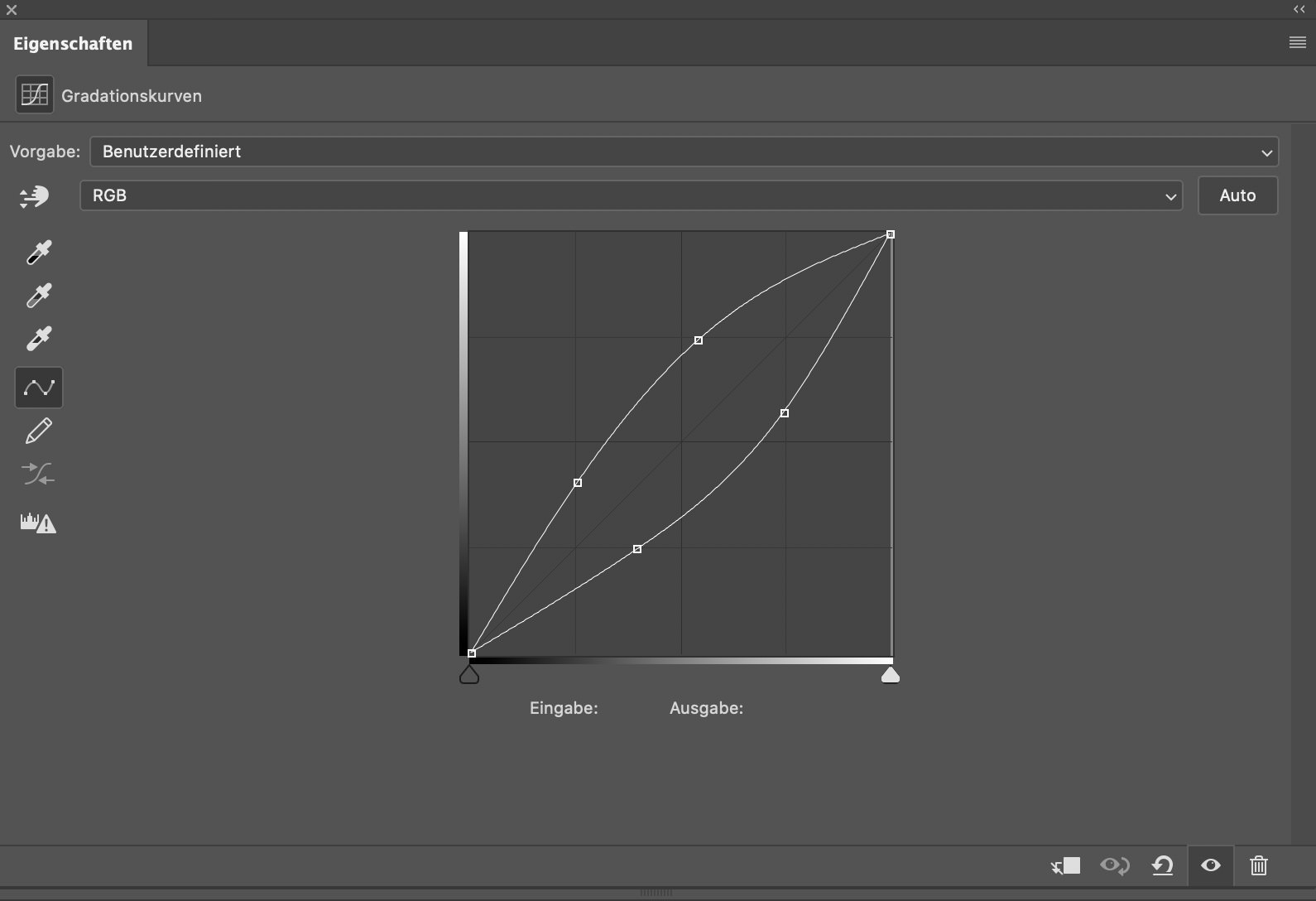
When sharpening images, Adobe Photoshop looks for edges and enhances them by making one side lighter and the other darker. However, Photoshop doesn’t take color contrast into account – it can only manipulate luminance contrasts:

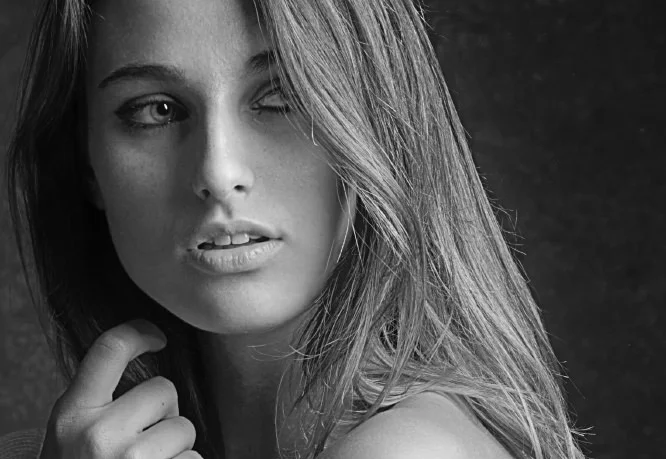
Let’s take a closer look and do the same thing again:


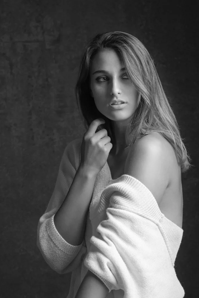
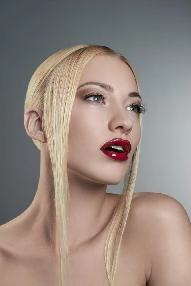
Take a look at the eye – it looks really sharp in this image. Unfortunately, this comes at the cost of the skin texture, which looks a bit rough, and the hair, which appears dry and straw-like. The hands also seem to be overly bright and have an unnatural glow to them.

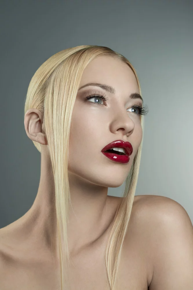
Fortunately, there is a great “manual tool” available for adjusting luminance in images: Dodge & Burn. With this tool, you can adjust the brightness of specific areas of the image to bring out more detail and make the image look more polished.

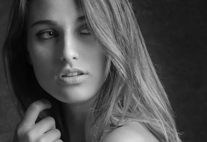
In this particular example, I used Dodge & Burn to manually sharpen the image. As you can see, the eye looks sharp without any negative side effects. Interestingly, this only took me about 2 minutes to do.

Sharpness through color contrasts

Let’s take a look at this image here:

These two colors are very similar – the red and the orange are almost identical, with only a small difference in their hues. The saturation and luminance of both colors are the same. However, if we change the hue of one of the color fields (while keeping the saturation and luminance the same), we get a completely different result:

The contrast between the two fields is so strong that even JPG compression struggles to accurately display the image. As a result, we can see visible artifacts in the middle. It’s amazing to see how much of a difference a simple change in color tone can make.

If you were to apply this concept to an image, you could do so in the following way:

By making only a minimal adjustment to the color tone, a sharper image was produced. It’s a very subtle effect, but it works wonders without any negative side effects.

Conclusion

In conclusion, if you want to achieve sharp images, it’s important to keep contrasts and contrast edges in mind when retouching your photos. This approach can often make subsequent sharpening unnecessary. When using Dodge & Burn, I always try to darken the edges a little more and lightly lighten the other side of the edge. With colors, it’s important to pay attention to color harmonies, so that you can achieve harmonious and sharp contrasts at the same time.

A little hint at the end

A final tip: if you try to sharpen your image while using the raw converter or increase the saturation, you may get a sharper image initially, but it will require twice the amount of work to eliminate any resulting problems. It’s better to use raw conversion to create a flatter, but balanced image and then deliberately increase the sharpness during retouching.

Stay tuned for our next blog article on sharpness, which will be published next week!

Do you have any suggestions, additions, is this post out of date, or have you found any mistakes? Then we look forward to your comment.
You are welcome to share this post. We are very grateful for every recommendation.

Aging and anatomy in retouching


Facial aging is a complex process that involves changes in both soft tissue and bony structures over time. When retouching images, we can manipulate the bone structure and the way light falls on the face using techniques like Dodge & Burn and Liquify.
However, it is important to be clear about whether we are intentionally rejuvenating a model and to avoid creating an unnatural overall impression by hiding some signs of aging while preserving others. This can lead to an unusual, inharmonious, and unnatural overall impression.
It is particularly essential to maintain the age of so-called “best agers” and only to make them look “fresher”.

The goal of this article will be to know different signs of aging and to use this knowledge (carefully!) accordingly in image editing.

The Major Forces responsible for Facial Aging

To use image editing techniques effectively, it is crucial to understand the different signs of aging, which can be caused by factors like:

  • Gravity,
  • Soft tissue maturation,
  • Skeletal remodeling,
  • Muscular facial activity,
  • Hormonal imbalance
  • Environmental factors: mental stress, diet, work habits, drug abuse, disease
  • and solar changes.(Zimbler MS, Kokoska MS & Thomas JR, 2012, p. 1)

Facial shape changes related to aging are similar in both sexes until around age 50, after which they become more pronounced in women. (Windhager S, Mitteroecker P, Rupić I, et al., 2019, p.1)

Signs of Youth

The youthful face is characterized by a balanced distribution of superficial and deep fat that creates a well-rounded 3D topography defined by a series of arcs and convexities.

In profile, three primary arcs are the most definitive features of youth:

  • The lateral cheek projection (the “ogee” curve), extending as an unbroken convex line from the lower eyelid to the cheek,
  • The arc of the jawline, extending from the lateral lower jaw to the chin
  • and the arc of the forehead.(Sydney R. Coleman, MD; Rajiv Grover, 2006, p.5).


Figure 1 – Woman aging from left to right. Arrows illustrating the loss of facial fullness that occurs with age. (Source: Aesthetic Surgery Journal 2006)


Signs of Aging

As people age, they lose volume in their facial tissues and their skin becomes less elastic due to epidermal thinning and decreased collagen production. This loss of fat, combined with the effects of gravity and muscle movement, leads to the development of wrinkles and dynamic lines, and can also affect the bones of the face. (Windhager S, Mitteroecker P, Rupić I, et al., 2019, p.1).

Various signs of aging include:

Global:

  • Textural skin changes,
  • Skin thickness decrease
  • A flatter face,
  • Reduction in facial height,
  • The defining arcs and convexities of youth are disrupted in higher age.

Upper third (forehead and brows):

  • Loss of fullness underneath the skin in the forehead, brow, temple, and upper eyelid areas,
  • The bony outline of the skull and supraorbital rims become more evident, as do the muscles of the brow,
  • The temporal blood vessels assume an increasingly tortuous appearance,
  • Loss of fullness in the upper eyelid,
  • The eyebrow seemingly descending to a position at or below the superior orbital rim,
  • Fixed wrinkles or folds

Middle third (midface)

  • Smaller visible areas of the eyes;
  • Deeper and broader orbit and double convex deformity of the lower eyelid;
  • Darker coloration to the thin infraorbital skin, resulting in a tired eye appearance;
  • Lid-cheek junction lengthening,
  • Deeper nasolabial folds,
  • Tip of the nose dropping
  • Ear lobe lengthening
  • The upper jaw decreases in size,
  • In profile, the primary arc of the cheek is broken.

The lower third (chin, jawline, and neck):

  • Lips are straight, thinner, drier and angular,
  • Sagged soft tissue (“broken” jawline)/ bone resorption in the lower jaw, the height and length of the lower jaw decrease, the lower jaw angle increases, so the shape of the chin changes,
  • A relative excess of the skin occurs in the aging lower face, leading to loss of definition of the jawline,
  • Development of the characteristic jowled “turkey neck” deformity,
  • The hyoid bone and larynx gradually descend.

(Windhager S, Mitteroecker P, Rupić I, et al., 2019, p.1)(Sydney R. Coleman, MD; Rajiv Grover, 2006, p. 4 ff.)(Windhager S, Mitteroecker P, Rupić I, et al., 2019, p.678)


Figure 2: Aging of the female face, as represented by models representing an individual at ~20 years of age (left), ~50 years (center), and ~75 years (right). The first event of aging is the loss of facial volume. All the aspects mentioned above can be recognized (Source: Aesthetic Surgery Journal 2006)


Figure 3: Aging of the female face based on facial scans in different stages of age. (Source: American Journal of Physical Anthropology 2019)

How to improve image editing

To improve your image editing, study the reference images provided in this article and compare them closely. When retouching images of middle-aged or older models, use this information to create a natural-looking result that is appropriate for their age.
It is important to be aware of these signs and to use retouching techniques in a way that maintains a natural appearance, rather than attempting to make middle-aged or older models look like they are in their twenties.

Remember that the goal is not to eliminate all signs of aging, but to create a fresher, more youthful appearance while maintaining a sense of harmony and balance.

A little tip for better image editing at the end of this article: If the intention to reduce wrinkles, you should only reduce the small ones; the large ones are very important for facial expressions and anatomy.

Now we have dealt a lot with the topic of aging to be able to edit model images better. If you want: Here you will find books on how you can do something good for yourself:

Do you have any suggestions, additions, is this post out of date, or have you found any mistakes? Then we look forward to your comment.
You are welcome to share this post. We are very grateful for every recommendation.

2-Point Curve as best option to do Dodge&Burn

Discover the Best Dodge and Burn Techniques


The Dodge & Burn technique can be approached in different ways and there are many opinions on how to make certain parts of an image lighter or darker. In this article, we will discuss various methods and test them for effectiveness.

Dodge & Burn Tools (DE: Abwedler & Nachbelichter)

The Dodge & Burn tools in Photoshop have been available for a long time. Many users have experienced using the Dodge tool to brighten an area of the image, only to realize they’ve gone too far. They then use the Burn tool to compensate and end up with light and dark patches that don’t fit well together. As a result, many people avoid using these tools altogether.

So here we have listed a number of alternatives for you to choose from:

50% gray layer

However, a better approach is to create an additional layer filled with neutral gray (50% gray) and switch it to the “Linear Light” blending mode. This layer doesn’t change the image at first, but when made lighter or darker, it affects the image’s overall brightness. To fix a mistake, you can paint 50% gray to restore the image to its original state. Some users prefer using the “Soft Light” blending mode as it has a subtler effect, but it affects the saturation of the image, which should be taken into account.

Pro Tip: You can also leave the layer empty and paint with black or white – the effect is 100% the same and saves storage space.

Multiple RAW conversions

Another technique that can be helpful is using multiple RAW conversions that differ in exposure. You can use one conversion for skin tones, another for the background, and another for the hair, depending on what the image requires. Then, you can load these individual RAW conversions as layers in Photoshop and mask them accordingly. However, you should only use this technique at the very beginning and it can inflate the file size. So you have to be sure of your decisions here.

Dodge & Burn Curves

Two curves, one for Dodge and one for Burn, are the optimal solution for using Dodge & Burn. Masking the effect in and out with white and black is straightforward. Switching between layers is easy with the following shortcut:

Windows: Alt +, (down), or Alt +. (up)
Mac: Option +, (down), or Option +. (up)

However, learning how to use curves for Dodge & Burn properly is necessary, as curves can influence not only luminance but also saturation and contrast, and small differences can result in significant changes.

Conny Wallström, a photographer, retouching teacher, and software developer based in Sweden, tested various curves and developed a 2-point gradation curve that reproduces the most natural and realistic way of dealing with color. This curve is integrated into a retouching toolkit, which creates two folders and includes hue/saturation corrections. These hue/saturation corrections are a measure against saturation problems caused by Dodge & Burn and make the most sense when processing skin.

More technical insights into the development of this method:

These curves were created by comparing them with the results of exposure levels from the raw converter in Capture One. The idea was that a raw converter like Capture One reproduces the most natural and realistic way of dealing with color with different exposures without causing color problems or shifts. Therefore, if we use these Dodge & Burn curves, we can expect a natural, realistic result. At the same time, we can work consistently and efficiently, since it is a Photoshop action that always works the same way.

But that’s not all. Many who already use this retouching toolkit know that this action creates two folders, and in addition to the special curves for Dodge and Burn, hue/saturation corrections are included. Here’s why the hue/saturation corrections are necessary:

When we analyze a portrait image , we find that increasing luminance tends to decrease saturation, while decreasing luminance tends to increase saturation. If we only lighten an image based on luminance, the proportion of saturation in the now lighter areas becomes too high (and vice versa). Therefore, using hue/saturation corrections is a measure against saturation problems caused by Dodge and Burn, which saves editing time in retouching.

These hue/saturation corrections are particularly useful when processing skin (skin texture, blood flow in the skin). Of course, this cannot be generalized 100%. Every image requires slight adjustments to the hue/saturation correction layers due to other camera manufacturers and raw formats. Therefore, it is recommended to adjust those layers slightly for each image. However, one cannot avoid looking at the saturation in the image afterward, at least briefly.

Hidden Gems / Tips and Tricks

Pro tip 1: Separately adjusted curves are also useful for very granular, high-contrast structures such as makeup (see example below) and are useful to avoid flattening the contrast.

(Photo by 𝐕𝐞𝐧𝐮𝐬 𝐇𝐃 𝐌𝐚𝐤𝐞- 𝐮𝐩 & 𝐏𝐞𝐫𝐟𝐮𝐦𝐞 from Pexels)

Pro tip 2: Additionally, the Dodge & Burn tools work well for eyebrows. If painted on an empty layer, you can achieve a more realistic result by painting individual hairs lighter or darker.

Don’t forget Dodge & Burn is much easier by using Wacom tablets.


Looking for more tips and tricks to improve your retouching skills? Check out the other articles in our Retouching Techniques blog section.

Do you have any suggestions, additions, is this post out of date, or have you found any mistakes? Then we look forward to your comment.
You are welcome to share this post. We are very grateful for every recommendation.